The Grid is somewhat reminiscent of an HTML table, but with several
differences: Unlike the HTML table, the Grid
doesn’t do formatting. It’s strictly for layout. There’s no concept of headers, for example,
or built-in cell dividers. Also, unlike the HTML table, the use of the Grid is actually encouraged.
A Grid has a certain
number of rows
and columns; rows can be different heights; columns can be different
widths. A child of the Grid normally occupies a particular row and column but
it can also span multiple rows and multiple columns. This sounds
versatile (and it is), but it comes with something of a price. Although
you can arbitrarily add children to a StackPanel or a Canvas,
with a Grid you
really need to know how many rows and columns you need to accommodate
all the children. You can add rows and columns from code at runtime, but
if you’re defining the Grid entirely in XAML you need to know beforehand.
Nesting Grid panels is
common, but don’t get carried away, particularly if something is going
on in your program that frequently generates layout cycles. Overly
complex nesting can bog down layout.
The Grid defines two properties named RowDefinitions and ColumnDefinitions.
These are, respectively, collections of RowDefinition
and ColumnDefinition objects. These objects define the height of each row and
the width of each column, and you have three choices:
The first and the last are
most common. The first indicates that the cell is sized to fit the
element in the cell. (The Grid
interrogates the size of that element in its MeasureOverride
method using infinite dimensions.) Rows and columns marked with asterisks are used to
divide remaining space proportionally.
As you’ve seen, it’s common that StackPanel
elements contain more children than can be displayed on the screen; the Grid is usually
defined so that doesn’t happen.
You indicate the particular row
and column of an element with the attached properties Grid.Row and Grid.Column.
Row and column
numbers begin with zero at the upper-left. You can specify that a
particular element occupies additional rows or additional columns with
attached properties Grid.RowSpan and Grid.ColumnSpan.
Here’s an example:
Example 1. Silverlight
Project: SimpleGrid File: MainPage.xaml (excerpt)
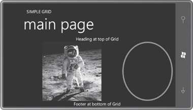
<Grid x:Name="ContentPanel" Grid.Row="1" Margin="12,0,12,0">
    <Grid.RowDefinitions>
        <RowDefinition Height="Auto" />
        <RowDefinition Height="*" />
        <RowDefinition Height="Auto" />
    </Grid.RowDefinitions>

    <Grid.ColumnDefinitions>
        <ColumnDefinition Width="2*" />
        <ColumnDefinition Width="*" />
    </Grid.ColumnDefinitions>

    <TextBlock Grid.Row="0"
               Grid.Column="0"
               Grid.ColumnSpan="2"
               Text="Heading at top of Grid"
               HorizontalAlignment="Center" />

    <Image Grid.Row="1"
           Grid.Column="0"
           Source="Images/BuzzAldrinOnTheMoon.png" />
    <Ellipse Grid.Row="1"
             Grid.Column="1"
             Stroke="{StaticResource PhoneAccentBrush}"
             StrokeThickness="6" />

    <TextBlock Grid.Row="2"
               Grid.Column="0"
               Grid.ColumnSpan="2"
               Text="Footer at bottom of Grid"
               HorizontalAlignment="Center" />
</Grid>
|
I just added the row and column
definitions to the existing content grid. Each element in the Grid has explicit Grid.Row
and Grid.Column
settings, but you can omit them for values of zero. Both the TextBlock at the top and TextBlock at the bottom
span the two columns to be centered in the whole grid.
The two columns were
apportioned so the first column is twice as wide as the second. The
width of that first column determines the size of the Image, which is then centered vertically in
the cell:

The rows and columns change
size when the phone is tilted, but the overall layout remains the same:
Try setting HorizontalAlignment
and VerticalAlignment properties on
this Grid. You’ll
discover that the size of the grid is constrained by the native pixel
dimensions of the bitmap.
The Grid named ContentPanel itself
has a setting of the Grid.Row attached property, but this refers to the second row
of its parent Grid—the one named LayoutRoot. The first row of that Grid is occupied by the StackPanel with the two titles.
And now, finally, we
have reached the point in the accumulation of knowledge of Silverlight
and XAML where nothing in MainPage.xaml should be a mystery.
