The ApplicationBar
serves the same role as a menu or toolbar that you might find in a
conventional Windows program. It also shares some visual and functional
similarities with those older structures. If you only need a couple
buttons in your program for some common commands, and perhaps a little
menu, the ApplicationBar
is what you should use. There is no conventional menu or toolbar
defined in Silverlight at all (although you can certainly make one
yourself).
The ApplicationBar and related classes (ApplicationBarIconButton and ApplicationBarMenuItem) are defined in the Microsoft.Phone.Shell namespace. These classes derive from Object and exist entirely apart from the whole DependencyObject, UIElement, and FrameworkElement class hierarchy of conventional Silverlight programming. Strictly speaking, the ApplicationBar is not part of the visual tree of your page.
An ApplicationBar object is always set to the ApplicationBar property of a PhoneApplicationPage. When the phone is held upright, the ApplicationBar always appears at the bottom of the page, and stays in the same location when the phone is turned sideways or upside down. The ApplicationBar is not at all customizable.
An ApplicationBar can contain up to four buttons. These are sometimes referred to as icons
and they always display images. These images are generally PNG files;
the bitmaps themselves should be 48 pixels square and mostly
transparent. The actual image should be white and occupy a 26-pixels
square area in the middle of the bitmap. A collection of suitable
bitmaps can be downloaded from http://www.microsoft.com/downloads/details.aspx?FamilyID=369b20f7-9d30-4cff-8a1b-f80901b2da93. You should study these images before designing your own.
I’ll assume you’ve downloaded the bitmaps. They are stored in two folders named light (black images on white backgrounds) and dark (white images on transparent background). Although the bitmaps in the light folder are easier to see in Windows Explorer, in your programs you should always use the corresponding files from the dark folder.
The MoviePlayer project contains a MediaElement to play a movie, and the ApplicationBar contains icons for Play, Pause, rewind to the beginning, and go to the end.
When creating a project in Visual Studio that uses the ApplicationBar,
you’ll want a folder in the project for the icons. Right click the
project name and choose Add and New Folder. (Or pick Add New Folder from
the Project menu.) Name the folder Images or something like that. Right click that folder name, choose Add and Existing Item, and navigate to the dark folder of the bitmaps you’ve downloaded. For MoviePlayer I selected:
appbar.transport.ff.rest.png
appbar.transport.pause.rest.png
appbar.transport.play.rest.png
appbar.transport.rew.rest.png
These are the four standard images associated with a videotape “transport” device metaphor.
This is crucial: Click each of these files as listed under the Images
directory to display its Properties page. (You might have to
right-click the file and select Properties.) Set the Build Action field
to Content. The ApplicationBar is not smart enough to find the images if the Build Action is Resource.
The ApplicationBar
is not part of standard Silverlight, so an XML namespace declaration
needs to associate the XML “shell” namespace with the .NET namespace Microsoft.Phone.Shell. The standard MainPage.xaml file provides this for you already:
xmlns:shell="clr-namespace:Microsoft.Phone.Shell;assembly=Microsoft.Phone"
MainPage.xaml will also have a sample ApplicationBar at the bottom of the file. You can uncomment and alter that one, or add your own right before the phone:PhoneApplicationPage end tag:
<phone:PhoneApplicationPage.ApplicationBar>
    <shell:ApplicationBar>
        <shell:ApplicationBarIconButton
                IconUri="Images/appbar.transport.rew.rest.png"
                Text="rewind" />

        <shell:ApplicationBarIconButton
                IconUri="Images/appbar.transport.play.rest.png"
                Text="play" />

        <shell:ApplicationBarIconButton
                IconUri="Images/appbar.transport.pause.rest.png"
                Text="pause" />

        <shell:ApplicationBarIconButton
                IconUri="Images/appbar.transport.ff.rest.png"
                Text="to end" />
    </shell:ApplicationBar>
</phone:PhoneApplicationPage.ApplicationBar>
ApplicationBar has a property named Buttons which is the content property for the class. The Buttons collection can contain no more than four ApplicationBarIconButton objects. The IconUri and Text fields are required! The text description should be short; it is converted to lower-case for display purposes.
Build and deploy the program as it exists at this point. Here’s what it looks like. (I’ve also removed the page title.)
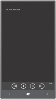
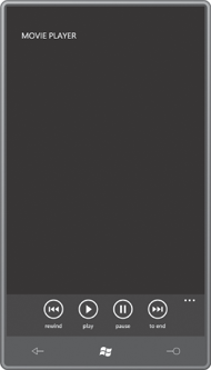
As you press each icon, it
flashes and wiggles a bit for feedback. If you press the ellipsis, the
buttons rise up to display the explanatory Text property:
When you turn the phone sideways, the ApplicationBar stays in the same place relative to the phone, but if you’ve set the SupportedOrientations property to PortraitOrLandscape, the images themselves turn sideways:
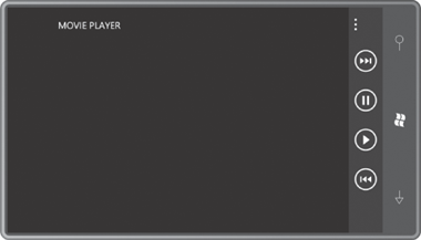
Watch out for this feature: Don’t use icons that will cause user disorientation when the phone is oriented sideways. If you have one icon with a horizontal bar, and another with a vertical bar, you’re going to confuse your users and, quite possibly, yourself.
If you’d like to define an ApplicationBar in XAML but you don’t want it to be initially displayed, you can set the IsVisible property to false:
<shell:ApplicationBar IsVisible="False">
You can later set that property to true in code. But don’t bother setting the x:Name attribute on the ApplicationBar to access it from code. Inexplicably, you can’t reference an ApplicationBar object in code by name. Instead, get at it through the ApplicationBar property of MainPage:
this.ApplicationBar.IsVisible = true;
ApplicationBar also defines ForegroundColor and BackgroundColor properties that you should probably ignore. By default the ApplicationBar colors will be properly swapped if you change the color theme of the phone.
ApplicationBar also defines an Opacity property, whose familiar name disguises an unconventional effect. The Opacity property involves the background of the ApplicationBar rather than the foreground; it never affects the icon images themselves.
The Opacity property is 1 by default, which means that the background of the ApplicationBar is opaque. The background is colored using the resource referenced as PhoneChromeBrush—a very darkish gray for the dark theme, and a very lightish gray for the light theme.
With an Opacity property of 1, the ApplicationBar takes space away from the rest of the content of the page. For any other Opacity values, other content on the page shares the space with the ApplicationBar. The ApplicationBar is always on top, and when Opacity goes down to 0, the ApplicationBar has an entirely transparent background and the icons are displayed on top of whatever happens to be in that area of the content grid. Documentation recommends you stick to Opacity values of 1, 0.5, or 0.
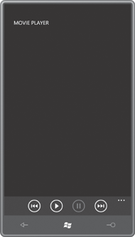
If a particular icon is not valid at a particular time, you can set the IsEnabled property of ApplicationBarIconButton to false.
For example, the Play and Pause buttons shouldn’t both be enabled at
the same time. Here’s how to disable the Pause button at startup:
<shell:ApplicationBarIconButton
        IconUri="Images/appbar.transport.pause.rest.png"
        Text="Pause"
        IsEnabled="False" />
Now it looks like this:
You’ll probably want to enable that button in code later on, but once again, you can’t use x:Name. Because this is the third button (and hence has an index in the Buttons collection of 2) you can set the IsEnabled property in code like this:
(this.ApplicationBar.Buttons[2] as ApplicationBarIconButton).IsEnabled = true;
You’ll probably be disabling the Play button at the same time:
(this.ApplicationBar.Buttons[1] as ApplicationBarIconButton).IsEnabled = false;
Actually, if the movie is
accessed over the Internet, you’ll probably want to disable all the
buttons until you’ve actually opened the media and know you’re going to
be able to play the movie!
The program also needs to know when a user has clicked an enabled button. Set the Click event to a handler:
<shell:ApplicationBarIconButton
        IconUri="Images/appbar.transport.play.rest.png"
        Text="Play"
        Click="OnAppBarPlayClick" />
In the code-behind file, the handler is based on the EventHandler delegate:
void OnAppbarPlayClick(object sender, EventArgs args)
{
    . . .
}
The final MoviePlayer project has an ApplicationBar defined like this:
Example 1. Silverlight Project: MoviePlayer File: MainPage.xaml (excerpt)
<phone:PhoneApplicationPage.ApplicationBar>
    <shell:ApplicationBar x:Name="appbar">
        <shell:ApplicationBarIconButton
                x:Name="appbarRewindButton"
                IconUri="Images/appbar.transport.rew.rest.png"
                Text="rewind"
                IsEnabled="False"
                Click="OnAppbarRewindClick" />

        <shell:ApplicationBarIconButton
                x:Name="appbarPlayButton"
                IconUri="Images/appbar.transport.play.rest.png"
                Text="play"
                IsEnabled="False"
                Click="OnAppbarPlayClick" />

        <shell:ApplicationBarIconButton
                x:Name="appbarPauseButton"
                IconUri="Images/appbar.transport.pause.rest.png"
                Text="pause"
                IsEnabled="False"
                Click="OnAppbarPauseClick" />

        <shell:ApplicationBarIconButton
                x:Name="appbarEndButton"
                IconUri="Images/appbar.transport.ff.rest.png"
                Text="to end"
                IsEnabled="False"
                Click="OnAppbarEndClick" />
    </shell:ApplicationBar>
</phone:PhoneApplicationPage.ApplicationBar>
|
Yes, I have assigned x:Name attributes to all the buttons, but you’ll see shortly that I’ve also reassigned them in code.
The content grid contains the MediaElement to play the movie and two TextBlock elements for some status and error messages:
Example 2. Silverlight Project: MoviePlayer File: MainPage.xaml (excerpt)
<Grid x:Name="ContentPanel" Grid.Row="1" Margin="12,0,12,0">
    <MediaElement Name="mediaElement"
                  Source="http://www.charlespetzold.com/Media/Walrus.wmv"
                  AutoPlay="False"
                  MediaOpened="OnMediaElementMediaOpened"
                  MediaFailed="OnMediaElementMediaFailed"
                  CurrentStateChanged="OnMediaElementCurrentStateChanged"  />

    <TextBlock Name="statusText"
               HorizontalAlignment="Left"
               VerticalAlignment="Bottom" />

    <TextBlock Name="errorText"
               HorizontalAlignment="Right"
               VerticalAlignment="Bottom"
               TextWrapping="Wrap" />
</Grid>
|
Notice that the AutoPlay property on the MediaElement is set to false so the movie doesn’t start playing when it’s loaded. That’s all handled in the code-behind file.
The constructor of the MainPage assigns x:Name attributes to the appropriate ApplicationBarIconButton so they can be conveniently referenced in the rest of the class:
Example 3. Silverlight Project: MoviePlayer File: MainPage.xaml.cs (excerpt)
public MainPage()
{
    InitializeComponent();

    // Re-assign names already in the XAML file
    appbarRewindButton = this.ApplicationBar.Buttons[0] as ApplicationBarIconButton;
    appbarPlayButton = this.ApplicationBar.Buttons[1] as ApplicationBarIconButton;
    appbarPauseButton = this.ApplicationBar.Buttons[2] as ApplicationBarIconButton;
    appbarEndButton = this.ApplicationBar.Buttons[3] as ApplicationBarIconButton;
}
|
The four handlers for the ApplicationBar buttons have just one line of code each:
Example 4. Silverlight Project: MoviePlayer File: MainPage.xaml.cs (excerpt)
void OnAppbarRewindClick(object sender, EventArgs args)
{
    mediaElement.Position = TimeSpan.Zero;
}

void OnAppbarPlayClick(object sender, EventArgs args)
{
    mediaElement.Play();
}
void OnAppbarPauseClick(object sender, EventArgs args)
{
    mediaElement.Pause();
}

void OnAppbarEndClick(object sender, EventArgs args)
{
    mediaElement.Position = mediaElement.NaturalDuration.TimeSpan;
}
|
The messy part of a movie-playing program involves the enabling and disabling of the buttons. Because the primary purpose of this program is to demonstrate the use of the ApplicationBar,
I’ve taken a very simple approach here: The Rewind and End buttons are
enabled when the media is opened, and the Play and Pause buttons are
enabled based on the CurrentState property of the MediaElement:
Example 5. Silverlight Project: MoviePlayer File: MainPage.xaml.cs (excerpt)
void OnMediaElementMediaFailed(object sender, ExceptionRoutedEventArgs args)
{
    errorText.Text = args.ErrorException.Message;
}

void OnMediaElementMediaOpened(object sender, RoutedEventArgs args)
{
    appbarRewindButton.IsEnabled = true;
    appbarEndButton.IsEnabled = true;
}

void OnMediaElementCurrentStateChanged(object sender, RoutedEventArgs args)
{
    statusText.Text = mediaElement.CurrentState.ToString();

    if (mediaElement.CurrentState == MediaElementState.Stopped ||
        mediaElement.CurrentState == MediaElementState.Paused)
    {
        appbarPlayButton.IsEnabled = true;
        appbarPauseButton.IsEnabled = false;
    }
    else if (mediaElement.CurrentState == MediaElementState.Playing)
    {
        appbarPlayButton.IsEnabled = false;
        appbarPauseButton.IsEnabled = true;
    }
}
|
