When beginning a project,
it’s usually best to cruise the Installed Fonts drop-down list in
CorelDRAW, see what you think is an appropriate typeface choice, find
fonts that work harmoniously if you need more than one typeface in the
design, and then, if you’re drawing a blank, check out the typefaces you
own but have not
installed. It’s generally a bad idea to pick the first font on the
installed fonts list; Arial is a good workaday font, but it’s most
appropriate for text on aspirin bottles and caution signs because of its
legibility at small point sizes and its authoritative, clean but
spartan look.
The following sections describe the anatomy of a font, what stroke width means, serifs
and font characteristics, and basically explain why a typeface looks
the way it does and therefore becomes appropriate for a design idea.
Also, the better you understand the characteristics of characters, the
better you’ll be able to communicate a specific need to a typographer or
a press operator, and to conduct a quicker search on your drive and the
Web for the typeface you need.
Styles and Types of Typefaces
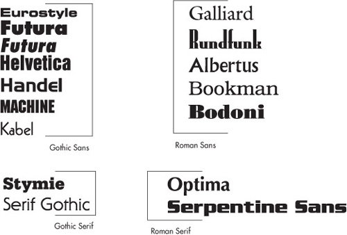
There are two basic categories of typefaces a designer uses daily:
Roman The characters (called glyphs by typographers) consist of thick and thin stems (called strokes) providing good contrast between characters to make long paragraphs at small point size easy to read.
Gothic
The characters are made up of strokes of even or almost-even widths.
This makes a Gothic font an excellent choice for headlines with impact
and for official signs.
Within the categories of typefaces, there are two more branches: serifs and sans (from the Latin “without”) serifs.
Serifs are an embellishment at the end of a stroke in a character;
their original purpose was both as a flourish when scribes would
hand-copy manuscripts and, as typesetting was invented, serifs made the
wooden and metal slugs easier to remove from the surface the slug was
pressed into.
Typographers ages ago
decided that a Gothic font could benefit from serifs and, conversely, a
Roman typeface could become more functional as a headline-style font by
removing the serifs. Designers now enjoy the use of both Roman and
Gothic type cast in serif and sans serif treatments, examples of which
are shown in Figure 13-1.
Tip
In
typographer’s language, a font is usually part of a family of
typefaces. Optima, for example, has normal, italic, bold, and
bold-italic as part of the font family; additionally, other weights of
Optima, part of the Optima family, are available from several vendors
you can find online. Typeface, in contrast, is generally used to
describe either a single member of a family (Optima Bold is a typeface)
or a typeface that has no family members, such as Rockabilly.
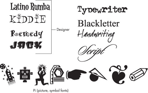
Other Types of Typefaces
The
design world would be a fairly boring place today if there weren’t
other types of fonts designed by professionals. Variations on the
traditional Roman and Gothic typefaces abound in the desktop publishing
world and many defy classification. On the CorelDRAW installation
disk(s), you’ll also find about a thousand typefaces, many of which
would fit in the category of “designer” fonts: from classic to classy,
from appropriate for packaging to logo treatments. In the world of
digital typefaces, an element of playfulness has snuck in, and we have
“grunge” fonts that look as though the office photocopier’s having a bad
hair day, elegant script typefaces that are ideal for wedding
invitations, Blackletter typefaces that span usage from fairytales to
metal band logos, fonts that look like handwriting, and Pi (picture)
fonts. In Figure 13-2
you can see a small collection of different types of fonts gathered
from the CorelDRAW disk and third-party vendors such as Émigré, The Font
Bureau, and Stu’s Font Diner.
Distant Cousins in Typeface Families
Often, font families are written
for normal, bold, bold-italic, and italic variations on a typeface.
However, as the need arose for specific printing purposes, typographers
extended font families to include expanded versions—compressed,
condensed, engraved, stenciled, and professional sets that include
characters not regularly written to standard typeface sets. For example,
Helvetica, Futura, and Goudy come in more than 17 “flavors” from
different typeface foundries. Typeface manufacturers have retained the
name “foundry” from the days when
typefaces were cast from metal using a forge, much like a metal foundry
that manufactures machine parts. When shopping and using Bitstream Font
Navigator ,
it’s important to know a few of the fancier variations on typeface
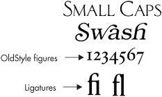
families. On the next page are examples of a small caps typeface: it’s
appropriate for formal announcements and doesn’t assault the reader as
ALL CAPS does! Look for SC in a font name; typographers often use it to denote this special font. Also, some Roman serif typefaces have swash
members: Bookman, Goudy, Garamond, and other popular fonts for body
text can be purchased with characters that have strokes that sweep under
and above neighboring characters for an elegant look. OldStyle versions
of fonts contain numbers that alternate in position to make long
sequences of digits easier to read, and frequently their filename is
appended with OS.
|
Fonts you use in CorelDRAW and most every other Windows application are actually applications, specifically runtime applications
that require a “player” to display, print, and otherwise use the
characters contained in the typeface. Fortunately, after you add a
typeface to the Fonts folder in the Windows Control Panel, you don’t
have to worry about the player; it’s in the operating system, and most
applications recognize a recently added typeface immediately.
A digital typeface has
outlines that describe the shape of the individual characters. This is
why you’ll see a lot of picture fonts available on the Web for free:
characters can be anything in a font, and it requires less skill to draw
a tiny picture than to design a professional font such as Times New
Roman for desktop publishing. Because the shapes are vector in nature,
fonts can be small in file size, they scale smoothly to any size you
might need, and CorelDRAW can simplify characters you type in a document
so they become regular vector shapes that can be manipulated in any way
you like. Common file extensions for digital typefaces are .OTF
(OpenType font) and .TTF (TrueType font), and older fonts come in two
parts: PostScript Type 1 fonts have the .PFB file extension for the binary data part, which contains the outlines of the characters, and an accompanying .PFM file holds header and metrics
information (information character width, space surrounding characters,
and so on). Windows and CorelDRAW can handle all three types of digital
fonts.
|
Finally, a well-designed, professional typeface of any family member will contain extended characters. An extended character is one you can’t directly access from the keyboard; instead you must first hold ALT
and then type four digits on the numeric keypad area of your keyboard.
For example, if you want to put a pause in a sentence, one way to
punctuate is with ellipses (three periods when we used typewriters).
However, the proper punctuation in today’s typesetting is the ellipse character, which is accessed from standard-encoded typefaces by pressing and holding ALT, then typing 0133.
Some typefaces don’t come
with extended characters, some come with a few, and the more
professional typefaces have ligature characters in the extended range of
the font. Ligatures were first invented by scribes several centuries
ago to get more words per line on parchment and to even out the look of
certain words, usually Latin. For example, (in today’s English) the word
“find” looks awkward in certain typefaces because of the proximity of
the f’s extension to the right, hitting the dot in the i.
Because today’s digital typefaces can contain thousands of characters
including entire foreign-language character sets, a specific typeface
might have a ligature for fi with the dot missing from the i, but this ligature is nearly impossible to look up to use. Fortunately, you can add an fi ligature, an fl, or any other extended character through the Insert Character docker (CTRL+F11). If you’re into typesetting, it’s a good idea to remember this keyboard shortcut.
Tip
Ligatures
occasionally come as part of an Expert set of a specific typeface,
making it easier to locate the ligature you need. These sets are often
called “Extras” in their filename.
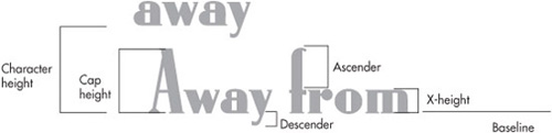
The Anatomy of a Font
When looking for a font
that seems appropriate for a specific design, the shape of the
individual characters might or might not work out the way you intend;
you want the spacing between lines of text (called leading)
to be extremely tight, but the ascender on certain characters is too
high and juts into the preceding line of text. What’s an ascender? The
vertical strokes in characters have names typographers use and you
should, too, when describing an ideal font or when seeking one:
Character height
Used to describe the overall height, which includes not only the
character but also the space above the character, this is usually coded
in by the person designing the typeface. Character height determines how
much interline spacing you’ll need to make more than one line of text.
Cap height
This is the height of a capital letter in a typeface, which is usually
not the same as character height, nor is it necessarily the height of
all characters (which is called the ascender).
Ascender This is the height of the tallest character in a font; usually it’s the f, the h, or a swash if the font contains this embellishment.
Descender This is the lowest part of a character; usually a g or a y, except when a font has swashes.
X-height This is the measurement of a lowercase character, traditionally measured by the letter x in the font.
Baseline An imaginary line where all the characters should rest.
Figure 1 shows all the measurements just described.
Tip
A few
typographic elements have characters not found in a digital typeface,
but instead are built by CorelDRAW and other applications. For example,
an underscored character, used a lot in legal documents, in CorelDRAW is
built from any typeface: you select the character(s) to be underscored,
click the Underline button on the property bar, and you’re done.
Similarly, if you need a Superscript or Subscript character (see the
next illustration), CorelDRAW builds one from any font. However, a
Superscript is a special treatment of a character, and you need to first
choose the character’s glyph node with the Shape tool (not with the
Pick or the Text tool). Then the Super and Subscript buttons appear on
the property bar and you’re home free.