The Windows Presentation Foundation has somewhat more flexibility than Silverlight in defining and using animations. WPF includes objects called triggers,
which respond to event firings or to changes in properties and which
can start animations going entirely in XAML, eliminating the need for
the code-behind file to start the Storyboard. Triggers are largely gone from Silverlight.
However, one trigger remains in Silverlight. This is a trigger that responds to the Loaded
event. This allows you to define an animation entirely in XAML that
automatically starts up when the page (or another element) is loaded.
The FadeInOnLoaded project contains the following XAML near the bottom of the page, right above the PhoneApplicationPage end tag. This is the traditional spot for event triggers:
Example 1. Silverlight Project: FadeInOnLoaded File: MainPage.xaml (excerpt)
<phone:PhoneApplicationPage.Triggers>
    <EventTrigger>
        <BeginStoryboard>
            <Storyboard>
                <DoubleAnimation Storyboard.TargetName="TitlePanel"
                                 Storyboard.TargetProperty="Opacity"
                                 From="0" To="1" Duration="0:0:10" />
            </Storyboard>
        </BeginStoryboard>
    </EventTrigger>
</phone:PhoneApplicationPage.Triggers>
|
The markup begins with a property-element tag for the Triggers property defined by FrameworkElement. The Triggers property is of type TriggerCollection, which sounds quite extensive and versatile, but in Silverlight the only thing you can put in there is an EventTrigger tag that is always associated with the Loaded event. This next tag is BeginStoryboard. This is the only place you’ll see a BeginStoryboard tag in Silverlight. And now we get to something familiar: A Storyboard with one or more animations that can target any dependency object of any object on the page.
This one targets the Opacity property of the TitlePanel, which is the StackPanel containing the two titles at the top of the page. I made the animation 10 seconds long so you don’t miss it. As the page is loaded, the titles fade into view:

The Silverlight
documentation discourages the use of animations triggered in this way.
Certainly the technique has limited use in real life. But it remains
very popular for XAML-based demonstration programs with animations that
run “forever.” You can make an animation run forever (or to the limits of your toleration) with:
RepeatBehavior="Forever"
Although I’ve read that you can’t put the markup with the Triggers
property element on anything other than the root element of the page,
in reality it’s possible to define it on something a little closer to
the actual objects being animated.
All the visuals in the following program are in a centered Grid with a fixed 400-pixel square size. The Grid contains five concentric circles, all of which are Path elements whose Data properties are set to EllipseGeometry objects. Each EllipseGeometry has RadiusX and a RadiusY properties set to values that are 25 pixels longer than the next smallest object.
Example 2. Silverlight Project: ExpandingCircles File: MainPage.xaml (excerpt)
<Grid x:Name="ContentPanel" Grid.Row="1" Margin="12,0,12,0"> <Grid Width="400" Height="400"
HorizontalAlignment="Center"
VerticalAlignment="Center" >
<!-- The inner circle. -->
<Path Name="pathInner"
Stroke="{StaticResource PhoneAccentBrush}"
StrokeThickness="12.5">
<Path.Data>
<EllipseGeometry x:Name="ellipse1"
Center="200 200"
RadiusX="0" RadiusY="0" />
</Path.Data>
</Path>
<!-- All circles except the inner and outer. -->
<Path Stroke="{StaticResource PhoneAccentBrush}"
StrokeThickness="12.5">
<Path.Data>
<GeometryGroup>
<EllipseGeometry x:Name="ellipse2"
Center="200 200"
RadiusX="25" RadiusY="25" />
<EllipseGeometry x:Name="ellipse3"
Center="200 200"
RadiusX="50" RadiusY="50" />
<EllipseGeometry x:Name="ellipse4"
Center="200 200"
RadiusX="75" RadiusY="75" />
</GeometryGroup>
</Path.Data>
</Path>
<!-- The outer circle. -->
<Path Name="pathOuter"
Stroke="{StaticResource PhoneAccentBrush}"
StrokeThickness="12.5">
<Path.Data>
<EllipseGeometry x:Name="ellipse5"
Center="200 200"
RadiusX="100" RadiusY="100" />
</Path.Data>
</Path>
<Grid.Triggers>
<EventTrigger>
<BeginStoryboard>
<Storyboard RepeatBehavior="Forever">
<DoubleAnimation Storyboard.TargetName="pathInner"
Storyboard.TargetProperty="StrokeThickness"
From="0" Duration="0:0:5" />
<DoubleAnimation Storyboard.TargetName="ellipse1"
Storyboard.TargetProperty="RadiusX"
From="0" To="25" Duration="0:0:5" />
<DoubleAnimation Storyboard.TargetName="ellipse1"
Storyboard.TargetProperty="RadiusY"
From="0" To="25" Duration="0:0:5" />
<DoubleAnimation Storyboard.TargetName="ellipse2"
Storyboard.TargetProperty="RadiusX"
From="25" To="50" Duration="0:0:5" />
<DoubleAnimation Storyboard.TargetName="ellipse2"
Storyboard.TargetProperty="RadiusY"
From="25" To="50" Duration="0:0:5" />
<DoubleAnimation Storyboard.TargetName="ellipse3"
Storyboard.TargetProperty="RadiusX"
From="50" To="75" Duration="0:0:5" />
<DoubleAnimation Storyboard.TargetName="ellipse3"
Storyboard.TargetProperty="RadiusY"
From="50" To="75" Duration="0:0:5" />
<DoubleAnimation Storyboard.TargetName="ellipse4"
Storyboard.TargetProperty="RadiusX"
From="75" To="100" Duration="0:0:5" />
<DoubleAnimation Storyboard.TargetName="ellipse4"
Storyboard.TargetProperty="RadiusY"
From="75" To="100" Duration="0:0:5" />
<DoubleAnimation Storyboard.TargetName="ellipse5"
Storyboard.TargetProperty="RadiusX"
From="100" To="125" Duration="0:0:5" />
<DoubleAnimation Storyboard.TargetName="ellipse5"
Storyboard.TargetProperty="RadiusY"
From="100" To="125" Duration="0:0:5" />
<DoubleAnimation Storyboard.TargetName="pathOuter"
Storyboard.TargetProperty="Opacity"
From="1" To="0" Duration="0:0:4.9" />
</Storyboard>
</BeginStoryboard>
</EventTrigger>
</Grid.Triggers>
</Grid>
</Grid>
|
That centered Path is also the element on which the EventTrigger is attached, and the Storyboard contains 12 DoubleAnimation
objects, all of which run in parallel for 5 seconds. (The last one is
actually 4.9 seconds, but I made that change to avoid a sporadic visual glitch.) The entire Storyboard is then repeated forever. All but two of these DoubleAnimation objects target the RadiusX and RadiusY properties of the five EllipseGeometry objects, making them 25 pixels larger—that is, as large as the base value of the next larger circle.
At the same time, the Opacity property of the outermost circle is animated to fade out, and the innermost circle has it StrokeThickness
property animated to make it seem as if it grows from nothing. The
overall visual effect is that circles seem to be generated from the
center, and then disappear once they reach the outside:

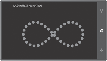
The next program is called DashOffsetAnimation, and it uses a Path
to draw an infinity sign in landscape mode. The infinity sign includes
two semicircles (at the far left and far right), each of which is drawn
using two Bézier splines based on a well-known approximation.
A single Bézier curve approximates a quarter
circle very well. For a circle centered at the point (0, 0) with a
radius of 100, the lower-right quarter-circle arc begins at the point
(100, 0) and goes clockwise to end at the point (0, 100). You can
approximate that arc with a Bézier curve that begins at the point (100,
0) and ends at the point (0, 100) with the two control points (100, 55)
and (55, 100). Continue that same pattern—I think of it as the “Bezier
55” rule—to construct an entire circle from four connected Bézier curves. The approximation is so good that some graphics systems actually implement circles using this technique.
The Data
definition used below is Path Markup Syntax that starts with an M
(“move”) and then a C (“cubic Bézier”) with two control points and an
end point. But then it switches to S (“smooth Bézier”), which requires
only the second control point and the end point. The S automatically
uses the previous Bézier to determine a first control point that is
collinear with the start point and previous control point.
The StrokeDashArray is set with the two points 0 and 1.5 indicating a dash length of 0 and a gap of 1.5. However, the StrokeDashCap is set to Round, so the dots are round and are separated by half the thickness of the line.
Example 3. Silverlight Project: DashOffsetAnimation File: MainPage.xaml (excerpt)
<Grid x:Name="ContentPanel" Grid.Row="1" Margin="12,0,12,0">
    <Path Name="path"
          HorizontalAlignment="Center"
          VerticalAlignment="Center"
          Stroke="{StaticResource PhoneAccentBrush}"
          StrokeThickness="23.98"
          StrokeDashArray="0 1.5"
          StrokeDashCap="Round"
          Data="M 100    0
                C  45    0,    0   45, 0 100
                S  45  200,  100  200
                S 200  150,  250  100
                S 345    0,  400    0
                S 500   45,  500  100
                S 455  200,  400  200
                S 300  150,  250  100
                S 155    0,  100    0">

        <Path.Triggers>
            <EventTrigger>
                <BeginStoryboard>
                    <Storyboard>
                        <DoubleAnimation Storyboard.TargetName="path"
                                         Storyboard.TargetProperty="StrokeDashOffset"
                                         From="0" To="1.5" Duration="0:0:1"
                                         RepeatBehavior="Forever" />
                    </Storyboard>
                </BeginStoryboard>
            </EventTrigger>
        </Path.Triggers>
    </Path>
</Grid>
|
This DoubleAnimation targets the StrokeDashOffset property of the Path,
which is normally zero. This is the property that indicates the
location in the sequence of dots, dashes, and gaps that is aligned with
the beginning of the line. The result is that the dots seem to travel
continuously around the figure.
To avoid discontinuities when animating StrokeDashOffset in a closed path, the crucial number is the StrokeThickness. You want the total length of the line to be an integral multiple of the StrokeDashArray times the StrokeThickness. If StrokeThickness
isn’t anywhere close to the correct value, you’ll see a kind of
bubbling effect as partial dots are drawn; if it’s very close to the
correct value but not exact, you may see flickering.
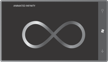
AnimatedInfinity is another landscape program that uses that same Path Markup Syntax but colors the infinity sign with a LinearGradientBrush with the traditional colors of the rainbow:
Example 4. Silverlight Project: AnimatedInfinity File: MainPage.xaml (excerpt)
<Grid x:Name="ContentPanel" Grid.Row="1" Margin="12,0,12,0">
    <Path HorizontalAlignment="Center"
          VerticalAlignment="Center"
          StrokeThickness="25"
          Data="M 100    0
                C  45    0,    0   45, 0 100
                S  45  200,  100  200
                S 200  150,  250  100
                S 345    0,  400    0
                S 500   45,  500  100
                S 455  200,  400  200
                S 300  150,  250  100
                S 155    0,  100    0">

        <Path.Stroke>
            <LinearGradientBrush SpreadMethod="Repeat">
                <LinearGradientBrush.Transform>
                    <TranslateTransform x:Name="translate" />
                </LinearGradientBrush.Transform>
                <LinearGradientBrush.GradientStops>
                    <GradientStop Offset="0.00" Color="Red" />
                    <GradientStop Offset="0.14" Color="Orange" />
                    <GradientStop Offset="0.28" Color="Yellow" />
                    <GradientStop Offset="0.42" Color="Green" />
                    <GradientStop Offset="0.56" Color="Blue" />
                    <GradientStop Offset="0.70" Color="Indigo" />
                    <GradientStop Offset="0.85" Color="Violet" />
                    <GradientStop Offset="1.00" Color="Red" />
                </LinearGradientBrush.GradientStops>
            </LinearGradientBrush>
        </Path.Stroke>
        <Path.Triggers>
            <EventTrigger>
                <BeginStoryboard>
                    <Storyboard>
                        <DoubleAnimation Storyboard.TargetName="translate"
                                         Storyboard.TargetProperty="X"
                                         From="0" To="625" Duration="0:0:2"
                                         RepeatBehavior="Forever" />
                    </Storyboard>
                </BeginStoryboard>
            </EventTrigger>
        </Path.Triggers>
    </Path>
</Grid>
|
The Brush defines a Transform property (although it’s not often used), and this program sets it to a TranslateTransform and then animates it, making the colors continuously sweep across the figure:
You can also animate properties of type Color, which means you can animate brush colors. Here’s a program that animates the Color properties in two GradientStop objects of a LinearGradientBrush:
Example 5. Silverlight Project: GradientAnimation File: MainPage.xaml (excerpt)
<Grid x:Name="ContentPanel" Grid.Row="1" Margin="12,0,12,0">
    <Grid HorizontalAlignment="Center"
          VerticalAlignment="Center">
        <TextBlock Text="GRADIENT"
                   FontSize="96"
                   FontWeight="Bold">
            <TextBlock.Foreground>
                <LinearGradientBrush>
                    <GradientStop x:Name="gradientStop1"
                                  Offset="0" Color="Red" />
                    <GradientStop x:Name="gradientStop2"
                                  Offset="1" Color="Blue" />
                </LinearGradientBrush>
            </TextBlock.Foreground>
        </TextBlock>

        <Grid.Triggers>
            <EventTrigger>
                <BeginStoryboard>
                    <Storyboard>
                        <ColorAnimation Storyboard.TargetName="gradientStop1"
                                        Storyboard.TargetProperty="Color"
                                        From="Red" To="Blue" Duration="0:0:11"
                                        AutoReverse="True"
                                        RepeatBehavior="Forever" />

                        <ColorAnimation Storyboard.TargetName="gradientStop2"
                                        Storyboard.TargetProperty="Color"
                                        From="Blue" To="Red" Duration="0:0:13"
                                        AutoReverse="True"
                                        RepeatBehavior="Forever" />
                    </Storyboard>
                </BeginStoryboard>
            </EventTrigger>
        </Grid.Triggers>
    </Grid>
</Grid>
|
The two animations are given prime-number periods of 11 seconds and 13 seconds so the overall cycle, including AutoReverse, lasts almost 5 minutes before it repeats.
