You’ve probably already grasped
that scrollbars and sliders
are not required as much on multi-touch screens as they are in
mouse-based environments.
Still, scrollbars and
sliders are sometimes useful for jobs that allow the user to select from
a continuous range of values. These controls are found in this little
corner of the class hierarchy:
Control (abstract)
        RangeBase (abstract)
               ProgressBar
               ScrollBar (sealed)
               Slider
The RangeBase class
defines Minimum, Maximum, SmallChange,
and LargeChange properties to
define the parameters of scrolling, plus a Value
property for the user’s selection and a ValueChanged
event that signals when Value has
changed. (Notice that ProgressBar also
derives from RangeBase, but the Value property is always
controlled programmatically rather than being set by the user.)
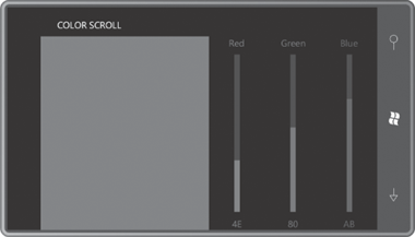
I’m going to focus on the Slider here because the version in Windows Phone 7 seems a
little more tailored to the phone than the ScrollBar. The goal is to use three Slider controls to create a program called ColorScroll that looks like this:
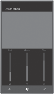
You scroll the red, green, and blue Slider controls to
define a composite color. To make it more interesting, when the phone is
turned sideways, I want the visuals to re-orient themselves slightly so
it looks like this:
The easiest way to architect such a display is with nested grids. One
grid has three rows and three columns containing the three Slider controls and six TextBlock elements. That Grid is in another Grid with just two cells. The other cell holds a Rectangle element whose Fill property is set to a SolidColorBrush
based on the color selected from the sliders.
That larger Grid with the two cells is the familiar Grid named ContentPanel. Whether those two cells are two rows or two
columns is determined by the code-behind file based on the current Orientation property.
The XAML file contains a Resources
collection with Style definitions for
both TextBlock and Slider:
Example 1. Silverlight
Project: ColorScroll File: MainPage.xaml (excerpt)
<phone:PhoneApplicationPage.Resources>
    <Style x:Key="textStyle" TargetType="TextBlock">
        <Setter Property="HorizontalAlignment" Value="Center" />
    </Style>

    <Style x:Key="sliderStyle" TargetType="Slider">
        <Setter Property="Minimum" Value="0" />
        <Setter Property="Maximum" Value="255" />
        <Setter Property="Orientation" Value="Vertical" />
    </Style>
</phone:PhoneApplicationPage.Resources>
|
A Style with just
one Setter seems a
bit ostentatious, but it’s nice to have if you ever want to add another
Setter for the Margin or FontSize. The default range of a Slider is 0 to 10; I’ve changed that to make the range
appropriate for a one-byte value.
ScrollBar and Slider have their own Orientation properties, entirely unrelated to
the Orientation property of PhoneApplicationPage but somewhat related to
the Orientation property of StackPanel because they both share the same Orientation enumeration with values of Horizontal and Vertical.
The default Orientation of a Slider
is Horizontal. (For a ScrollBar it’s Vertical,
a difference I’ve never quite understood.)
By default, the top of a vertical Slider
is associated with the Maximum value. That’s OK for this program but you can
change it by setting the IsDirectionReversed property to true.
Here’s the whole content panel:
Example 2. Silverlight
Project: ColorScroll File: MainPage.xaml (excerpt)
<Grid x:Name="<Grid x:Name="ContentPanel" Grid.Row="1" Margin="12,0,12,0">
    <Grid.RowDefinitions>
        <RowDefinition Height="*" />
        <RowDefinition Height="*" />
    </Grid.RowDefinitions>

    <Rectangle Name="rect"
               Grid.Row="0"
               Grid.Column="0" />

    <Grid Name="controlGrid"
          Grid.Row="1"
          Grid.Column="0">
        <Grid.RowDefinitions>
            <RowDefinition Height="Auto" />
            <RowDefinition Height="*" />
            <RowDefinition Height="Auto" />
        </Grid.RowDefinitions>

        <Grid.ColumnDefinitions>
            <ColumnDefinition Width="*" />
            <ColumnDefinition Width="*" />
            <ColumnDefinition Width="*" />
        </Grid.ColumnDefinitions>

        <!-- Red column -->
        <TextBlock Grid.Column="0"
                   Grid.Row="0"
                   Text="Red"
                   Foreground="Red"
                   Style="{StaticResource textStyle}" />

        <Slider Name="redSlider"
                Grid.Column="0"
                Grid.Row="1"
                Foreground="Red"
                Style="{StaticResource sliderStyle}"
                ValueChanged="OnSliderValueChanged" />

        <TextBlock Name="redText"
                   Grid.Column="0"
                   Grid.Row="2"
                   Text="0"
                   Foreground="Red"
                   Style="{StaticResource textStyle}" />

        <!-- Green column -->
        <TextBlock Grid.Column="1"
                   Grid.Row="0"
                   Text="Green"
                   Foreground="Green"
                   Style="{StaticResource textStyle}" />

        <Slider Name="greenSlider"
                Grid.Column="1"
                Grid.Row="1"
                Foreground="Green"
                Style="{StaticResource sliderStyle}"
                ValueChanged="OnSliderValueChanged" />

        <TextBlock Name="greenText"
                   Grid.Column="1"
                   Grid.Row="2"
                   Text="0"
                   Foreground="Green"
                   Style="{StaticResource textStyle}" />

        <!-- Blue column -->
        <TextBlock Grid.Column="2"
                   Grid.Row="0"
                   Text="Blue"
                   Foreground="Blue"
                   Style="{StaticResource textStyle}" />

        <Slider Name="blueSlider"
                Grid.Column="2"
                Grid.Row="1"
                Foreground="Blue"
                Style="{StaticResource sliderStyle}"
                ValueChanged="OnSliderValueChanged" />

        <TextBlock Name="blueText"
                   Grid.Column="2"
                   Grid.Row="2"
                   Text="0"
                   Foreground="Blue"
                   Style="{StaticResource textStyle}" />
    </Grid>
</Grid>
|
All the Slider controls have their ValueChanged events
set to the same handler. This handler really takes an easy way out by
not bothering to determine which Slider
actually raised the event:
Example 3. Silverlight
Project: ColorScroll File: MainPage.xaml.cs (excerpt)
void OnSliderValueChanged(object sender, RoutedPropertyChangedEventArgs<double> args)
{
    Color clr = Color.FromArgb(255, (byte)redSlider.Value,
                                    (byte)greenSlider.Value,
                                    (byte)blueSlider.Value);

    rect.Fill = new SolidColorBrush(clr);

    redText.Text = clr.R.ToString("X2");
    greenText.Text = clr.G.ToString("X2");
    blueText.Text = clr.B.ToString("X2");
}
|
You may have noticed that
the XAML file doesn’t initialize the Value
property of any Slider. Here’s why:
As the page is being constructed, various elements and controls are
created, event
handlers are linked to events, and properties are set. When a new Value property is set to a Slider in the construction of this page, the Slider fires the ValueChanged
event. It is extremely likely that the OnSliderValueChanged
method in MainPage will be called before the page has been entirely
constructed. But OnSliderValueChanged references other elements in the visual tree. If
those element do not yet exist, a runtime
exception will result.
Want to see it happen? Try
setting
<Setter Property="Value" Value="128" />
in the Style
definition for the Slider.
Causing an event to be fired while the visual tree is being constructed
is a common pitfall. You can either bullet-proof your event handlers by
checking for null
elements and controls, or you can do what I do in ColorScroll:
Properties that trigger events in the page are safely set in the class’s
constructor after the call to InitializeComponent when the visual tree has been entirely built:
Example 4. Silverlight
Project: ColorScroll File: MainPage.xaml.cs (excerpt)
public MainPage()
{
    InitializeComponent();
    redSlider.Value = 128;
    greenSlider.Value = 128;
    blueSlider.Value = 128;
}
|
To handle orientation
changes in the phone, MainPage
overrides its OnOrientationChanged method. The event arguments include a property
named Orientation of type PageOrientation.
It helps to know that the PageOrientation enumeration values are bit flags with the following
values:
| None | 0000–0000 |
| Portrait | 0000–0001 |
| Landscape | 0000–0010 |
| PortraitUp | 0000–0101 |
| PortraitDown | 0000–1001 |
| LandscapeLeft | 0001–0010 |
| LandscapeRight | 0010–0010 |
You can check for portrait
or landscape by performing a bitwise OR operation between the Orientation property and the Portrait or Landscape members, and then checking for a non-zero result.
It makes the code just a little simpler:
Example 5. Silverlight
Project: ColorScroll File: MainPage.xaml.cs (excerpt)
protected override void OnOrientationChanged(OrientationChangedEventArgs args)
{
    ContentPanel.RowDefinitions.Clear();
    ContentPanel.ColumnDefinitions.Clear();

    // Landscape
    if ((args.Orientation & PageOrientation.Landscape) != 0)
    {
        ColumnDefinition coldef = new ColumnDefinition();
        coldef.Width = new GridLength(1, GridUnitType.Star);
        ContentPanel.ColumnDefinitions.Add(coldef);

        coldef = new ColumnDefinition();
        coldef.Width = new GridLength(1, GridUnitType.Star);
        ContentPanel.ColumnDefinitions.Add(coldef);

        Grid.SetRow(controlGrid, 0);
        Grid.SetColumn(controlGrid, 1);
    }
    // Portrait
    else
    {
        RowDefinition rowdef = new RowDefinition();
        rowdef.Height = new GridLength(1, GridUnitType.Star);
        ContentPanel.RowDefinitions.Add(rowdef);

        rowdef = new RowDefinition();
        rowdef.Height = new GridLength(1, GridUnitType.Star);
        ContentPanel.RowDefinitions.Add(rowdef);

        Grid.SetRow(controlGrid, 1);
        Grid.SetColumn(controlGrid, 0);

    }
    base.OnOrientationChanged(args);
}
|
The ContentPanel object needs to be switched between two rows for
portrait mode and two columns for landscape mode, so it creates the GridDefinition and ColumnDefinition objects for the new orientation. (Alternatively,
it could create these collections ahead of time and just switch back and
forth. Or it could create a 2-cell by 2-cell Grid in the XAML file and set the unused row or
column to a zero height or width.)
The Rectangle element is always in the cell with Grid.Row and Grid.Column settings of zero. But the Grid
named controlGrid must have its Grid.Row and Grid.Column attached properties set using the syntax.
