When it comes to adding
contrast to a photo, I pretty much avoid the Contrast slider in Camera
Raw’s Basic panel as much as possible, because it’s too broad and too
lame. So, when it comes to creating contrast, try the Tone Curve
instead, and you’ll never go back to that one broad and lame slider that
is too broad and too lame.
Step One. | After
you’ve done all your exposure and tone adjustments in the Basic panel,
skip the Contrast slider and click on the Tone Curve icon (it’s the
second icon from the left). There are two different types of curves
available here: the Point curve, and the Parametric curve. We’ll start
with the Point curve, so click on the Point tab at the top of the panel.
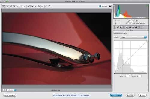
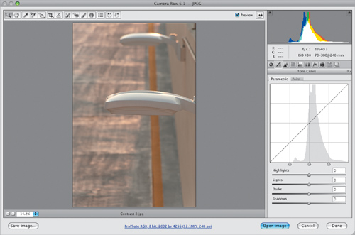
Here’s what the photo shown here looks like with no added contrast in
the Point curve (notice that the pop-up menu above the curve is set to
Linear, which is a flat, unadjusted curve). Note:
If you shoot in RAW, by default the curve will be set to Medium
Contrast (since your camera didn’t add any contrast). If you shoot in
JPEG, it’ll be set to Linear, which means no contrast has been added
(since it’s a JPEG, your camera already added it.
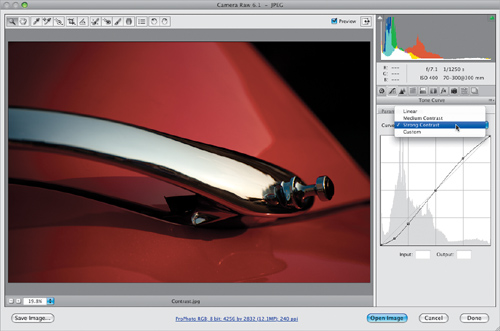
 | Step Two. | If you want more contrast, choose Strong Contrast
from the Curve pop-up menu (as shown here), and you can see how much
more contrast this photo now has, compared with Step One. The difference
is the Strong Contrast settings create a much steeper curve, and the
steeper the curve, the more contrast it creates.
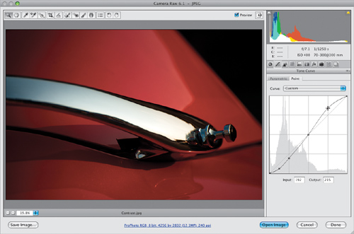
 | Step Three. | If
you’re familiar with Photoshop’s Curves and want to create your own
custom curve, start by choosing any one of the preset curves, then
either click-and-drag the adjustment points on the curve or use the Arrow keys
to move them (I think it’s easier to click on a point, then use the Up
and Down Arrow keys on your keyboard to move that part of the curve up
or down). If you’d prefer to start from scratch, choose Linear
from the Curve pop-up menu, which gives you a flat curve. To add
adjustment points, just click along the curve. To remove a point, just
click-and-drag it right off the curve (drag it off quickly, like you’re
pulling off a Band-Aid).
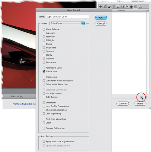
 | Step Four. | If
you create a curve that you’d like to be able to apply again to other
photos, you can save this curve as a preset. To do that, click on the
Presets icon (the second icon from the right) at the top of the Panel
area to bring up the Presets panel. Next, click on the New Preset icon
(which looks just like Photoshop’s Create a New Layer icon) at the
bottom of the panel. This brings up the New Preset dialog (shown here).
If you just want to save this curve setting, from the Subset pop-up menu
near the top, choose Point Curve,
and it turns off the check-boxes for all the other settings available as
presets, and leaves only the Point Curve checkbox turned on (as shown
here). Give your preset a name (I named mine “Super Contrast Curve”) and
click OK.
 | Step Five. | If
you’re not comfortable with adjusting the Point curve, try the
Parametric curve, which lets you craft your curve using sliders that
adjust the curve for you. Click on the Parametric tab, and you’ll see
four sliders, which control the four different areas of the curve, but
before you start “sliding,” know that the adjustments you make here are
added to anything you did in the Point Curve tab (if you did anything
there first).
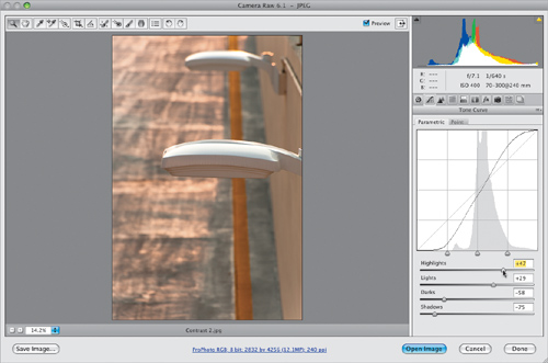
 | Step Six. | The
Highlights slider controls the highlights area of the curve (the top of
the curve), and dragging it to the right arcs the curve upward, making
the highlights brighter. Right below that is the Lights slider, which
covers the next lower range of tones (the area between the midtones and
the highlights). Dragging this slider to the right makes this part of
the curve steeper, and increases the upper mid-tones. The Darks and
Shadows sliders do pretty much the same thing for the lower midtones and
deep shadow areas. But remember, dragging to the right opens up those
areas, so to create contrast, you’d drag both of those to the left
instead. Here, to create some real punchy contrast, I dragged both the
Highlights and Lights sliders to the right, and the Darks and Shadows
sliders to the left.
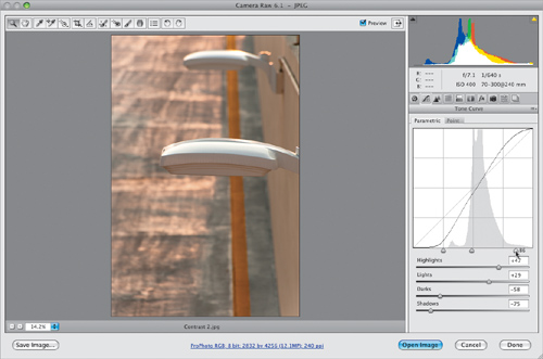
 | Step Seven. | Another
advantage of the Parametric curve is that you can use the region
divider controls (under the curve) to choose how wide a range each of
the four sliders covers. So, if you move the far-right region divider to
the right (shown here), it expands the area controlled by the Lights
slider. Now the Highlights slider has less impact, flattening the upper
part of the curve, so the contrast is decreased. If I drag that same
region divider control back to the left instead, it expands the
Highlights slider’s area, which steepens the curve and increases
contrast.
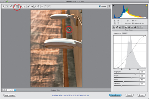
 | Step Eight. | If
all of this makes you a bit squeamish, have I got a tool for you: it’s
called the Targeted Adjustment tool (or TAT for short) and you’ll find
it up in the toolbar at the top of the window (it’s the fifth tool from
the left, shown circled here). Just move the tool over the part of the
image you want to adjust, then drag upward to lighten that area, or
downward to darken it (this just moves the part of the curve that
represents that part of the image). A lot of photographers love the TAT,
so make sure you give it a try, because it makes getting that one area
you want brighter (or darker) easier. Now, there is one caveat (I’ve
been waiting to use that word for a while), and that is: it doesn’t just
adjust that one area of your photo—it adjusts the curve itself. So,
depending on the image, other areas may get lighter/darker, too, so just
keep an eye on that while you’re adjusting. In the example shown here, I
clicked and dragged upward to brighten up that shadowy area, and the
curve adjusted to make that happen automatically.
 |
|