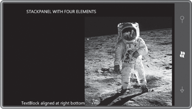
Here are the same four elements in a StackPanel, which is nested in the content grid:
Example 1. Silverlight
Project: StackPanelWithFourElements File: MainPage.xaml (excerpt)
<Grid x:Name="ContentPanel" Grid.Row="1" Margin="12,0,12,0">
    <StackPanel Name="stackPanel"
                Orientation="Vertical">
        <TextBlock Text="TextBlock aligned at right bottom"
                   HorizontalAlignment="Right"
                   VerticalAlignment="Bottom" />

        <Image Source="Images/BuzzAldrinOnTheMoon.png" />

        <Ellipse Stroke="{StaticResource PhoneAccentBrush}"
                 StrokeThickness="12" />

        <TextBlock Text="TextBlock aligned at left top"
                   HorizontalAlignment="Left"
                   VerticalAlignment="Top" />
    </StackPanel>
</Grid>
|
By default, the StackPanel
arranges its children
in a stack from top to bottom. The children do not overlap:

The text displayed by the two TextBlock elements now seems a little peculiar: The
first TextBlock
is at the top of the display because that’s the first one in the Children collection. The HorizontalAlignment
property moves it over to the right, but the VerticalAlignment
property (which indicates Bottom) is obviously being ignored, and similarly for
the other TextBlock. The width of the Image element
occupies the full width of the StackPanel. It still has the correct aspect ratio, and now
only requires enough vertical space to accommodate its height.
Both the TextBlock and Image elements only
occupy the minimum vertical space that they require, and the Ellipse … well, the Ellipse has totally disappeared. You might find that
shocking, but reasonable. The Ellipse
doesn’t really require any vertical space at all, and that’s exactly what it’s
received. (If you set the Height
property of Ellipse
to a positive number, you’ll bring it back into view.)
Changing the orientation
of the phone provides the Image with a greater width that it matches with a height
that preserves the aspect ratio of the bitmap, but in doing so pushes
most of the bitmap off the screen, together with the second TextBlock:

As you know, the ability of the
page to respond to portrait and landscape orientation changes is governed by the SupportedOrientations property of the PhoneApplicationPage
class. The property is set to a member of the SupportedPageOrientation
enumeration. PhoneApplicationPage
defines another property named Orientation which is set to a member of the PageOrientation
enumeration to indicate whether the orientation of the phone is
currently portrait or landscape.
The StackPanel has
its own Orientation
property, but it has nothing to do with page orientation. The Orientation property of StackPanel is set to a
member of the Orientation enumeration,
either Horizontal or Vertical. The default is Vertical, but the StackPanelWithFourElements
program toggles the StackPanel orientation when you
tap the screen. Here’s the code to do it:
Example 2. Silverlight
Project: StackPanelWithFourElements File: MainPage.xaml.cs (excerpt)
protected override void OnManipulationStarted(ManipulationStartedEventArgs args)
{
    stackPanel.Orientation =
        stackPanel.Orientation == System.Windows.Controls.Orientation.Vertical ?
                                  System.Windows.Controls.Orientation.Horizontal :
                                  System.Windows.Controls.Orientation.Vertical;
    args.Complete();
    args.Handled = true;
    base.OnManipulationStarted(args);
}
|
The Orientation enumeration has to be fully qualified or the
compiler thinks you’re referring to the Orientation
property defined by PhoneApplicationPage.
One tap and the elements
are arranged from left to right:

The HorizontalAlignment
of the first TextBlock is now ignored,
and the VerticalAlignment puts it down
at the bottom. The Image gets such a big height that most of it is off screen. We can
get a little better view (including the second TextBlock)
by turning the phone sideways:

The StackPanel occupies the full interior of the content grid,
even if that that’s more than what its children require. You can easily
verify this by setting a BackgroundStackPanel. The
StackPanel fills its parent container because the default values of the HorizontalAlignment and VerticalAlignment properties are the default
values of Stretch. on
the
You can set other HorizontalAlignment
or VerticalAlignment properties on the
StackPanel to force
it to use only as much space
as necessary, and position it within the content grid. Here’s a Background of Pink and a VerticalAlignment property of Center:

In this particular program, the HorizontalAlignment property of the StackPanel has no effect.