This class hierarchy is complete beginning with the ButtonBase class:
Control (abstract)
        ContentControl
                ButtonBase (abstract)
                        Button
                        HyperlinkButton
                        RepeatButton (sealed)
                        ToggleButton
                                CheckBox
                                RadioButton
It’s actually ButtonBase that defines the Click event and the ClickMode property.
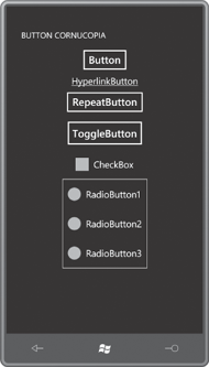
The ButtonCornucopia project creates instances of all these buttons with nearly as few superfluous properties as possible:
Example 1. Silverlight Project: ButtonCornucopia File: MainPage.xaml
<Grid x:Name="ContentPanel" Grid.Row="1" Margin="12,0,12,0">
    <StackPanel>
        <Button Content="Button" HorizontalAlignment="Center" />
        <HyperlinkButton Content="HyperlinkButton" HorizontalAlignment="Center" />
        <RepeatButton Content="RepeatButton" HorizontalAlignment="Center" />
        <ToggleButton Content="ToggleButton" HorizontalAlignment="Center" />
        <CheckBox Content="CheckBox" HorizontalAlignment="Center" />

        <Border BorderBrush="White"
                BorderThickness="1"
                HorizontalAlignment="Center">
            <StackPanel>
                <RadioButton Content="RadioButton1" />
                <RadioButton Content="RadioButton2" />
                <RadioButton Content="RadioButton3" />
            </StackPanel>
        </Border>
    </StackPanel>
</Grid>
|
The buttons may seem a bit large
with too much space around them, but keep in mind that they need to
provide adequate touch targets:
The HyperlinkButton is used in connection with Silverlight page navigation, and includes a NavigateUri property for that purpose. RepeatButton generates multiple Click events when the button is held down; its primary purpose is in the ScrollBar and Slider, and it’s rarely used elsewhere.
There is no functional difference between the ToggleButton and CheckBox. The difference is only visual, and that’s something that can be changed with a template. The Silverlight for Windows Phone Toolkit adds a ToggleButton derivative named ToggleSwitchButton that you’ve probably seen in the Settings section of a Windows Phone.
When checked, the RadioButton causes all its siblings to become unchecked. There is no special container for the RadioButton. Just put two or more in a panel (almost always a StackPanel) and they will turn off by themselves. RadioButton defines a GroupName
property that allows you to differentiate multiple groups of mutually
exclusive buttons that might be children of the same panel.
Normally the ToggleButton and CheckBox are physical manifestations of a Boolean. They turn on and off with successive clicks. But ToggleButton defines an IsThreeState property that optionally provides a third “indeterminate” state. Generally this is used only in connection with the CheckBox; the ToggleButton doesn’t even have a unique visual appearance for the indeterminate state.
Consequently, the IsChecked property defined by ToggleButton is not of type bool. It’s of type Nullable<bool> (also written as bool?) with three possible values: true, false, and null. If you need to set the IsChecked property to a null value in XAML you can use a special markup extension:
IsChecked="{x:Null}"
For conventional two-state toggling purposes, IsChecked usually needs to be cast to bool.
ToggleButton defines three events: Checked is fired when the button becomes checked, Unchecked when it becomes unchecked, and Indeterminate when it’s going into the third state. In most cases, a program using a ToggleButton or CheckBox needs to handle both the Checked and Unchecked events, but you can use the same handler for both events.
