1. Problem
You would like to have a customized button that shows an image instead of the usual written text.
2. Solution
You have several solutions
to this problem, each with its pros and cons., and we will be listing
them all brought then a definitive template that reflects what we want
from this customization
3. How It Works
With XAML, you have the
ability to create multiple controls together—so, for example, items in a
list box can be a series of check boxes. You can also use XAML to set
the contents of a button to be not text but an image. Finally, you can
customize the behavior of a check box so that it has a different symbol
than the standard, by editing the template to modify the path
representing the usual check mark.
4. The Code
From Expression Blend, create a new project for Windows Phone and call it PlayWithControlTemplate.
Do not create a pilot project for this recipe, because you could use
this information in all your applications, and consequently bring your
template around your products. (Suppose that you have created a suite of
products, to which you have given your footprint graphic and you want
these are always on the same line for each product to let the user
easily settle with your other software.)
In this project, the first thing you do is add an Images folder and add an image named TestImage.png (Look at this link if you want some information about this image format: www.libpng.org/pub/png/pngintro.html). In this example, the image is the one shown in Figure 1, but you are free to choose another.

The first thing you want to get
is an image that works just like a button. There are several ways to
achieve this goal, but the easiest is to use an image instead of text as
the content of the button. Here is an example:
<Button x:Name="ImageButton" Height="84" >
        <Image Source="Images/TestImage.jpg" />
</Button>
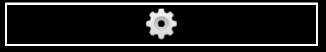
This code creates a button, shown in Figure 2,
which is apparently already a button that is acceptable, but lacks some
specialties, for example, has kept the edge to the content then we have
to edit the template of the button to remove the Board and add our
button some small effect to make it complete. Then, as always,
right-click the button and edit the template, calling it ImageButtonTemplate.
First, you need to locate ButtonBackground, which currently is an element of type Border. You want to delete it or replace it with a common Grid, whose Background remains bound to the template. Then this Grid will add a rectangle that you will call OverlayRectangle and will fill with black so that its opacity is 100% not visible initially.
The addition of this
rectangle to afford when the button is disabled, showing an overlay on
the image (or any other custom content).
Then the XAML that you need to use is similar to the following:
<Gridx:Name="ButtonBackground"Background="{TemplateBinding Background}"
   Margin="{StaticResource PhoneTouchTargetOverhang}">
        <ContentControl x:Name="ContentContainer" ContentTemplate="{TemplateBinding
           ContentTemplate}" Content="{TemplateBinding Content}"
           Foreground="{TemplateBinding Foreground}"
           HorizontalContentAlignment="{TemplateBinding HorizontalContentAlignment}"
           Padding="{TemplateBinding Padding}" VerticalContentAlignment="{TemplateBinding
           VerticalContentAlignment}"/>
        <Rectangle x:Name="OverlayRectangle" Fill="#B0000000" Visibility="Collapsed" />
</Grid>
Now you have to edit the statuses disabled and pressed. (This step would be avoidable if you don't remove the Border, but as you change it with the Grid, remember that if you do, it will result in an error in the storyboard, because unlike the Grid, does not have a border attribute as BorderBrush.) To complete this custom control, press F6 to toggle to storyboard mode and select the Pressed state, and then the grid, changing the background to {StaticResourcePhoneForegroundBrush}.
Just as before, the button will change color from black to white (and
vice versa), depending on the visual theme chosen by the user (which
should always be taken into account). The XAML for this effect should be
similar to this:
<VisualState x:Name="Pressed">
 <Storyboard>
  <ObjectAnimationUsingKeyFrames           Storyboard.TargetProperty="Background"
Storyboard.TargetName="ButtonBackground">
   <DiscreteObjectKeyFrame                  KeyTime="0" Value="{StaticResource
PhoneForegroundBrush}"/>
  </ObjectAnimationUsingKeyFrames>
 </Storyboard>
</VisualState>
You are changing the
foreground color because you are thinking of abstracting this template
compared to contents (contrary to what is chosen for the naming
convention of the templates) so that if you apply this style to a button
with text as its content, you would get the same result, a reversal of
the background and foreground color. The aim is always the same, to have
consistent behavior between the various elements that make up the user
interface so that they are part of one big picture.
Well, you just have to manage the Disabled
state of your templates, so that the rectangle forming the overlay to
show "inert" our elements to change their visibility in visible, then
once again select the element and change the visibility into property in
order to obtain automatically the XAML like this:
<VisualState x:Name="Disabled">
 <Storyboard>
  <ObjectAnimationUsingKeyFrames
Storyboard.TargetProperty="(UIElement.Visibility)" Storyboard.TargetName="OverlayRectangle">
   <DiscreteObjectKeyFrame                      KeyTime="0">
    <DiscreteObjectKeyFrame.Value>
     <Visibility>Visible</Visibility>
    </DiscreteObjectKeyFrame.Value>
   </DiscreteObjectKeyFrame>
  </ObjectAnimationUsingKeyFrames>
 </Storyboard>
</VisualState>
Note: If you have previously changed the Border control in XAML to a Grid
control and then haven't deleted the storyboard attached to it, you'll
end up with a change of the foreground color in this case. However, does
nothing more than what is already done by the rectangle, except that in
this case it also applies to images, in either case applies only to
text.
The template is ready, as you
have customized the button template. Earlier, we said that you could
create this template in several ways—and just for the sake of
information, there is also a reverse way that could come in handy if you
wanted to give a background image to your button. However, keeping a
"normal" behavior compared to textual content.
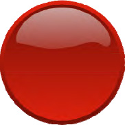
This template will depart
from using an item image for a button control. The process is virtually
automatic thanks to Blend, and allows you to achieve satisfactory
results with regard to the user experience. Our image for the button,
shown in Figure 3, represents a prototype idea of a circular button.
Insert it into your own XAML as a normal image:
<Image Source="Images/Circle Button Red.jpg" />
So now you just have to
right-click and choose the menu item Make Into Control. At this point,
you will see a screen for selecting the controls that you can achieve
starting from this image. In our case, we chose a button, but if you had
a different image that represented, for example, a sheet of notebook
paper, you might have considered using a list box.
Name the template CircleButtonTemplate.
If you try to, you will realize that the button is inert; it does not
react to changes in state, to user pressure, or to being disabled. So
you have to define the behavior under these conditions. Although this is
unlike the type of template that you created earlier, it's not a big
problem. All you have to do to start is add two ellipses to the template
that will overlay the button's Pressed and Disabled
states. You could also use a rectangle to achieve this goal, but just
to let you see that you can achieve the same result in this manner, this
example uses an ellipse.
The first ellipse, PressedEllipse, will overlay the image when the button is pressed. The second ellipse, DisabledEllipse, will, as its name suggests, overlay the image when the button is disabled.
Both ellipses must have their visibility set to Collapsed.
Their opacity mask must be the image that you used to create the
button. The fill color is white for the pressed state and gray for the
disabled state. Both are not entirely opaque and have a good level of
transparency.
<Ellipse x:Name="PressedEllipse" Visibility="Collapsed" Fill="#72DEDADA" >
        <Ellipse.OpacityMask>
                <ImageBrush Stretch="Uniform" ImageSource="Images/Circle Button Red.jpg"/>
 </Ellipse.OpacityMask>
</Ellipse>
<Ellipse x:Name="DisabledEllipse" Visibility="Collapsed" Fill="#B2787878" >
        <Ellipse.OpacityMask>
                <ImageBrush Stretch="Uniform" ImageSource="Images/Circle Button Red.jpg"/>
 </Ellipse.OpacityMask>
</Ellipse>
At this point, edit the Pressed state storyboard, and set the PressedEllipse visibility to Visible, and do the same for the Disabled state on DisabledEllipse in order to obtain an interactive button.
At the end of this edit, your XAML should be like this:
...
<VisualState x:Name="Pressed">
 <Storyboard>
  <ObjectAnimationUsingKeyFrames
Storyboard.TargetProperty="(UIElement.Visibility)" Storyboard.TargetName="PressedEllipse">
   <DiscreteObjectKeyFrame                      KeyTime="0">
    <DiscreteObjectKeyFrame.Value>
     <Visibility>Visible</Visibility>
    </DiscreteObjectKeyFrame.Value>
   </DiscreteObjectKeyFrame>
</ObjectAnimationUsingKeyFrames>
 </Storyboard>
</VisualState>

<VisualState x:Name="Disabled">
 <Storyboard>
  <ObjectAnimationUsingKeyFrames
Storyboard.TargetProperty="(UIElement.Visibility)" Storyboard.TargetName="DisabledEllipse">
   <DiscreteObjectKeyFrame                      KeyTime="0">
    <DiscreteObjectKeyFrame.Value>
     <Visibility>Visible</Visibility>
    </DiscreteObjectKeyFrame.Value>
   </DiscreteObjectKeyFrame>
  </ObjectAnimationUsingKeyFrames>
 </Storyboard>
</VisualState>
...
Now you have a fully functional
button. And now that you've learned how to customize the data template,
button, and interezioni with these tools, understanding how to change
the template of a check box will be much easier.
A check box template is
composed of various elements: a content container, which allows you to
specify the text to display (as you may have guessed, even in this case
you could use an image); a path (a sequence of points connected by lines
that make up a figure) that is made visible when the check box is
selected; and a rectangle that is made visible in the case of an
indeterminate state (as in the case of three state check box).
Suppose that for your
application, you want your check box to be marked with an X instead of
the usual check mark. You also want to display a question mark instead
of a square for the indeterminate state. The first thing to do is get
the path that reflects this forms. We recommend using Microsoft
Expression Design for this purpose because creating a path by hand can
be too difficult. To create an X, the code would be written as follows:
<Path x:Name="CheckMark" Fill="{StaticResource PhoneRadioCheckBoxCheckBrush}" Width="25"
Height="25" Canvas.Left="0" Canvas.Top="0" Stretch="Fill" StrokeLineJoin="Round"
Stroke="#FF000000" Data="F1 M 0.5,2.47917L 2.46875,0.5L 12.4687,10.4792L 22.4687,0.500002L
24.5,2.47917L 14.4687,12.4792L 24.5,22.4792L 22.4687,24.5L 12.4687,14.4792L 2.46875,24.5L
0.5,22.4792L 10.4687,12.4792L 0.5,2.47917 Z "/>
The path to get the question mark will more or less take this form:
<Path x:Name="IndeterminateMark" Fill="{StaticResourcePhoneRadioCheckBoxCheckBrush}"
Width="11.2721" Height="21.6238" Canvas.Left="0" Canvas.Top="0" Stretch="Fill" Data="F1 M
3.33606,15.3168C 3.24626,15.0697 3.16511,14.7475 3.09259,14.3501C 3.02006,13.9528
2.9838,13.5571 2.9838,13.1629C 2.9838,12.5529 3.1228,12.0015 3.40081,11.5087C 3.67881,11.016
4.02589,10.5546 4.44203,10.1244C 4.85817,9.69425 5.31144,9.28051 5.80183,8.8832C
6.29223,8.48589 6.7455,8.08388 7.16164,7.67719C 7.57778,7.27049 7.92486,6.84502
8.20286,6.40078C 8.48087,5.95655 8.61987,5.46538 8.61987,4.92729C 8.61987,4.47054
8.51885,4.06462 8.31683,3.70955C 8.1148,3.35447 7.83852,3.05726 7.48799,2.81794C
7.13747,2.57861 6.73254,2.39951 6.27323,2.28063C 5.81392,2.16175 5.32698,2.10231
4.81241,2.10231C 2.96135,2.10231 1.35722,2.80308 0,4.20462L 0,1.48288C 1.67493,0.494293
3.41203,0 5.21129,0C ...
And does not seem
appropriate to continue with all the points contained in it, but it is
only to explain how important it is for a designer who intends to
customize their own strong interface, using a tool such as Design to get
XAML like this.
5. Usage
To use this recipe, use an
alternative form to create a dictionary in which you insert all the
effects, styles, and templates that were shown. Then apply them to 7Drum
or some other application. Note how important (and clever) it is as a
designer to create your own dictionary of effects (while always trying
to improve the graphics rendering) to keep in touch in the creation of
an application. And if you're a developer, you can do the same thing, if
you want to do without a designer your othe application.
