1. Problem
You want your application to
display a list of items inside a list box. This list box needs a custom
layout that enables you to display a rectangle next to each list item.
The rectangle will appear when the item is selected. You also want to
test the display of the list box by using various combinations of themes
allowed by Windows Phone.
2. Solution
To create the layout of your list, you must create an ItemTemplate template and an ItemContainerTemplate. Then you must interact with the Device panel in Expression Blend to change between various combinations of themes.
3. How It Works
The data template is a
powerful tool put in the hands of developers and designers that provides
significant control over customizing UI elements (including, for
example, a list box). These templates allow you to create a custom
organization of UI elements that is based on the way you want users to
visualize the information and that allows users to easily find what they
need. By combining the power of the data template with the Device panel
of Blend at design time, you can try out various combinations of themes
and accent colors to determine what the user's feedback will be.
4. The Code
It is important that your
application be able to adapt to the user's visual choices. I If you
don't use a color scheme suited to the theme chosen by the user, your
application could become unused. Of course, some applications can impose
a schema of color that differs from the choices of the user, while
still providing a great user experience, by adapting the needs of the
user to that graphic style (look at Facebook). In other cases, however,
you won't be able to boast with such boldness and you'll want your
application to be in line with the user's choices
Suppose that on the main
page, your application has a list box. Without having any customization
on brushes, you use system colors. Then, when the user changes the
theme, your application is still in line with it.
Problems arise when you
decide that you don't want to design an application similar to others.
Instead, you want one that reflects, for example, the web version of
your application. You want to use your color scheme, and would like it
if we use the light or dark theme.
Well, the first thing to know
is that you don't need to make ongoing changes to the settings of your
device or emulator. Blend already supports (at design time) the change
of themes by providing an instant preview. So before we show you how to
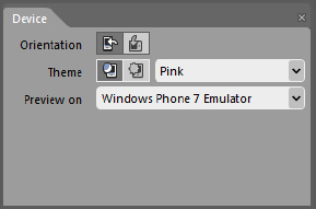
customize your application, we will show you how to use the Device panel
of Microsoft Expression Blend (shown in Figure 1).
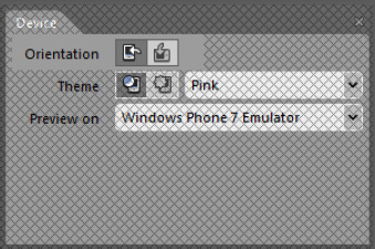
By clicking one of the two buttons highlighted in Figure 2,
you can rotate the preview in landscape or portrait orientation, and
then immediately test whether the application is ready for the two
display modes. Of course, if your application doesn't need to rotate in
the hands of the user, this option is not for you.
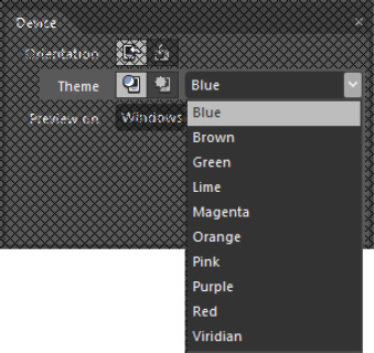
Similarly, you can change the appearance (dark or light) and the accent color matching PhoneAccentBrush,
which will allow you to keep the display in line with the "mood" of the
user. The Device panel enables you to try various combinations of
themes and accent colors, as you can see highlighted in Figure 3.
However, in addition to enabling you to see whether your layout works
with various accent colors, the Display panel also enables you to
monitor how the various brushes that you have defined in your
application are compatible with dark and light themes.
A screen similar to Figure 4
displays and asks where you want to create the resource. We recommend
that you always create a dictionary in which you can enter all the data
template and container styles. We make this recommendation for several
reasons. First, if you create a template and your application consists
of many pages, you will want to reuse the template for data of the same
type. Although it would be equally available profiles in the app.xaml
file but is our best practice to leave this as clean as possible,
because by using the Resources panel in Blend, you have available all
the resources from various dictionaries merged into a single point.
Then, if you're editing the template, you already know where to go to
find it. We do not recommend using the template defined inside the
control because it is more difficult to see the template while you are
creating the application, without selecting the template again, and
because this template will not be easily reusable.
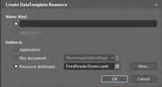
So create a new dictionary named FeedReaderTheme.xaml and create a new template named NewsItemTemplate.
In this case, we opted for a simple template that has a stack panel
with a text block to show the title of the news, and a hyperlink button
to open the link to the news in a browser. The XAML is as follows:
...
<DataTemplate x:Key="NewsItemTemplate">
  <StackPanel>
    <TextBlock Text="{Binding Title}" Style="{StaticResourceNewsTitleTextBlockStyle}" />
    <HyperlinkButtonHorizontalAlignment="Left" Content="{Binding Link}"
             Click="HyperlinkButton_Click"/>
  </StackPanel>
</DataTemplate>
...
As you can see in the following
code, you also retrieve the style of the text block that displays the
title, and for this we have chosen a Tahoma (Bold) 12-point font:
...
<Style x:Key="NewsTitleTextBlockStyle" TargetType="TextBlock">
  <Setter Property="FontWeight" Value="Bold"/>
  <Setter Property="FontFamily" Value="Tahoma" />
  <Setter Property="FontSize" Value="16"/>
</Style>
...
After defining the style of the
elements contained in the list, you will customize the itemContainer for
the selection of an item that appears as a rectangle outline. Again,
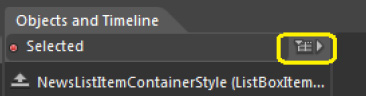
right-click the list box and then choose Edit Additional Template => Edit Generated Item Container => Edit A Copy. Call the style NewsListItemContainerStyle.
The template will appear very
simple, but complete enough. In Blend's States panel, you can see the
states that currently can take this control. What interests us is Selected
status. If you select it, the interface is put in "recording" and the
text is displayed with the color that you chose for the accent brush.
(Now you get to play with the Device panel in Blend.)
In the States panel, select
the element Base, to which you will add a rectangle without fill. Set
the outline color to Accent Color, and then set the opacity to 0% so
that in all cases the rectangle will be transparent. Then select
Selected status, but this time for working more comfortable press F6 to
change the layout of panels and enter in Storyboard Creation modality.
Select the rectangle, and if you do not see the storyboard, click the
Show Timeline button shown in Figure 5.
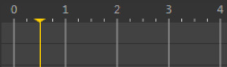
Now you want the rectangle to appear with a fading effect with a delay
of 5 seconds, so select the rectangle and move the playhead along the
timeline up to 500 milliseconds, as shown in Figure 6. In the Properties panel, edit the property opacity to 100%.
In this way, you just created a storyboard, which will result in the following XAML:
...
<VisualState>
  <Storyboard>
    <ObjectAnimationUsingKeyFrames Storyboard.TargetProperty="Foreground"
          Storyboard.TargetName="ContentContainer">
      <DiscreteObjectKeyFrame KeyTime="0" Value="{StaticResource PhoneAccentBrush}"/>
    </ObjectAnimationUsingKeyFrames>
    <ObjectAnimationUsingKeyFrames Storyboard.TargetProperty="(UIElement.Visibility)"
            Storyboard.TargetName="rectangle">
      <DiscreteObjectKeyFrame KeyTime="0">
        <DiscreteObjectKeyFrame.Value>
          <Visibility>Visible</Visibility>
        </DiscreteObjectKeyFrame.Value>
      </DiscreteObjectKeyFrame>
    </ObjectAnimationUsingKeyFrames>
    <DoubleAnimationUsingKeyFrames Storyboard.TargetProperty="(UIElement.Opacity)"
          Storyboard.TargetName="rectangle">
      <EasingDoubleKeyFrame KeyTime="0" Value="0"/>
      <EasingDoubleKeyFrame KeyTime="0:0:0.5" Value="1"/>
    </DoubleAnimationUsingKeyFrames>
  </Storyboard>
</VisualState>
...
Obviously, it is much easier
for a designer to create an animation with a few simple clicks than to
write the XAML. Therefore, even though explained step by step is not
difficult, but only requires more time (and in the real world, when you
work, time is never enough).
The portion of XAML storyboards that most interests us is included in the item DoubleAnimationUsingKeyFrames—which, contrary to what it may seem, is an animation in which you define changes to properties that have values of type Double.
Storyboard.TargetProperty indicates to the storyboard what properties of the element specified in Storyboard.TargetName
apply the changes keyframe by keyframe. In fact, you specify which are
keyframes for us (at time 0 and 0.5), and declare that at time 0, the
value of the property is 0, while at time 0.5, the value is 1 (100%).
Then you're finished, because an animation declared in this way (with EasingDoubleKeyFrame) will increase with a linear function.
5. Usage
From Blend, select the target
of your test in the Device panel. Press F5 or Ctrl+F5 and wait for the
application to take the information from the Web. Select an element and
watch the rectangle's opacity increase. Then select another and watch
the unfocused element return to normal.
