As UI design becomes more sophisticated, users expect
to have more control over the user experience. This means being able,
at minimum, to resize windows. Resizing can wreak havoc on the controls
that you spend lots of time nudging into their proper positions. Windows
Forms provide several options for managing controls for resizing,
including containers for grouping controls and properties for locking
controls in place.
1. Grouping controls
The Visual Studio toolbox has a group of container controls. Use container controls whenever you need to
Easily manipulate groups of controls in the Windows Forms Designer
Create visible groupings of controls
Make it easier to resize a form
The container controls are shown in this list:
FlowLayoutPanel: Arranges controls in a horizontal or vertical flow
GroupBox: Creates a visible grouping of controls with a caption
Panel: Creates a scrollable grouping of controls
SplitContainer: Arranges controls on two separate panels separated by a movable bar
TabControl: Arranges controls on multiple tabs or pages, similar to a file folder
TableLayoutPanel: Arranges controls in a tabular grid
You can position container controls inside other controls. The FlowLayoutPanel and TableLayoutPanel controls can dynamically reposition the child controls placed inside them when the Windows Form is resized. To see FlowLayoutPanel in action, follow these steps:
Add a FlowLayoutPanel control to a form.
Click the arrow in the upper-right corner of the control.
The control's task dialog box appears.
Click Dock in the parent container.
The FlowLayoutPanel control expands to fill the form.
Add two text boxes to the form.
Grab the second text box with your mouse and try to move the box below the first one.
The text box "jumps" back because the controls placed in a FlowLayoutPanel flow either horizontally or vertically.
Add a GroupBox control to the form.
Place a label and a text box inside the GroupBox control.
As you add the controls, notice that snaplines appear inside the GroupBox control.
Although you can position all the controls placed inside the GroupBox exactly where you want them, GroupBox flows with the rest of the controls in the FlowLayoutPanel control.
Add a MonthCalendar control to the form.
Press Ctrl+F5 to run the form.
Resize the form and notice that the controls move.
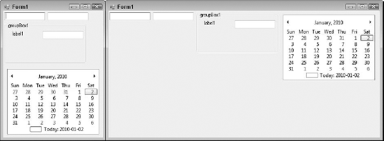
Figure 1
shows the form in its default size and again resized. Notice that the
controls are stacked in the form on the left because the form is narrow.
As the form is resized, the controls move to fill the form.
You have some options for controlling the flow in a FlowLayoutPanel control:
To force a control to move to the next line: Set the control's FlowBreak property to True.
To change the direction of the FlowLayoutPanel control: Set the FlowDirection property.
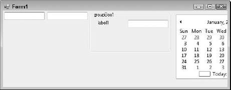
To set FlowLayoutPanel so that child controls are clipped rather than wrapped to the next line: Set the WrapContents property to False. Figure 2 shows a form that has FlowLayoutPanel with a clipped MonthCalendar control.
2. Setting layout properties
You may want to position controls
in a way that they stay in place in the face of resizing. You can set
many properties for controlling a control's layout:
Anchor: Specifies an anchor position that the control maintains when the form is resized
Dock: Positions the control so that one edge of the control is always touching the parent control's edge
AutoSize: Allows a control to grow or shrink automatically
Margin: Sets spacing outside a control's borders
Padding: Adds spacing between a control's borders and its interior contents
The best way to picture
these properties in action is to see them at work. The following
sections walk you through using these properties.
2.1. Anchoring and docking
Anchoring and docking are two properties you can use to position a control when a form is resized. When you set a control's Anchor and Dock properties, you specify the edges of a form — top, bottom, left, right — to which you want to position your control. The Dock property accepts a Fill value, which forces the control to expand to touch all four sides of a form.
The primary difference between Anchor and Dock
is that anchoring allows you to maintain a set distance between the
edge of the control and the edge of the form. With docking, the control
always maintains constant contact with the form's edge. There's no space
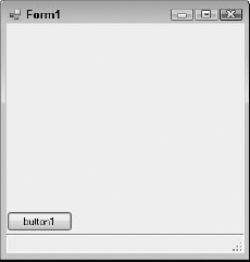
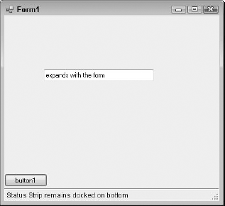
between the control and the edge. Figure 3 shows a button that's anchored to the lower-left corner of the form and a status strip that's docked to the bottom.
|
Menus, toolbars, and status strips are always docked by default.
|
|
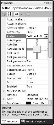
To anchor a Submit button to the lower-left corner of a form, follow these steps:
Click the button and press F4 to open the Properties window.
Scroll to the Anchor property.
The Anchor property is in the Layout category.
Click the arrow on the drop-down list for the Anchor property.
A visual positioning tool appears.
Click the left and bottom bars to set the anchor.
Click the top bar to clear the anchor.
Figure 4 shows you an example.
Press Enter to set the property.
Press Ctrl+F5 to run the form.
Resize the form from the bottom, top, left, and right.
Notice that the button maintains its distance from the bottom and the left.
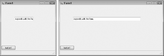
You can use the Anchor property to expand a control as the form expands. To set a text box to grow as the sides of a form expand, follow these steps:
Add a text box to the center of the form.
Set the text box's Anchor property to Left, Right.
Press Ctrl+F5 to run the form.
Resize the form to the left and the right.
Figure 5
shows the form in its default size and resized. Notice how the text
isn't completely displayed in the text box. After the form is resized,
the text box expands and maintains equal distance from the left and
right sides.
Setting a control's Dock property is similar to setting the Anchor property. With the Dock
property, you specify the edges to which you want to dock the control.
The control always maintains contact with the edge you specify. Figure 6 shows a form with a StatusStrip control docked on the bottom of the form. As the form is resized, the StatusStrip control remains at the bottom.
2.2. Using automatic sizing
Two properties are related to setting automatic sizing:
AutoSize: Specifies, by using a True/False value, whether the control should be automatically sized
AutoSizeMode: Sets a control to GrowAndShrink or GrowOnly
The AutoSizeMode property works only if AutoSize is set to True. Although not all controls have an AutoSizeMode property, it provides more control than AutoSize when it's available. The size of a control grows rightward and downward.
To set the automatic sizing properties for a button, follow these steps:
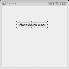
Use the Properties window to set the button's Text property to Please click this button.
Notice that the button displays only part of the text.
Set the button's AutoSize property to True.
The button expands to display the text, as shown in Figure 7.
The AutoSize and AutoSizeMode properties honor the MinimumSize and MaximumSize property settings.
2.3. Setting margins and padding
Margins and padding set the
space outside and within a control's borders, respectively. Because a
control's border has four sides, the margins and padding properties
comprise a set of properties. When you set the margins and padding
properties, you can specify values for top, left, right, bottom, or all.
To set a control's margins and padding, follow these steps:
Click the new button and press F4 to open the Properties window.
Scroll to the Margin property.
Click the plus (+) sign next to the Margin property to expand the property.
In the All property, type 20.
All the button's margins are now set to 20.
Drag another button to the form.
As
you approach the first button, notice that the snaplines are farther
apart than usual because the first button's margin is higher.
NOTE
The space between the two
buttons when the snaplines are present is 23. The snapline's distance
between controls is a sum of the two control's margins. The default
margin for a button control is 3.
Allow the second button to snap to the first button and drop the second button.
Change the padding property on the second button to All = 10.
Resize the second button so that you can see the button's text.
Notice the padding that appears around the text now. Figure 8 shows you an example.
