8. LongListSelector Control
The LongListSelector control is the uber-ListBox control available for Windows Phone 7. It supports flat lists (like in a ListBox), but it can provide better performance than the standard ListBox
control. Try it for your scenario. The LongListSelector control also
supports grouped list, inline "more like these" buttons, and jump list
UI.
Given the complexity and
power of this control, the next couple sections describe its visual
capabilities, key properties and methods, and coding approaches.
8.1. LongListSelector - IsFlatList
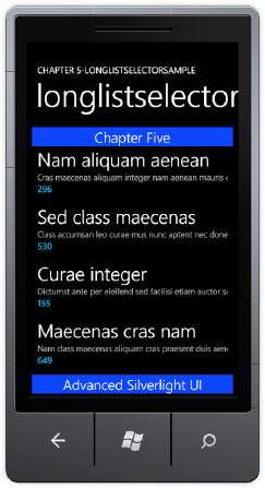
The quickest way to take advantage of the LongListSelector control's potential performance and list virtualization advantages is to replace existing ListBox controls with LongListSelector controls and set the attribute IsFlatList to True. When in IsFlatList=true mode, the UI looks just like a ListBox control though you can provide a header and footer to the list via the ListHeaderTemplate and ListFooterTemplate properties, as shown in Figure 9.
Listing 1 shows the XAML for the control and the three templates that are configured.
<phone:PhoneApplicationPage
Example 1. LongListSelector XAML Markup File
x:Class="LongListSelectorSample.pages.LongListSelectorPage2"
...<!—removed standard namespaces for clarity
    SupportedOrientations="Portrait" Orientation="Portrait"
    mc:Ignorable="d" d:DesignHeight="768" d:DesignWidth="480"
    shell:SystemTray.IsVisible="True" Loaded="PhoneApplicationPage_Loaded"
    xmlns:toolkit="clr-namespace:Microsoft.Phone.Controls;assembly=
Microsoft.Phone.Controls.Toolkit">
  <phone:PhoneApplicationPage.Resources>
    <DataTemplate x:Key="ItemTemplate">
      <StackPanel Margin="0,0,0,20">
        <TextBlock Text="{Binding Name}"
                   Style="{StaticResource PhoneTextExtraLargeStyle}"/>
        <TextBlock Text="{Binding Description}"
                   Style="{StaticResource PhoneTextSmallStyle}"/>
        <TextBlock Text="{Binding Quantity}"
                   Style="{StaticResource PhoneTextAccentStyle}"/>
      </StackPanel>
    </DataTemplate>
    <DataTemplate x:Key="HeaderDataTemplate">
      <Border Background="#FF0027FF">
        <TextBlock TextWrapping="Wrap" Text="Chapter Five"
          HorizontalAlignment="Center" VerticalAlignment="Center"
          Style="{StaticResource PhoneTextLargeStyle}"/>
      </Border>
    </DataTemplate>
    <DataTemplate x:Key="FooterDataTemplate">
      <Border Background="#FF0027FF">
        <TextBlock TextWrapping="Wrap" Text="Advanced Silverlight UI"
         HorizontalAlignment="Center" VerticalAlignment="Center"
         Style="{StaticResource PhoneTextLargeStyle}"/>
      </Border>
    </DataTemplate>
  </phone:PhoneApplicationPage.Resources>
  <!--LayoutRoot is the root grid where all page content is placed-->
  <Grid x:Name="LayoutRoot" Background="Transparent"
    DataContext="{Binding Source={StaticResource longlistDataSource}}">
    <Grid.RowDefinitions><RowDefinition Height="Auto"/>
      <RowDefinition Height="*"/></Grid.RowDefinitions>
    <!--TitlePanel contains the name of the application and page title-->
    <StackPanel x:Name="TitlePanel" Grid.Row="0" Margin="12,17,0,28">
      <TextBlock x:Name="ApplicationTitle" Text="Chapter 5-LONGLISTSELECTORSAMPLE"
                 Style="{StaticResource PhoneTextNormalStyle}"/>
      <TextBlock x:Name="PageTitle" Text="longlistselector" Margin="9,-7,0,0"
                 Style="{StaticResource PhoneTextTitle1Style}"/>
    </StackPanel>
    <!--ContentPanel - place additional content here-->
    <Grid x:Name="ContentPanel" Grid.Row="1" Margin="12,0,12,0">
      <toolkit:LongListSelector IsFlatList="True"
ItemTemplate="{StaticResource ItemTemplate}"
        ItemsSource="{Binding Collection}"
        ListHeaderTemplate="{StaticResource HeaderDataTemplate}"
        ListFooterTemplate="{StaticResource FooterDataTemplate}"/>
    </Grid>
  </Grid>
</phone:PhoneApplicationPage>
|
If you forget to set IsFlatList equal to True, it will generate an error when data bound to a flat list. This is because by default the LongListSelector
control expects a data structure with a grouped set of items that
permits the control to display the long list of content segmented by
available groups.
8.2. LongListSelector via LINQ
The PhoneToolkit Sample Solution downloaded from CodePlex when you install the toolkit includes a page named LongListSelectorSample.xaml. This page demonstrates several ways a developer can implement grouping with the LongListSelector control. The UI for the LongListSelectorSample.xaml is a Pivot control with three PivotItem pages titled linq, code, and buddies. The LongListSelector implementation for the PivitItem titled linq has the following XAML:
<toolkit:LongListSelector x:Name="linqMovies" Background="Transparent"
    ListHeaderTemplate="{StaticResource movieListHeader}"
    GroupHeaderTemplate="{StaticResource movieGroupHeader}"
    GroupItemTemplate="{StaticResource groupItemHeader}"
    ItemTemplate="{StaticResource movieItemTemplate}">
</toolkit:LongListSelector>
Note that it does not implement a GroupFooterTemplate.
The PivotItem page titled linq displays movie data via Category using
LINQ to demonstrate how to group items in the correct format using LINQ.
The item that is displayed in the LongListSelector for both the linq and code PivotItem pages is a Movie
class that has fields like Title, Description, Year, etc. The movies
are grouped by either Category, which is of type string. In the
code-behind file, the LoadLinqMovies
method creates a flat collection of movies with random data and then
builds a LINQ to Object query to group the movies by category.
The LINQ query is dazzlingly simple, taking advantage of the built-in group by support in LINQ that is based on the IGrouping Interface. Here is the LoadLinqMovies method:
private void LoadLinqMovies()
{
    List<Movie> movies = new List<Movie>();

    for (int i = 0; i < 50; ++i)
    {
        movies.Add(Movie.CreateRandom());
    }

    var moviesByCategory = from movie in movies
                            group movie by movie.Category into c
                            orderby c.Key
                            select new PublicGrouping<string, Movie>(c);

    linqMovies.ItemsSource = moviesByCategory;
}
The class PublicGrouping implements the IGrouping Interface, which has this definition from metadata:
namespace System.Linq
{
  // Summary:
  //     Represents a collection of objects that have a common key.
  //
  // Type parameters:
  //   TKey:
  //     The type of the key of the System.Linq.IGrouping<TKey,TElement>.
  //
  //   TElement:
  //     The type of the values in the System.Linq.IGrouping<TKey,TElement>.
  public interface IGrouping<TKey, TElement> : IEnumerable<TElement>, IEnumerable
  {
    // Summary:
    //     Gets the key of the System.Linq.IGrouping<TKey,TElement>.
    //
    // Returns:
    //     The key of the System.Linq.IGrouping<TKey,TElement>.
    TKey Key { get; }
  }
}
An IEnumerable collection of PublicGrouping items is the output from the previous LINQ query:
var moviesByCategory = from movie in movies
                        group movie by movie.Category into c
                        orderby c.Key
                        select new PublicGrouping<string, Movie>(c);
The PublicGrouping class is generic: Here is the class declaration and constructor:
public class PublicGrouping<TKey, TElement> : IGrouping<TKey, TElement>
...
public PublicGrouping(IGrouping<TKey, TElement> internalGrouping)
{
    _internalGrouping = internalGrouping;
}
The LINQ query obtains the Enumerator from the LINQ Query, in this case the 'c' variable, which is defined as Category. Use the PublicGrouping class as a basis for your usage of the LongListSelector control.
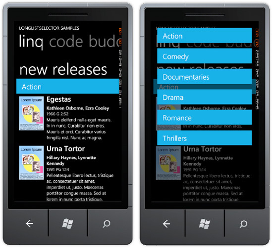
Given the correctly formatted data structure, the LongListSelector class renders the UI in a grouped format. If you click on a group item, it displays a menu of available groups. Figure 10 shows the linq PivotItem
in action, with the screenshot on the right showing the results of
clicking the group item. Select a new group item like Comedy to jump to
the portion of the list containing the Comedy movies.
8.3. LongListSelector via Code
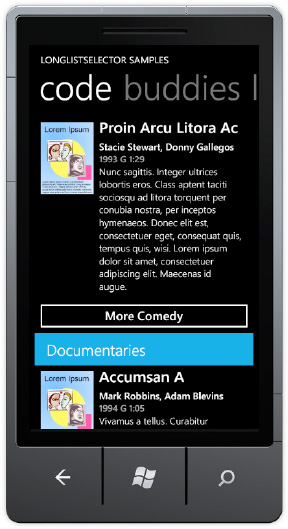
The code PivotItem in the PhoneToolkit project LongListSelectorSample.xaml page implements an additional feature with the LongListSelector control. The GroupFooterTemplate is modified to include a Button to display "more" of a particular category. Here is the XAML for the code PivotItem LongListSelector control:
<toolkit:LongListSelector x:Name="codeMovies" Background="Transparent"
            ItemsSource="{StaticResource movies}"
            ListHeaderTemplate="{StaticResource movieListHeader}"
            GroupHeaderTemplate="{StaticResource movieGroupHeader}"
            GroupItemTemplate="{StaticResource groupItemHeader}"
            ItemTemplate="{StaticResource movieItemTemplate}">
  <toolkit:LongListSelector.GroupFooterTemplate>
    <DataTemplate>
      <local:CommandButton DataContext="{Binding}" Content="{Binding GetMore}"
        Command="{StaticResource moreCommand}" CommandParameter="{Binding}"/>
    </DataTemplate>
  </toolkit:LongListSelector.GroupFooterTemplate>
</toolkit:LongListSelector>
Notice that the GroupFooterTemplate includes a DataTemplate with a CommandButton class instance, which is included in the sample code. The LongListSelector implementation on the code PivotItem does not use LINQ to generate the grouped item list. It binds to a StaticResource defined on the page named moreCommand, which is a class located in the MoviesByCategory.cs class file in the Data folder. More on that in a bit.
Also notice that ItemsSource data binds to a StaticResource named movies, which points to a class named MoviesByCategory located in the Data folder. The MoviesByCategory class is fairly simple. It obtains the Categories, and then randomly generates a set of fake objects for each Category using the MoviesInCategory class. It demonstrates how to create properly formatted groups in code and can provide a useful starter example.
The MoreCommand class implements the ICommand interface. The ICommand.Execute
method adds additional random objects to the currently selected group
that is passed in via a parameter. For a real implementation, some
tracking is necessary to identify which records are already displayed so
that the correct next set of records is retrieved, if present. Figure 11 shows the UI with the More Command button.
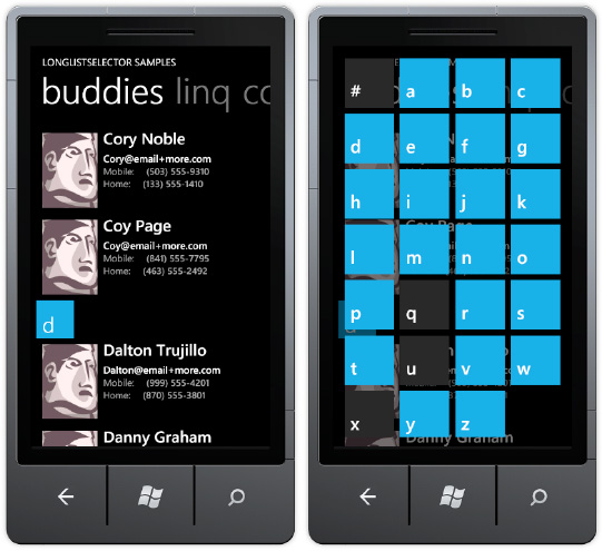
The last PivotItem, named buddies, also generates a collection in code. It randomly generates a list of people names via the AllPeople class, sorts, them, and then generates groups by the alphabet and related group of names starting with each letter in the PeopleByFirstName class. The GroupItemTemplate in this case is the alphabet as shown in Figure 12.
