3. ContextMenu Control
The ContextMenu control provides a user interaction unique to Windows Phone 7 with the tap-and-hold gesture. Figure 3 shows the test page within text hints on functionality, as well as results after tap-and-hold actions.
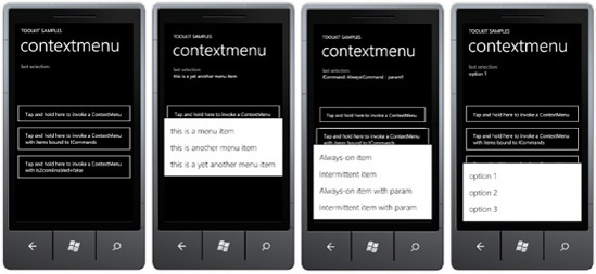
The ContextMenu control is bindable to ICommand
objects, so it can work quite nicely with GalaSoft's MVVM support for
Commanding allowing context menu items to invoke methods on the data
bound ViewModel class.
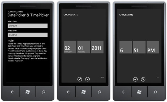
4. DatePicker and TimePicker Controls
The DatePicker and TimePicker controls make it easy for users to pick date and time within a Windows Phone 7 application. Figure 4 shows the controls in action.
You can attach an event hander to the Click event and assign commands to the Command property. Here is example XAML for ICommand support:
<toolkit:ContextMenuService.ContextMenu>
    <toolkit:ContextMenu>
        <toolkit:MenuItem
        Header="Always-on item"
        Command="{Binding AlwaysCommand}"/>
        <toolkit:MenuItem
        Header="Intermittent item"
        Command="{Binding IntermittentCommand}"/>
        <toolkit:MenuItem
        Header="Always-on item with param"
Command="{Binding AlwaysCommand}"
        CommandParameter="param1"/>
        <toolkit:MenuItem
        Header="Intermittent item with param"
        Command="{Binding IntermittentCommand}"
        CommandParameter="param2"/>
    </toolkit:ContextMenu>
</toolkit:ContextMenuService.ContextMenu>
The controls are dependent on having the correct application bar icons in a folder named Toolkit.Content. The icons are ApplicationBar.Cancel.png and ApplicationBar.Check.png and their build action must be set to Content.
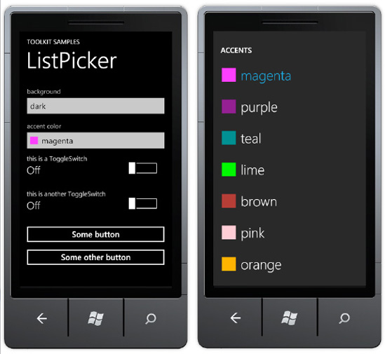
5. ListPicker Control
The ListPicker control provides a full-page, touch-friendly drop-down scrollable list to select an item. Figure 5 shows the example.
The ListPicker control can display a set of inline strings like this:
<toolkit:ListPicker Header="background">
    <sys:String>dark</sys:String>
    <sys:String>light</sys:String>
    <sys:String>dazzle</sys:String>
</toolkit:ListPicker>
The ListPicker
control also has ItemSource and ItemTemplate attributes to support data
binding and full customization of how items are displayed. Here is
example XAML:
<toolkit:ListPicker ItemsSource="{Binding}" Header="accent color"
                  FullModeHeader="ACCENTS" CacheMode="BitmapCache">
    <toolkit:ListPicker.ItemTemplate>
        <DataTemplate>
            <StackPanel Orientation="Horizontal">
                <Rectangle Fill="{Binding}" Width="24" Height="24"/>
                <TextBlock Text="{Binding}" Margin="12 0 0 0"/>
            </StackPanel>
        </DataTemplate>
    </toolkit:ListPicker.ItemTemplate>
    <toolkit:ListPicker.FullModeItemTemplate>
        <DataTemplate>
            <StackPanel Orientation="Horizontal" Margin="16 21 0 20">
                <Rectangle Fill="{Binding}" Width="43" Height="43"/>
                <TextBlock Text="{Binding}" Margin="16 0 0 0" FontSize="43"
                           FontFamily="{StaticResource PhoneFontFamilyLight}"/>
            </StackPanel>
        </DataTemplate>
    </toolkit:ListPicker.FullModeItemTemplate
</toolkit:ListPicker>
6. ToggleSwitch Control
The ToggleSwitch control configures a boolean value as On or Off.
It can take a simple Header attribute for a text value to display
across the top above the switch and current status as shown in the first
two ToggleSwitch controls in Figure 6.
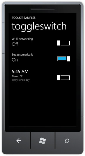
The last ToggleSwitch control is much more customized than the first two. It includes a ToggleSwitch.HeaderTemplate to adjust the Font for the header. The ToggleSwitch.ContentTemplate customizes the ToggleSwitch status info on the left with additional detail. Simply embed a <ContentControl Content="{Binding}"/>ToggleSwitch.ContentTemplate to have the On/Off status display correctly, as in the following: control inside of the
<toolkit:ToggleSwitch Header="5:45 AM">
    <toolkit:ToggleSwitch.HeaderTemplate>
        <DataTemplate>
            <ContentControl FontSize="{StaticResource PhoneFontSizeLarge}"
                  Foreground="{StaticResource PhoneForegroundBrush}" Content="{Binding}"/>
        </DataTemplate>
    </toolkit:ToggleSwitch.HeaderTemplate>
    <toolkit:ToggleSwitch.ContentTemplate>
        <DataTemplate>
            <StackPanel>
                <StackPanel Orientation="Horizontal">
                    <TextBlock Text="Alarm: " FontSize="{StaticResource PhoneFontSizeSmall}"/>
                    <ContentControl HorizontalAlignment="Left"
FontSize="{StaticResource PhoneFontSizeSmall}" Content="{Binding}"/>
                </StackPanel>
                <TextBlock Text="every schoolday"
                            FontSize="{StaticResource PhoneFontSizeSmall}"
                            Foreground="{StaticResource PhoneSubtleBrush}"/>
            </StackPanel>
        </DataTemplate>
    </toolkit:ToggleSwitch.ContentTemplate>
</toolkit:ToggleSwitch>
