The standard Silverlight Button is much more flexible than the ApplicationBar buttons, as well as being easier to use. You can put a Button in the content Grid as simply as this:
<Grid x:Name="ContentPanel" Grid.Row="1" Margin="12,0,12,0">
    <Button Content="Click me!" />
</Grid>
By default, the Button fills the Grid:
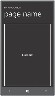
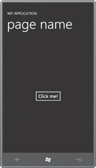
It has a simple white border and displays the text string assigned to its Content property. If you put the Button in a horizontal StackPanel, it will be only as wide as it needs to be to fit the content; the opposite effect happens when you switch the StackPanel orientation to Vertical. Or you can set the HorizontalAlignment and VerticalAlignment properties to anything other than Stretch:
Obviously the basic Button has been redesigned a bit for the phone. It has a little more space around its border to provide a larger touch target.
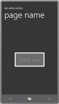
The border in the Button is an actual Border and the content of the Button (in this example) is an actual TextBlock. Earlier I mentioned that the Control class defines a bunch of properties normally associated with the Border and the TextBlock. You can set some of those properties like so:
<Grid x:Name="ContentPanel" Grid.Row="1" Margin="12,0,12,0">
    <Button Content="Click me!"
            FontSize="48"
            FontStyle="Italic"
            Foreground="Red"
            Background="Blue"
            BorderThickness="10"
            BorderBrush="Yellow"
            Padding="20"
            HorizontalAlignment="Center"
            VerticalAlignment="Center" />
</Grid>
As you might hope (or perhaps fear), these property settings are reflected in the button’s appearance:
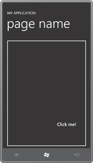
The Control class also defines HorizontalContentAlignment and VerticalContentAlignment and Padding properties that you can set like so:
<Grid x:Name="ContentPanel" Grid.Row="1" Margin="12,0,12,0">
    <Button Content="Click me!"
            Padding="50 100"
            HorizontalContentAlignment="Right"
            VerticalContentAlignment="Bottom" />
</Grid>
Now the content is positioned at the lower-right corner but 50 pixels from the right and 100 pixels from the bottom:
The Control class defines an IsEnabled property; when set to false, the Button is grayed and does not respond to touch.
Almost always you’ll want to set a handler for the Click property of the Button to know when it’s been pressed. The Click event is generated only when the user presses the Button and then releases the finger without moving away. Setting the ClickMode property to Press causes the Button to fire the Click event when the finger first meets the screen.
