It’s easy for anyone to
mistype a word or use fractured grammar in an email message. However, an
ad posted on the Web and a sign hanging in a store window for thousands
to see is not
a use of “relaxed” typography between friends—and it’s hard to retract.
A badly designed sign from a typographic point of view hurts the
product, the company, and your reputation as a professional.
Font Appropriateness and Very Basic Layout Rules
When an audience looks at a printed message, they don’t simply absorb what the message says, but they additionally look at the presentation:
the choice of capitalization, emphasis through bold and italic family
members, how lines of text are stacked (justification), point size, font
color, and how well the printed message harmonizes with any
accompanying graphic. With most digital typefaces, the artist casts a
tone on the typed message. Headline, sans serif Gothic fonts, for
example, are rather hard-edged and cold yet impactful, while Roman serif
fonts tend to lull the audience with rounded strokes, swooping serifs,
and swashes. Roman typefaces generally send a warm but clean and
professional signal to the viewer, while Gothic fonts wake up the
reader, perhaps even warning them—hence their appropriateness as a
headline typeface.
Figure 1
has two obvious sight gags demonstrating inappropriate uses of specific
fonts. At left, the use of all uppercase, Gothic stencil contrasts
extremely distastefully with both the message and the graphic behind it.
At right, the choice of fonts on the page the officer is showing to
someone about to be detained clashes with the message to the extent that
the officer will probably have a hard time getting the cuffs on the
person rolling on the pavement laughing.
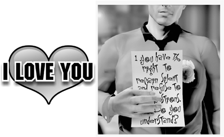
A quick fix to these two bad
examples would be to swap the fonts around, so the stencil font is used
in the Miranda rights, and the slightly silly typeface is used for “I
Love You.” But better still, a quick trip to Font Navigator and the
CorelDRAW Fonts CD will show you that Staccato 222BT (its industry name
is Mistral) is warm, loose, and splendid for a valentine, and the font
that commonly goes by the name Machine
(distributed by ITC among other vendors) is serious, functional, and
perfect for the arresting officer. You have the choices of fonts at
hand; all you need to do is apply your artistic sensibilities to the
selection.
When you have more than one
line of text in a headline, legibility is a concern, and this, too, is
accomplished by an appropriate choice of fonts. You want a “quick read”
from the audience, especially on billboards and vehicle signage that
appears and disappears as the sign or the reader moves.
Let’s take a simple example
headline, pull it apart, examine it, and make it work hard for your
money. “The best deals in town” is a common slogan. In Figure 2
you can see this headline cast in text three different ways, with icons
beneath them to indicate their merit as a sales message.
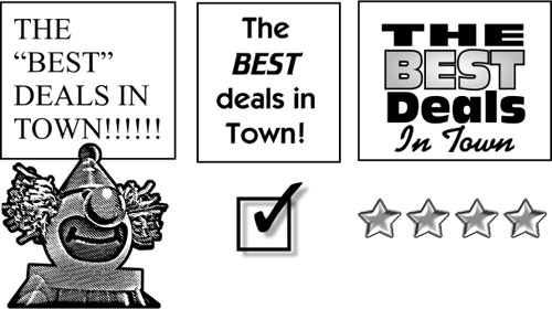
First, the sign above the clown suffers from the following abuses of typographic conventions and rules:
The use of Times New
Roman, a Roman serif font, is stale (it’s a Windows default typeface
used since 1991 on the PC) and artistically defeats the message. It’s
large yet the characters aren’t bold enough to present an impactful
message.
The
use of all capital characters looks particularly inappropriate; Roman
typefaces have upper-and lowercase characters, and the message looks
like the designer had the CAPS LOCK
key enabled. Also, it’s plain bad form to “shout” a message unless a
typeface has no lowercase letters and the designer is firm about the
choice of fonts.
The
use of several exclamation marks suggests that if the business owner
shouts loudly enough, someone will buy the product. One exclamation mark
is sufficient for stressing a message; often a headline is adequately
emphasized with no exclamation at all. It is redundant to cast a
headline in all caps followed by several exclamation marks.
The use of quotes is for quotations, not
for emphasizing a phrase. When a designer puts quotation marks around
“BEST” in this example, it creates in the reader’s mind the suggestion
that the retailer is speaking euphemistically.
For example, when someone writes, “Get that ‘antique’ out of my parking
lot in 15 minutes,” they aren’t actually referring to your 10-year-old
car as a valuable antique, but rather as a piece of junk to which
they’re referring euphemistically or sarcastically. The word “BEST” in
quotes will surely be interpreted by anyone with writing skills as,
“They really aren’t the best deals; they mean something else.”
The
alignment of the headline is wrong. Although left justification is
acceptable for Western language countries, the second line is much
shorter than the third line. As a result, the reader has a hard time
focusing to quickly read the message.
The center example in Figure 2
is a vast improvement and gets a checkmark because it’s acceptable as a
headline. Here’s what is going right for this treatment of the slogan:
The use of sans serif Gothic fonts makes the headline easier to read quickly.
The
emphasis created by using a bold, italic font to stress “BEST” makes it
the first word a casual passerby will read. What this design does is
create a hierarchy of importance within the message. It directs the
reader to the most important, then to the second most important area of
the slogan.
The
slogan uses center justification and the lines are stacked to align
well; no line is too long or short, and both legibility and neatness
have been added.
The middle example is short of ideal for two reasons:
Because “BEST” is italicized, it might be design overkill to also make it all capitals and bolder.
The
exclamation mark at the end is not really necessary. The message’s
importance is already well supported by the use of the fonts. Generally,
if you’ve graphically punctuated a slogan, you don’t need to add an
exclamation mark to overdo the importance of the slogan.
The example at right, which earns four stars, works the best for the slogan. Here’s why:
The lines of text
have been stretched to fit, by using the Pick tool and scaling
horizontally, disproportionately. You can do this with CorelDRAW
artistic text. The result is a very neatly stacked presentation of
words.
The word
“BEST” stands out through the use of a different color. In design, you
don’t necessarily have to use black to emphasize something, not when
text surrounding a particular word is set in black. Contrast can be
achieved through emphasis, or by “negative emphasis”; when objects
surrounding the most important one are gray, you make the most important
object black. And conversely, a gray object gets noticed when
surrounded by black objects. Additionally, uppercase for “THE” and
“BEST” works in this example because the other words are upper-and
lowercase. In art, you first learn the rules, and then when you
understand them well enough, you can break the rules with style.
The
hierarchy of importance of the words is proper and reads well. “BEST”
is read first, then the surrounding text, and then “in town”—because a
thin typeface is used, a script type font, it becomes subordinate in
visual importance.
It’s not hard to think up a
more compelling and fresh sales slogan than “The Best deals in town.”
Once you have that ideal slogan, consider the good and bad points in the
previous example, approach your sales message with taste and
sensitivity, lean but don’t push, and you cannot go wrong