1. Controls and Events
Because you are well versed in the controls available through ASP.NET, there's a lot to say about the way Silverlight controls work. Silverlight includes nearly all the same controls available as ASP.NET server-side controls (Button, ListBox, RadioButton, TextBox, Label, and so forth).
Whereas the job of an ASP.NET server-side control is to emit a tag to be interpreted by the browser eventually, Silverlight
controls are rendered directly on the client by the Silverlight engine.
ASP.NET control events are usually handled on the server by server-side
event handlers, while Silverlight control events are handled on the client side within the Silverlight component.
1.1. Routed Events
Silverlight control
events look much like typical .NET events. The event handlers all use an
object as the first parameter (always the sender). Following the sender
parameter, the handlers include some permutation of the standard event
arguments. To manage events Silverlight uses routed events, which are
like typical .NET events in that handlers for routed events can be
attached directly to the controls that produce them (for example, the Button control exposes a Click
event). However, routed events are different because you can attach
handlers for events at various places up and down the Silverlight visual
tree. That is, you do not need to attach the handlers directly to the
controls. This can be useful in various scenarios. For example, imagine
you want to trap the left mouse down event for all elements in a layout
panel (within a Grid,
for instance). Rather than attaching singular event handlers to each
element in the panel, you could attach the handler to the layout panel
itself and intercept the event there.
1.2. Silverlight Controls and Class Members
Just as ASP.NET tags that are
given IDs in the ASPX file have corresponding members in the
code-beside class, XAML tags that are given names also end up as members
in the code-beside class. For example, the following XAML produces Grid and Button member variables named LayoutRoot and theButton that you can access from the code-beside accompanying the Silverlight application:
<UserControl x:Class="SilverlightSite.MainPage"
 xmlns="http://schemas.microsoft.com/winfx/2006/xaml/presentation"
 xmlns:x="http://schemas.microsoft.com/winfx/2006/xaml" xmlns:d="http://schemas.microsoft.
com/expression/blend/2008"
 xmlns:mc="http://schemas.openxmlformats.org/markup-compatibility/2006"
 mc:Ignorable="d"
 d:DesignHeight="300" d:DesignWidth="400">
   <Grid x:Name="LayoutRoot" Background="White">
      <Button Content="Hello World!"
       x:Name="theButton"
       Click="theButton_Click"></Button>
   </Grid></UserControl>
2. Silverlight and Layout
MainPage (derived from UserControl) is the main presentation area for the Silverlight content. The UserControl is a ContentControl that can contain a single piece of content. Although you could put any control (such as a TextBlock or a Button)
on the page, you'd be left with no more room to put anything else.
Rather than forcing a singular layout scheme (for example, absolute x and y positioning), Silverlight supports various layout
schemes available through layout panels. By using these panels, you can
add many controls as well as dictate their positioning in the final
user interface. Out of the box, Silverlight supports the Canvas, the Grid, and the StackPanel.
When you place a Canvas layout panel inside the MainPage, it positions elements at absolute x and y locations. The Grid positions elements in rows and columns. The StackPanel stacks elements either vertically or horizontally. Here is an exercise to illustrate how Silverlight layout works.
Working with Silverlight layout
Create a new Silverlight application named SilverlightLayout. Have Visual Studio create an ASP.NET test project for you.
Examine the MainPage.xaml file generated by Visual Studio. Make the UserControl width 600.
Visual Studio gives you a grid as the layout. Turn on grid lines and add two grid columns. The Grid ShowGridLines property is a simple Boolean. However, the Grid column definitions are a little trickier. Defining columns requires using the rich property syntax:
<UserControl x:Class="SilverlightLayout.MainPage"
 xmlns="http://schemas.microsoft.com/winfx/2006/xaml/presentation"
 xmlns:x="http://schemas.microsoft.com/winfx/2006/xaml"
 xmlns:d="http://schemas.microsoft.com/expression/blend/2008"
 xmlns:mc="http://schemas.openxmlformats.org/markup-compatibility/2006"
 mc:Ignorable="d"

 DesignWidth="600" DesignHeight="300">
 <Grid x:Name="LayoutRoot" Background="White"
  ShowGridLines="True">
  <Grid.ColumnDefinitions>
   <ColumnDefinition ></ColumnDefinition>
   <ColumnDefinition ></ColumnDefinition>
  </Grid.ColumnDefinitions>
 </Grid>
</UserControl>
Add a Canvas to the grid, name the Canvas theCanvas so that you can refer to it programmatically later on. Put it in column 0. Add some content to the Canvas. The following example shows how you can draw a few shapes and locate them within the Canvas using the Canvas.Left and Canvas.Right attached properties. Notice that shapes have Stroke and StrokeThickness that define the color and thickness of each shape's border. There's also a Fill
property with which you can define the color used to fill a shape.
Finally, set the opacity of each of these shapes to 60 percent. You can
use this property to add some mouse interactivity to the shapes.
<UserControl x:Class="SilverlightLayout.MainPage"
 xmlns="http://schemas.microsoft.com/winfx/2006/xaml/presentation"
 xmlns:x="http://schemas.microsoft.com/winfx/2006/xaml"
 xmlns:d="http://schemas.microsoft.com/expression/blend/2008"
 xmlns:mc="http://schemas.openxmlformats.org/markup-compatibility/2006"
 mc:Ignorable="d"

 DesignWidth="600" DesignHeight="300">
    <Grid x:Name="LayoutRoot" Background="White"
          ShowGridLines="True">
        <Grid.ColumnDefinitions>
            <ColumnDefinition ></ColumnDefinition>
            <ColumnDefinition ></ColumnDefinition>
         </Grid.ColumnDefinitions>

        <Canvas Grid.Column="0" x:Name="theCanvas">
            <Rectangle Width="100" Height="100"
                       Fill="LightBlue" Stroke="Black"
                       StrokeThickness="2"
                       Canvas.Top="75" Canvas.Left="150"
                       Opacity=".6">
            </Rectangle>
            <Ellipse Width="150" Height="100"
                     Fill="Green" Stroke="Yellow"
                     StrokeThickness="3"
                     Canvas.Left="50"
                     Canvas.Top="175"
                    Opacity=".6">
            </Ellipse>
            <Rectangle Width="150" Height="150"
                       Fill="Red"
                       Stroke="Maroon"
                       StrokeThickness="3"
                       Canvas.Left="30"
                       Canvas.Top="45"
                       Opacity=".6">
            </Rectangle>
        </Canvas>
    </Grid>
</UserControl>
Now add some mouse interactivity to the shapes on the Canvas. First, set up mouse enter and leave handlers to increase the opacity of the shapes in the Canvas when the pointer rests on them. To do this, open the MainPage.xaml.cs file and implement event handlers for the MouseEnter and the MouseLeave
events. The event handlers are going to be attached to the shapes
themselves, so the sender of these events is going to be the shapes. For
each implementation, cast the first argument (the sender) to be of type
Shape. This is necessary to access its Opacity property. The MouseEnter handler should then assign the Opacity property to be 100 percent (the number 1, that is). The MouseLeave handler should reduce the Opacity property to 60 percent (the number 0.6, that is). After implementing the MouseEnter and MouseLeave handlers, in the Page constructor, wire up the event handlers to the MouseEnter and MouseLeave events of every element on the Canvas, as shown in bold text in the following XAML:
public partial class MainPage : UserControl
{
 private void theCanvas_MouseEnter(object sender, MouseEventArgs e)
 {
  Shape shape = sender as Shape;
  if (shape != null)
  {
   shape.Opacity = 1;
  }
 }
 private void theCanvas_MouseLeave(object sender, MouseEventArgs e)
 {
  Shape s = sender as Shape;
  if (s != null)
  {
   s.Opacity = .6;
  }
 }

 public MainPage()
 {
  InitializeComponent();
  foreach (Shape s in theCanvas.Children)
  {
   s.MouseEnter += this.theCanvas_MouseEnter;
   s.MouseLeave += this.theCanvas_MouseLeave;
  }
 }
}
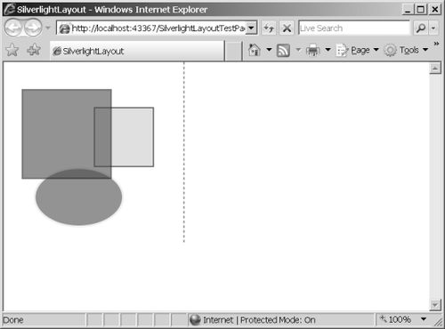
Run
the application. At first, you should be able to see the outlines of
all the shapes because they start out with an opacity of 60 percent, as
shown in the following graphic:
Then, when you move the pointer over one of the shapes, you should see it become opaque:
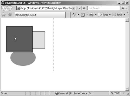
In this case,
when the pointer rests on the rectangle that is topmost in the Z-order,
the rectangle blocks full view of the other rectangle and ellipse behind
it.
Now add a StackPanel to the grid and place it in the second column. Add a Button to the StackPanel, followed by a ListBox with some contained items. Following the first ListBox, nest another StackPanel in the outer StackPanel—orient this one horizontally by setting the Orientation property to Horizontal. Place two more ListBoxes in the nested StackPanel:
<UserControl x:Class="SilverlightLayout.MainPage"
xmlns="http://schemas.microsoft.com/winfx/2006/xaml/presentation"
 xmlns:x="http://schemas.microsoft.com/winfx/2006/xaml"
 xmlns:d="http://schemas.microsoft.com/expression/blend/2008"
 xmlns:mc="http://schemas.openxmlformats.org/markup-compatibility/2006"
 mc:Ignorable="d"

 DesignWidth="600" DesignHeight="600">
    <Grid x:Name="LayoutRoot" Background="White"
          ShowGridLines="True">
        <Grid.ColumnDefinitions>
             <ColumnDefinition ></ColumnDefinition>
             <ColumnDefinition ></ColumnDefinition>
         </Grid.ColumnDefinitions>

        <!-- Canvas goes here... -->

         <StackPanel Grid.Column="1">
             <Button Content="Button1"></Button>
             <ListBox Height="75">
                 <ListBoxItem Content="Item 1"></ListBoxItem>
                 <ListBoxItem Content="Item 2"></ListBoxItem>
                 <ListBoxItem Content="Item 3"></ListBoxItem>
                 <ListBoxItem Content="Item 4"></ListBoxItem>
                 <ListBoxItem Content="Item 5"></ListBoxItem>
             </ListBox>
             <StackPanel Orientation="Horizontal">
                 <ListBox Height="75">
                     <ListBoxItem Content="Item 1"></ListBoxItem>
                     <ListBoxItem Content="Item 2"></ListBoxItem>
                     <ListBoxItem Content="Item 3"></ListBoxItem>
                     <ListBoxItem Content="Item 4"></ListBoxItem>
                     <ListBoxItem Content="Item 5"></ListBoxItem>
                 </ListBox>
            </StackPanel>
        </StackPanel>
    </Grid>
</UserControl>
The layout should appear like this when you're finished:
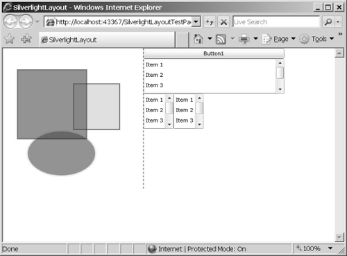
This example shows that you can nest Silverlight layout
panels arbitrarily. In addition to the three panels available as part
of the official control set, you can write your own custom panel by
deriving from the Panel class.
