We used the NavigateToPageAction
behavior to navigate from one page to another. In this section, I focus
on how to create more interactivity with Expression Blend for page
transitions, status changes, and orientation changes. We start with
investigating how to add interactivity using the Silverlight for Windows
Phone 7 Toolkit. We next focus on the Visual State Manager to create
animations and transitions using a state-based management system.
1. Toolkit Page Transitions
The Silverlight for Windows Phone 7 toolkit enables transitions that
match the built-in native transitions available in Windows Phone 7,
allowing your application to have the same look and feel without a lot
of work.
1.1. Sample Project
The ToolkitTransitions project has three XAML pages. MainPage.xaml navigates to TestTransitionsPage.xaml,
which data binds to a collection of sample data. The sample data is
present to make the transitions more obvious than with just a mostly
blank screen. When an item is selected in the TestTransitionsPage.xaml's
sampleDataListBox, the code in the sampleDataListBox_SelectionChanged event appends the index of the selected item to a query string and then navigates to TestTransitionsPage2.xaml. The TestTransitionsPage2.xaml page displays the full details of the selected item.
An extra page is added to the project beyond MainPage.xaml
because transitions from the Silverlight for Windows Phone 7 toolkit do
not override the standard application loading and exiting page
transitions so we need another page to fully demonstrate the
transitions. The page in the middle, TestTransitionsPage.xaml,
will have the transitions configured on it to demonstrate the full
navigating to and from page transition capabilities because it is not
the default item or main page for the application.
To get started, first add a project reference to the Microsoft.Phone.Controls.Toolkit assembly. Next open the App.xaml.cs file and change this line of code in the InitializePhoneApplication() method:
RootFrame = new PhoneApplicationFrame();
to this line of code:
RootFrame = new Microsoft.Phone.Controls.TransitionFrame();
Next, add a second page named toolkittransitionpage.xaml to a pages folder. A TextBlock is added to MainPage.xaml and the NavigateToPageAction behavior is applied to the TextBlock, so that when it is touched, the toolkittransitionpage.xaml is displayed. Run the project and check to make sure the navigation from MainPage to the toolkittranstiionpage.xaml
is working. It is working, but it still does not have a nice transition
to the second page. Now you can add any transition within the
application.
1.2. Configuring Transitions
There isn't any
Expression Blend support for visually applying transitions via
behaviors. You edit the XAML to apply transitions. For each page, you
can define four types of transitions:
NavigationInTransition:
Applies when navigating to the current page, either via a forward
navigation to the page or via clicking the Back button to navigate back
to the page.
NavigationOutTransition:
Applies when the current page is navigating out to another page, either
via forward navigation to another page or when clicking the Back button
on the current page.
DatePickerPage: Applies when the current page is navigating to a DatePicker control page.
TimePickerPage: Applies when the current page is navigating to a TimePicker control page.
To add a transition in XAML, add a namespace reference to the toolkit:
xmlns:toolkit="clr-namespace:Microsoft.Phone.Controls;assembly=
Microsoft.Phone.Controls.Toolkit"
Next type <toolkit:TransitionService to bring up IntelliSense to show the four available transition types. Select NavigationInTransition and then close the tag to generate the ending element </toolkit:TransitionService.NavigationInTransition>. A warning appears "Property 'NavigationInTransition' does not have a value." and blue squiggly lines appear as shown in Figure 1.
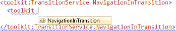
The only option that displays is toolkit:Navigation:InTransition. Within that element you can add the following two additional elements:
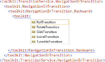
Within the .Backward and .Forward transitions, you can configure one of four options, as shown in Figure 2.
We discuss the four possible transitions in detail in the next subsection. NavigationOutTransition also has a .Backward and .Forward option. Figure 3 describes the relationship for all four configurations.
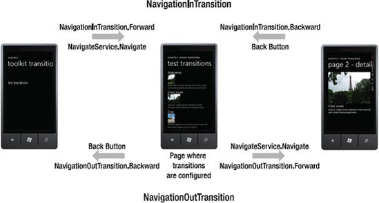
In Figure 3,
all four transitions are configured on the middle page and have
independent behavior depending on the relative navigation to the middle
page. This is the same configuration as in the ToolkitTransitions sample project's TestTransitionsPage.xaml page where all four options are configured. Here is the XAML for the ToolkitTransitions sample transitions:
<toolkit:TransitionService.NavigationInTransition>
  <toolkit:NavigationInTransition>
    <toolkit:NavigationInTransition.Backward>
      <toolkit:RollTransition />
    </toolkit:NavigationInTransition.Backward>
    <toolkit:NavigationInTransition.Forward>
      <toolkit:RotateTransition  />
    </toolkit:NavigationInTransition.Forward>
  </toolkit:NavigationInTransition>
</toolkit:TransitionService.NavigationInTransition>
<toolkit:TransitionService.NavigationOutTransition>
  <toolkit:NavigationOutTransition>
    <toolkit:NavigationOutTransition.Backward>
  <toolkit:TurnstileTransition Mode="BackwardOut" />
  </toolkit:NavigationOutTransition.Backward>
    <toolkit:NavigationOutTransition.Forward>
      <toolkit:TurnstileTransition Mode="ForwardOut" />
    </toolkit:NavigationOutTransition.Forward>
  </toolkit:NavigationOutTransition>
</toolkit:TransitionService.NavigationOutTransition>
To help further explain,
let's configure transitions on the page right. Since it is a "leaf"
page without any additional forward navigation actions, only two
transitions need to be configured. One for when the page is being
navigated to and the other when on the page and the back button is
touched and the page is navigated from. The two transitions are the
forward "in" transition, NavigationInTransition.Forward, and the backward "out" transition, NavigationOutTransition.Backward. Here is the XAML:
<toolkit:TransitionService.NavigationInTransition>
  <toolkit:NavigationInTransition>
    <toolkit:NavigationInTransition.Forward>
      <toolkit:RotateTransition  />
    </toolkit:NavigationInTransition.Forward>
  </toolkit:NavigationInTransition>
</toolkit:TransitionService.NavigationInTransition>
<toolkit:TransitionService.NavigationOutTransition>
  <toolkit:NavigationOutTransition>
    <toolkit:NavigationOutTransition.Backward>
      <toolkit:TurnstileTransition Mode="BackwardOut" />
    </toolkit:NavigationOutTransition.Backward>
  </toolkit:NavigationOutTransition>
</toolkit:TransitionService.NavigationOutTransition>
Run the project in the
emulator or, better yet, on a device where the transitions are more
apparent. You will see that the transitions are "chained," meaning that
the NavigationOutTranstion.Forward for page TestTransitionsPage.xaml does not override the NavigationIn.Forward for page TestTransitionsPage2.xaml. Instead, the transitions are chained. Again, this is more visible on a real device than in the emulator.
1.3. Transitions in Depth
We briefly mentioned above
the four possible types of transitions that can be applied in any
configuration, i.e., "in," "out," Forward, or Backward:
RollTransition
RotateTransition
SlideTransition
SwivelTransition
TurnstileTransition
All of the transitions except the RollTransition take a Mode property that can have these values:
BackwardIn
BackwardOut
ForwardIn
ForwardOut
The Mode attribute allows you to tell the transition how it should appear based on whether it is a Forward "in" transition, and so on, so that it matches the native transitions correctly.
In addition to the Backward and Forward properties, the NavigationInTransition and NavigationOutTransition objects also have two events:
BeginTransition
EndTransition
These events allow you to hook
into the transition at the Begin and End portion to perform actions such
as data loading, unloading, and the like. Because these are events, you
can use the MVVM Light Toolkit EventToCommand Behavior to bind the transition events to Commands declared in the ViewModel for your application.
1.4. Transitions and UI Elements
Transitions can be applied to any UI Element object. In the ToolkitTransitions project, click on the apply transition to rectangleTextBlock in MainPage.Xaml to load the corresponding page and click on the single application bar button. The Rectangle object will side down and fade in. The Rectangle is named targetRectangle and its Opacity is set to 0 in XAML:
private void ApplyTransitionAppBarBtn_Click(object sender, EventArgs e)
{
  RotateTransition rotateTransition =
    new RotateTransition { Mode = RotateTransitionMode.In180Clockwise};

  ITransition transition = rotateTransition.GetTransition(targetRectangle);

  transition.Completed +=
    (s, eventarg) => { transition.Stop(); targetRectangle.Opacity = 1; };

  transition.Begin();
}
You can of course simply create a Storyboard using Expression Blend and apply it to the Rectangle
as well but this section demonstrates how to leverage the pre-existing
animations available in the Silverlight for Windows Phone 7 toolkit. The
next section describes how to create a transition based on a custom Storyboard object.
1.5. Custom Transitions
In this section I describe how to create a new transition class that leverages a custom Storyboard object. The steps are to implement the ITransition Interface with a custom class and implement another class that inherits from the TransitionElement base class. In Solution ToolkitTransitions project's MainPage.xaml, there is a TextBlock titled "custom transition that navigates to the CustomTransitionPage.xaml page. This page demonstrates a custom Transition.
The first step is to create a custom Storyboard animation that applies to the entire page named CustomPageTransitionStoryboard in Expression Blend. The CustomPageTransitionStoryboard uses translation to move the Page content from off-screen lower left sliding diagonally into place. The Storyboard is moved into the App.Resources section of App.xaml to make it globally available throughout the application.
Next create a class named TheTransition that implements ITransition, as shown in Listing 1
Example 1. TheTransition Class
public class TheTransition : ITransition
{
  private Storyboard _storyboard;

  public TheTransition(Storyboard storyBoard)
  {
_storyboard = storyBoard;
  }

  public void Begin()
  {
    _storyboard.Begin();
  }

  public event EventHandler Completed;

  public ClockState GetCurrentState()
  {
    return _storyboard.GetCurrentState();
  }

  public TimeSpan GetCurrentTime()
  {
    return _storyboard.GetCurrentTime();
  }

  public void Pause()
  {
    _storyboard.Pause();
  }

  public void Resume()
  {
    _storyboard.Resume();
  }

  public void Seek(TimeSpan offset)
  {
    _storyboard.Seek(offset);
  }

  public void SeekAlignedToLastTick(TimeSpan offset)
  {
    _storyboard.SeekAlignedToLastTick(offset);
  }

  public void SkipToFill()
  {
    _storyboard.SkipToFill();
  }

  public void Stop()
  {
    _storyboard.Stop();
  }
}
|
It is a pretty simple class that essentially wraps the Storyboard object. The class that is actually added in Xaml is named MyTransition, and is shown in Listing 2.
Example 2. MyTransition Class
public class MyTransition : TransitionElement
{
  public override ITransition GetTransition(UIElement element)
  {
    Storyboard myStoryboard = App.Current.Resources["CustomPageTransitionStoryboard"] as Storyboard;

    Storyboard.SetTarget(myStoryboard, element);

    return new TheTransition(myStoryboard);
  }
|
Notice how the
MyTransition class obtains the Storyboard via the App.Current.Resources
collection. In the CustomTransitionPage.xaml, a namespace named thisPage
is added as is the custom transition:
xmlns:thisPage="clr-namespace:ToolkitTransitions.pages"
...
<toolkit:TransitionService.NavigationInTransition>
  <toolkit:NavigationInTransition>
    <toolkit:NavigationInTransition.Forward>
      <thisPage:MyTransition/>
    </toolkit:NavigationInTransition.Forward>
  </toolkit:NavigationInTransition>
</toolkit:TransitionService.NavigationInTransition>
Run the toolkitTransitions project to see the custom transition in action. It would make sense to add a Mode parameter to the MyTransitions class and then apply a custom Storyboard, depending on whether it is Backward, Forward, "in," or "out," but this sample demonstrates how to get started if you wish to create a custom transition.
This concludes coverage of
the Silverlight for Windows Phone 7 Toolkit and how to create
interactivity for page transitions. The next section demonstrates how to
use the Visual State Manager to provide interactivity within a page.
