1. Problem
You want to add animations to your application, to make the interaction with the user more interesting.
2. Solution
You will consider the idea of creating storyboard-based animations, and bind them to the various states of your controls.
3. How It Works
You will modify 7Drum,
our pilot project, and change the three text blocks into three buttons.
You will add a different effect to each button by creating a template
for each and applying transformations to the elements that make up the
template. The interface will then become animated, offering the user a
more interactive experience.
4. The Code
Open the 7Drum project from Blend and open the main page. Let's start with the comment on the three text blocks:
<!--
<TextBlock x:Name="tbRecordGroove" Text="Take your groove" Style="{StaticResource
     PhoneTextExtraLargeStyle}" ManipulationStarted="tbRecordGroove_ManipulationStarted"
     HorizontalAlignment="Center" VerticalAlignment="Center" Padding="0 34" />

<TextBlock x:Name="tbTraining" Text="Training" Style="{StaticResource
     PhoneTextExtraLargeStyle}" ManipulationStarted="tbTraining_ManipulationStarted"
     HorizontalAlignment="Center" VerticalAlignment="Center" Padding="0 34" />

<TextBlock x:Name="tbMetronome" Text="Metronome" Style="{StaticResource
     PhoneTextExtraLargeStyle}" ManipulationStarted="tbMetronome_ManipulationStarted"
     HorizontalAlignment="Center" VerticalAlignment="Center" Padding="0 34" />
-->
Then add the three buttons:
<Button x:Name="RecordGrooveButton" Content="Take your groove" />
<Button x:Name="TrainingButton" Content="Training" />
<Button x:Name="MetronomeButton" Content="Metronome" />
For the first button, you want its size to decrease and then increase at regular intervals when the button is pressed.
First you have to convert the base template button in a custom template. Right-click RecordGrooveButton and choose Edit Template => Edit A Copy, naming it GrooveButtonTemplate.
As always, we prefer the dictionary-based approach to organize our
styles. Then in the screen of creation of the dictionary, you create a
dictionary called SevenDrumButtonTemplates, because there you will put the template to use for the various buttons. You now have a template on which to work.
First you access the animation mode of the Blend interface by pressing
F6 on your keyboard. For this first button, you do not need to add
elements to the template for this type of animation, but you do have to
select the state of all that you want to animate. So select in the
States panel the state Pressed and then select the Border element called ButtonBackground, which contains the element ContentControl
that acts as a container for the content you choose. Even before you
have changed something, you expand the node of the tree view to display
the children of ButtonBackground, note
that has already set an animation, which develops all in the instant 0
in the timeline, when the button changes its color when touched.
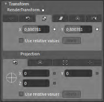
Once you have selected ButtonBackground,
move the yellow playhead along the timeline at instant 0.1 (the
animation grows in a short time). In the Properties panel, select the
Transform section from the list of sections and then tab Scales (as in Figure 4-9), bringing the values of X and Y to about 0.8
In this way, you have
created the first part of the animation. Unfortunately, the animation is
limited to execute only once, without then increase again the
proportions as we have planned before. So select the animation of the RenderTransform property on the value of ScaleX
and edit the XAML (this method is faster than having to select the
various property and edit values in the Properties panel) to set the AutoReverse property to true, so that the animation will re-create the condition of the button enlargement, and set the RepeatBehavior to Forever so that there is a loop in the animation.
...
<DoubleAnimationUsingKeyFrames Storyboard.TargetProperty=
"(UIElement.RenderTransform).(CompositeTransform.ScaleX)" Storyboard.TargetName="ButtonBackground" AutoReverse="True" RepeatBehavior="Forever">
        <EasingDoubleKeyFrame KeyTime="0" Value="1"/>
        <EasingDoubleKeyFrame KeyTime="0:0:0.1" Value="0.8"/>
</DoubleAnimationUsingKeyFrames>

<DoubleAnimationUsingKeyFrames
Storyboard.TargetProperty="(UIElement.RenderTransform).(CompositeTransform.ScaleY)"
Storyboard.TargetName="ButtonBackground"  AutoReverse="True" RepeatBehavior="Forever">
        <EasingDoubleKeyFrame KeyTime="0" Value="1"/>
        <EasingDoubleKeyFrame KeyTime="0:0:0.1" Value="0.8"/>
</DoubleAnimationUsingKeyFrames>
...
Now your first animation of
the button is ready, and you can move on to the next animation. In this
case, you want the button area to become smaller and will be only a
rectangle that widens and narrows to do animation.
As before, your first task is
to edit a copy of the button's current template, placing it in the
resource dictionary that you created earlier. Call the template TrainingButtonTemplate. Unlike before, this time you will go deeper into the study of why you need to modify the template by adding a Rectangle that will create the button animation that you desire. The template consists of a main Grid control.
...
<ControlTemplateTargetType="Button">
 <Grid        Background="Transparent">
...
Inside of is set the value of the attached property VisualStateManager.VisualStateGroups,
which defines the various states that the control can assume. If you
read it, you will find that it contains various Storyboard that we have
defined. Immediately under the definition of this attached property, you
will put a rectangle that will have as its margin the system resource PhoneTouchTargetOverhang and the PhoneAccentBrush as Stroke color to fit just the size of the border ButtonBackground, like a unique element.
...
<Rectangle Margin="{StaticResourcePhoneTouchTargetOverhang}"
Stroke="{StaticResourcePhoneAccentBrush}" />
<Border x:Name="ButtonBackground"
...
Now you have the controls that you need and you can proceed with the creation of the storyboard.
Select from the States panel the Pressed state and select ButtonBackground
that you want to remain smaller for all the time of the pressure. Move
the playhead along the timeline to 0.04 seconds (if you have difficulty
doing so, you need to disable snapping to the timeline), as you did with
the previous button size climbing up to 0.8, but in this case, you do
not want your storyboard to be performed cyclically, so you will not
define RepeatBehavior, and you don't want to run back, so you will not define the autoreverse (which by default is set to false).
So for this animation, you have this XAML:
<DoubleAnimationUsingKeyFrames
    Storyboard.TargetProperty="(UIElement.RenderTransform).(CompositeTransform.ScaleX)"
    Storyboard.TargetName="ButtonBackground">
  <EasingDoubleKeyFrame KeyTime="0" Value="1"/>
  <EasingDoubleKeyFrame KeyTime="0:0:0.04" Value="0.8"/>
</DoubleAnimationUsingKeyFrames>
<DoubleAnimationUsingKeyFrames
      Storyboard.TargetProperty="(UIElement.RenderTransform).(CompositeTransform.ScaleY)"
      Storyboard.TargetName="ButtonBackground">
  <EasingDoubleKeyFrame KeyTime="0" Value="1"/>
  <EasingDoubleKeyFrame KeyTime="0:0:0.04" Value="0.8"/>
</DoubleAnimationUsingKeyFrames>
Now you just have to animate the rectangle that you added earlier. Therefore, always remaining within the editing of the Pressed
state, select the rectangle and move the playhead to the beginning of
the timeline if it isn't there already. You create a keyframe, and then
moving along the timeline at the level of 0.20 seconds, scale the
rectangle to 0.8 for both the x- and y-axis. In this case, however, you
define an infinite loop, and set Autoreverse to true
so that the animation will expand and shrink the rectangle
continuously, until the finger is on the button. Your XML should look
like this:
<DoubleAnimationUsingKeyFrames AutoReverse="True" RepeatBehavior="Forever"
      Storyboard.TargetProperty="(UIElement.RenderTransform).(CompositeTransform.ScaleX)"
      Storyboard.TargetName="rectangle">
  <EasingDoubleKeyFrame KeyTime="0" Value="1"/>
  <EasingDoubleKeyFrame KeyTime="0:0:0.2" Value="0.8"/>
</DoubleAnimationUsingKeyFrames>
<DoubleAnimationUsingKeyFrames AutoReverse="True" RepeatBehavior="Forever"
     Storyboard.TargetProperty="(UIElement.RenderTransform).(CompositeTransform.ScaleY)"
     Storyboard.TargetName="rectangle">
  <EasingDoubleKeyFrame KeyTime="0" Value="1"/>
  <EasingDoubleKeyFrame KeyTime="0:0:0.2" Value="0.8"/>
</DoubleAnimationUsingKeyFrames>
It's time to animate the
last button. This time, the animation will be a bit more 3D. As the user
presses the button, it will flip along the y-axis.
As with the other buttons, you have to edit the template in the usual way, so right-click the button and edit the template as MetronomeButtonTemplate.
You are using this naming convention because you are applying this
style exclusively to the button itself. However, from the perspective of
reusing these animations, you should indicate the name of the animation
so that in your future projects, you can link in app.xaml the dictionary with templates and animations so you can use them anywhere.
Because you're editing the Metronome button, you want to give the button
an oscillating movement in order to stay in the topic, and then select
as usual the Pressed status and the ButtonBackground Border to edit the properties of the latter in time.
In the Properties panel under
the transforsection, you have other kinds of transformations to apply to
objects, including projection that is the arrangement of control along
the x-, y- and z-axis.
At instant 0:00.1, you set the Y value of the Projection
property to 18. Then in the instant 0: 00.3, you set it to −18.
Finally, at instant 0:00.4, you reset it to 0. In this way, there is
perpetual movement and adjustments over time. You also have to set RepeatBehavior to Forever for this animation to be ready.
The XAML resulting from these steps is as follows:
<DoubleAnimationUsingKeyFrames RepeatBehavior="Forever"
Storyboard.TargetProperty="(UIElement.Projection).(PlaneProjection.RotationY)"
Storyboard.TargetName="ButtonBackground">
        <EasingDoubleKeyFrame KeyTime="0" Value="0"/>
        <EasingDoubleKeyFrame KeyTime="0:0:0.1" Value="18"/>
        <EasingDoubleKeyFrame KeyTime="0:0:0.3" Value="-18"/>
        <EasingDoubleKeyFrame KeyTime="0:0:0.4" Value="0"/>
</DoubleAnimationUsingKeyFrames>
This animation presents a lot
to consider, including the fact that it develops with regular
intervals, just like a metronome. In this way, the animation draws the
user's attention to what awaits via clicking that button. The animation
itself grows in a short time, enabling the user to retrieve a visual
benefit. (There is also to say that an animation too long on a control
that should just manage the TAP does not make sense.)
Now you have to perform the developer's task and create the event handler to manage the Click event of all three buttons, so they do what they were doing before the text blocks.
E i tre eventhandler saranno tutti uguali
private void RecordGrooveButton_Click(object sender, System.Windows.RoutedEventArgs e)
{
        this.NavigationService.Navigate(new Uri("/VirtualDrum.xaml", UriKind.Relative));
}

private void TrainingButton_Click(object sender, RoutedEventArgs e)
{
        this.NavigationService.Navigate(new Uri("/Training.xaml", UriKind.Relative));
}

private void MetronomeButton_Click(object sender, RoutedEventArgs e)
{
        this.NavigationService.Navigate(new Uri("/Metronome.xaml", UriKind.Relative));
}
5. Usage
From Expression Blend, run the
project by pressing F5 or Ctrl+F5. Click all three buttons to test that
all the animations work, and relative event handler.
