To
illustrate the difference that dependency properties make, let’s first
look at a custom control class perhaps coded by a naïve programmer.
Suppose you want to use a bunch
of buttons whose foregrounds are colored with various linear gradient
brushes, and you figure it would be convenient for you to specify the
two colors as properties of the buttons, perhaps properties named Color1 and Color2. So you open a project named NaiveGradientButtonDemo and add a new class named NaiveGradientButton. Here’s that class:
Example 1. Silverlight Project: NaiveGradientButtonDemo File: NaiveGradientButton.cs (excerpt)
public class NaiveGradientButton : Button
{
    GradientStop gradientStop1, gradientStop2;

    public NaiveGradientButton()
    {
        LinearGradientBrush brush = new LinearGradientBrush();
        brush.StartPoint = new Point(0, 0);
        brush.EndPoint = new Point(1, 0);

        gradientStop1 = new GradientStop();
        gradientStop1.Offset = 0;
        brush.GradientStops.Add(gradientStop1);

        gradientStop2 = new GradientStop();
        gradientStop2.Offset = 1;
        brush.GradientStops.Add(gradientStop2);

        Foreground = brush;
    }

    public Color Color1
    {
        set { gradientStop1.Color = value; }
        get { return (Color)gradientStop1.Color; }
    }

    public Color Color2
    {
        set { gradientStop2.Color = value; }
        get { return (Color)gradientStop2.Color; }
    }
}
|
As expected, NaiveGradientButton derives from Button and has two new properties of type Color named Color1 and Color2. The constructor creates a LinearGradientBrush, sets the StartPoint and EndPoint properties, creates two GradientStop objects that are stored as fields, adds those to the LinearGradientBrush, and then sets the brush to the button’s Foreground property.
This class will not prevent the Foreground property of the GradientBrush from being re-set in code or XAML after the object has been created, but because the code that sets the Foreground here is considered to be a local setting, it will prevent inheritance of the Foreground property, and won’t be affected by a Style that targets the Foreground property.
As you can see, the set and get accessors of the Color1 and Color2 properties are implemented simply to access the Color property in the corresponding GradientStop.
The
MainPage.xaml file in the NaiveGradientButtonDemo project references
this class. The root element includes an XML namespace declaration that
associates the namespace prefix “local” with the CLR namespace of NaiveGradientButton:
xmlns:local="clr-namespace:NaiveGradientButtonDemo"
The Resources collection in MainPage.xaml defines a Style for NaiveGradientButton:
Example 2. Silverlight Project: NaiveGradientButtonDemo File: MainPage.xaml (excerpt)
<phone:PhoneApplicationPage.Resources>
    <Style x:Key="gradientButtonStyle"
           TargetType="local:NaiveGradientButton">
        <Setter Property="HorizontalAlignment" Value="Center" />

        <!--
        <Setter Property="Color1" Value="Cyan" />
        <Setter Property="Color2" Value="Pink" />
        -->

    </Style>
</phone:PhoneApplicationPage.Resources>
|
Notice the style TargetType referencing the custom class by prefacing the class name with the XML namespace.
You’ll also notice that I’ve commented out Setter tags that target the Color1 and Color2 properties. (Perhaps I’m not as naïve as I sometimes pretend to be.)
The content area of the XAML file has four instances of NaiveGradientButton with their Color1 and Color2 properties set in a variety of different ways:
Example 3. Silverlight Project: NaiveGradientButtonDemo File: MainPage.xaml (excerpt)
<Grid x:Name="ContentPanel" Grid.Row="1" Margin="12,0,12,0">
    <StackPanel>
        <local:NaiveGradientButton Content="Naive Gradient Button #1"
                                   HorizontalAlignment="Center" />

        <local:NaiveGradientButton Content="Naive Gradient Button #2"
                                   Color1="Blue" Color2="Red"
                                   HorizontalAlignment="Center" />

        <local:NaiveGradientButton Content="Naive Gradient Button #3"
                                   Color1="{StaticResource PhoneForegroundColor}"
                                   Color2="{StaticResource PhoneBackgroundColor}"
                                   HorizontalAlignment="Center" />

        <local:NaiveGradientButton Content="Naive Gradient Button #4"
                                   Style="{StaticResource gradientButtonStyle}" />
    </StackPanel>
</Grid>
|
The first button uses the default values of Color1 and Color2; the second uses explicit colors; the third references theme colors, and the fourth references the StyleResources collection. defined in the
When you run the program,
you’ll discover that the second and third buttons are fine, but the
first and fourth seem to have no content:
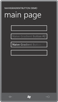
There are no default values for Color1 and Color2. If they’re not explicitly set, the colors in the gradient will have all the A, R, G, and B properties set to 0, a color known as transparent black.
Try uncommenting the two Setter tags in the Style. The Visual Studio error window will tell you “Object reference not set to an instance of an object” (certainly one of my favorite error messages) and if you try to run the program under the debugger, a XamlParseException
will be raised with the message “Invalid attribute value Color1 for
property Property.” That’s a little better: It’s telling you that in the
Setter tag, you can’t set Property to Color1.
What the error message should really say is: “Don’t be so naïve. Use dependency properties.”
