Internally, an ItemsControl uses an ItemsPresenter to display all the items. One of
the essential elements used to display the items is a panel of some
sort. By default, this is a StackPanel (or, with ListBox, a VirtualizingStackPanel) with a vertical orientation. A vertical StackPanel is such a natural choice for this job that you may not think about replacing it.
But you can replace it. It’s another template—but usually an extremely simple template—that you set to the ItemsPanel property defined by ItemsControl.
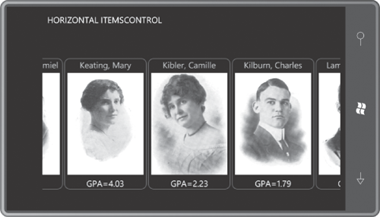
The HorizontalItemsControl project is much like the previous project. It has references and namespace declarations for Petzold.Silverlight.Phone and ElPasoHighSchool, and an identical Resources collection. The big difference is the use of a StackPanel with a horizontal orientation in the ItemsControl. The program also defines a rather different DataTemplate for each student and relies on a landscape orientation of the phone.
Because the ItemsControl is now displaying its items horizontally rather than vertically, the default behavior of ScrollViewer is all wrong. The ScrollViewer must be enabled for horizontal scrolling:
Example 1. Silverlight Project: HorizontalItemsControl File: MainPage.xaml (excerpt)
<Grid x:Name="ContentPanel" Grid.Row="1" Margin="12,0,12,0">

    <ScrollViewer VerticalAlignment="Center"
                  HorizontalScrollBarVisibility="Auto"
                  VerticalScrollBarVisibility="Disabled">
        <ItemsControl ItemsSource="{Binding
                                      Source={StaticResource sortedStudents}}">
            <ItemsControl.ItemTemplate>
                <DataTemplate>
                    <Border BorderBrush="{StaticResource PhoneAccentBrush}"
                            BorderThickness="1"
                            CornerRadius="12"
                            Margin="2">
                        <Grid>
                            <Grid.RowDefinitions>
                                <RowDefinition Height="Auto" />
                                <RowDefinition Height="Auto" />
                                <RowDefinition Height="Auto" />
                            </Grid.RowDefinitions>

                            <ContentControl Grid.Row="0"
                                            HorizontalAlignment="Center"
                              Foreground="{Binding Sex,
                                Converter={StaticResource sexToBrushConverter}}">

                                <StackPanel Orientation="Horizontal">
                                    <TextBlock Text="{Binding LastName}" />
                                    <TextBlock Text=", " />
                                    <TextBlock Text="{Binding FirstName}" />
                                    <TextBlock Text=", " />
                                    <TextBlock Text="{Binding MiddleName}" />
                                </StackPanel>
                            </ContentControl>

                            <Image Grid.Row="1"
                                   Source="{Binding PhotoFilename}"
                                   Height="240"
                                   Width="180"
                                   Margin="6" />

                            <StackPanel Grid.Row="2"
                                        Orientation="Horizontal"
                                        HorizontalAlignment="Center">
                                <TextBlock Text="GPA=" />
                                <TextBlock Text="{Binding GradePointAverage}" />
                            </StackPanel>
                        </Grid>
                    </Border>
                </DataTemplate>
            </ItemsControl.ItemTemplate>
             <ItemsControl.ItemsPanel>
                 <ItemsPanelTemplate>
                     <StackPanel Orientation="Horizontal" />
                </ItemsPanelTemplate>
            </ItemsControl.ItemsPanel>

        </ItemsControl>
    </ScrollViewer>
</Grid>
|
Towards the bottom of the ItemsControl markup you’ll see the ItemsPanel property set to an object of type ItemsPanelTemplate, which then encloses the Panel derivative you want to use.
Not every type of panel is suitable for an items control. Generally you’ll want to use a panel that organizes its children based on their order in its Children collection and not based on attached properties.
It is very common for programmers to create custom panels specifically for a ListBox or ItemsControl.
Sometimes these panels take the form of circular organizations of
children, or carousels. Toward the end of this chapter I’ll show you an
example of a custom panel to display these students.
