There are three basic ways to get items into an items control: code, XAML, and a data binding.
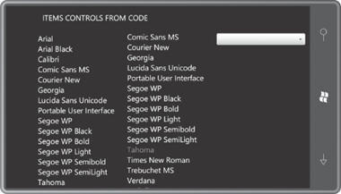
The code method is demonstrated by the ItemsControlsFromCode project. The program is intended to be displayed in a landscape orientation. It instantiates an ItemsControl, a ListBox, and a ComboBox in three columns of the content Grid:
Example 1. Silverlight Project: ItemsControlsFromCode File: MainPage.xaml (excerpt)
<Grid x:Name="ContentPanel" Grid.Row="1" Margin="12,0,12,0">
    <Grid.ColumnDefinitions>
        <ColumnDefinition Width="*" />
        <ColumnDefinition Width="*" />
        <ColumnDefinition Width="*" />
    </Grid.ColumnDefinitions>

    <ItemsControl Name="itemsControl" Grid.Column="0" />

    <ListBox Name="listBox" Grid.Column="1" />

    <ComboBox Name="comboBox" Grid.Column="2"
              VerticalAlignment="Top"
              Foreground="Black" />
</Grid>
|
I’ve added a couple property settings to the ComboBox. Aligning the control at the top of the cell works better with the drop-down feature. I also discovered that the default template for ComboBox has not been tweaked for the phone, so setting the Foreground property was necessary for the items to be displayed.
The code-behind file fills each of these controls with FontFamily objects:
Example 2. Silverlight Project: ItemsControlsFromCode File: MainPage.xaml.cs (excerpt)
public partial class MainPage : PhoneApplicationPage
{
    public MainPage()
    {
        InitializeComponent();

        FillItUp(itemsControl);
        FillItUp(listBox);
        FillItUp(comboBox);
    }

    void FillItUp(ItemsControl itemsControl)
    {
        string[] fontFamilies =
        {
            "Arial", "Arial Black", "Calibri", "Comic Sans MS",
            "Courier New", "Georgia", "Lucida Sans Unicode",
            "Portable User Interface", "Segoe WP", "Segoe WP Black",
            "Segoe WP Bold", "Segoe WP Light", "Segoe WP Semibold",
            "Segoe WP SemiLight", "Tahoma", "Times New Roman",
            "Trebuchet MS", "Verdana", "Webdings"
        };

        foreach (string fontFamily in fontFamilies)
            itemsControl.Items.Add(new FontFamily(fontFamily));
    }
}
|
The Items property defined by ItemsControl is of type ItemCollection and you can put pretty much anything in there that you want. If an object you put in the collection derives from FrameworkElement (such as a Button) then the element displays itself. Otherwise, the item’s ToString method is used. Very conveniently, FontFamily has a ToString method that displays the FontFamily name:
Perhaps the first thing you’ll notice about this program is that the ItemsControl doesn’t scroll. If you want to scroll an ItemsControl, put it in a ScrollViewer.
The ListBox incorporates its own ScrollViewer.
You use your fingers to both scroll and select an item, which is
highlighted with the accent color, as Tahoma is highlighted here.
The ComboBox doesn’t open until you touch anywhere in the control, and then the list appears:
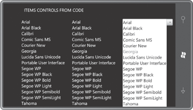
You see now why I set the Foreground property to Black. At first I set it to the PhoneBackgroundBrush resource but then I discovered that the ComboBox uses these same colors even with the Light theme.
The ItemsControlsVisualTrees project is very similar to the ItemsControlsFromCode project except that it replaces the ComboBox with another ItemsControl (but this one in a ScrollViewer) and also includes a couple buttons. The program uses that second ItemsControl to display the visual trees associated with the first ItemsControl and the ListBox.
Here’s the content area in the XAML file. To provide enough horizontal space to the ItemsControl used for displaying the visual trees, I’ve reduced the width of the first two columns:
Example 3. Silverlight Project: ItemsControlsVisualTrees File: MainPage.xaml (excerpt)
<Grid x:Name="ContentPanel" Grid.Row="1" Margin="12,0,12,0">
    <Grid.ColumnDefinitions>
        <ColumnDefinition Width="*" />
        <ColumnDefinition Width="*" />
        <ColumnDefinition Width="2*" />
    </Grid.ColumnDefinitions>

    <Grid.RowDefinitions>
        <RowDefinition Height="*" />
        <RowDefinition Height="Auto" />
    </Grid.RowDefinitions>

    <ItemsControl Name="itemsControl"
                  Grid.Column="0" Grid.Row="0" />

    <Button Content="Dump"
            Grid.Column="0" Grid.Row="1"
            Click="OnItemsControlDumpClick" />

    <ListBox Name="listBox"
             Grid.Column="1" Grid.Row="0" />

    <Button Content="Dump"
            Grid.Column="1" Grid.Row="1"
            Click="OnListBoxDumpClick" />

     <ScrollViewer Grid.Column="2" Grid.Row="0" Grid.RowSpan="2">
         <ItemsControl Name="dumpTreeItemsControl" />
    </ScrollViewer>
</Grid>
|
The code-behind file fills the first two controls with FontFamily objects again just as in the first program:
Example 4. Silverlight Project: ItemsControlsVisualTrees File: MainPage.xaml.cs (excerpt)
public MainPage()
{
    InitializeComponent();

    FillItUp(itemsControl);
    FillItUp(listBox);
}

void FillItUp(ItemsControl itemsControl)
{
    string[] fontFamilies =
    {
        "Arial", "Arial Black", "Calibri", "Comic Sans MS",
        "Courier New", "Georgia", "Lucida Sans Unicode",
        "Portable User Interface", "Segoe WP", "Segoe WP Black",
        "Segoe WP Bold", "Segoe WP Light", "Segoe WP Semibold",
        "Segoe WP SemiLight", "Tahoma", "Times New Roman",
        "Trebuchet MS", "Verdana", "Webdings"
    };

    foreach (string fontFamily in fontFamilies)
        itemsControl.Items.Add(new FontFamily(fontFamily));
}
|
The class also includes handlers for the Click events for the two buttons and responds by dumping the visual tree of the corresponding items control:
Example 5. Silverlight Project: ItemsControlsVisualTrees File: MainPage.xaml.cs (excerpt)
void OnItemsControlDumpClick(object sender, RoutedEventArgs args)
{
    dumpTreeItemsControl.Items.Clear();
    DumpVisualTree(itemsControl, 0);
}

void OnListBoxDumpClick(object sender, RoutedEventArgs args)
{
    dumpTreeItemsControl.Items.Clear();
    DumpVisualTree(listBox, 0);
}

void DumpVisualTree(DependencyObject parent, int indent)
{
    TextBlock txtblk = new TextBlock();
    txtblk.Text = String.Format("{0}{1}", new string(' ', 4 * indent),
                                          parent.GetType().Name);
    dumpTreeItemsControl.Items.Add(txtblk);

    int numChildren = VisualTreeHelper.GetChildrenCount(parent);

    for (int childIndex = 0; childIndex < numChildren; childIndex++)
    {
        DependencyObject child = VisualTreeHelper.GetChild(parent, childIndex);
        DumpVisualTree(child, indent + 1);
    }
}
|
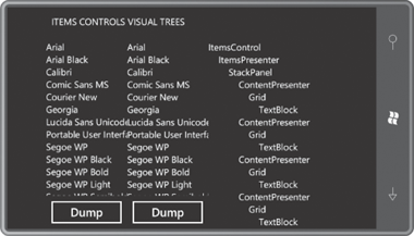
Here’s the program displaying the visual tree for the ItemsControl:
The entire visual tree for an
items control potentially incorporates several templates. This can be
somewhat confusing, so perhaps a little review will help:
In some controls, such as Slider, the ControlTemplate defines the appearance of the entire control. The theme style for Slider defines a default ControlTemplate and you can define your own. That ControlTemplate might include other ControlTemplate definitions for the ToggleButton and Thumb that make up the Slider.
In ContentControl derivatives like Button, potentially two templates are present: a ControlTemplate defining the control’s chrome, and a DataTemplate describing how the object set to the Content property is rendered in the control.
In ItemsControl derivatives, three types of templates are involved: A ControlTemplate for the control’s chrome, an ItemsPanelTemplate for the panel it uses to host the items, and a DataTemplate that is applied to each item.
The visual tree for ItemsControl begins with the ControlTemplate for the control, and the default ControlTemplate for ItemsControl is simply an ItemsPresenter. This is a rather mysterious class that defines no public properties on its own. The ItemsPresenter is sometimes treated as a “placeholder” in a custom ControlTemplate for an items control.
The ItemsPresenter always uses a Panel derivative to display the items in the items control. In the default ItemsControl this is a StackPanel with a vertical orientation. This panel is replaceable by setting the ItemsPanel property defined by ItemsControl with an ItemsPanelTemplate.
Following that are identical snippets of visual tree for each item in the collection beginning with a familiar element named ContentPresenter.The ContentPresenter is the core of a ContentControl. This is the element responsible for hosting a FrameworkElement derivative, or converting a non-FrameworkElement derivative to text using its TextString method, or hosting an object using a visual tree based on a DataTemplate set to its ContentTemplate property. The ContentPresenter has the same role here but for each item individually.
In the ItemsControl being analyzed in this program, each item is displayed with a TextBlock within a single-cell Grid.
The visual tree for the ListBox is much more elaborate:
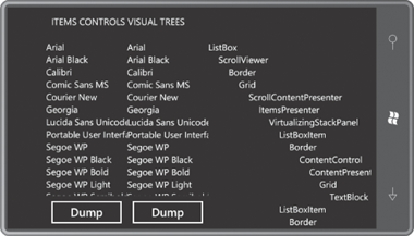
The visual tree begins with the default ControlTemplate for the ListBox. This tree begins with a ScrollViewer, which itself is a control so it has its own default ControlTemplate and its own visual tree starting with a Border and ending with the ScrollContentPresenter, which functions as the ScrollViewer engine. ScrollViewer is derived from ContentControl and within the ControlTemplate for ListBox, the Content of ScrollViewer is set to an ItemsPresenter, the same class that forms the entire default ControlTemplate of ItemsControl.
In the ItemsControl visual tree, the ItemsPresenter hosted a StackPanel; in the ListBox the ItemsPresenter hosts a VirtualizingStackPanel. Let me come back to that.
In the ItemsControl visual tree, each item is a ContentPresenter. Here, each item is a ListBoxItem, which itself derives from ContentControl, and which has its own template, and its own ContentPresenter.
Why the difference? Why does ListBox need a special class named ListBoxItem to host each item but ItemsControl does not?
The answer is simple: Selection. Somebody has to handle the special display of a selected item in the ListBox and the ComboBox, and so there are classes for this purpose named ListBoxItem and ComboBoxItem (which derives from ListBoxItem). ListBoxItem derives from ContentControl—as you can see from the visual tree, it includes a ContentControl in its template, just like Button—but also defines an IsSelected property. The ListBox knows that its items are hosted by ListBoxItem controls so it is able to set that IsSelected property on the selected item, which the ListBoxItem template uses to highlight the item.
In the lingo of items controls, ListBoxItem is known as the container for items in the ListBox. These ListBoxItem containers are automatically created when the program adds items to the ListBox. The public interface to create and manage these containers is defined by ItemsControl, such as the ItemContainerGenerator
property and several overridable methods for defining an alternative
container class.
However, you may want to define a different ControlTemplate for ListBoxItem, perhaps to change the way that selected items are highlighted, but you might feel a little stymied because the ListBoxItem instances are created and maintained within this container logic. Fortunately, providing a custom ControlTemplate for ListBoxItem is easier than you might think: ListBox and ComboBox both define a property named ItemContainerStyle that you can set to a Style object that the ListBox applies to each ListBoxItem instance. Of course, this Style might include a Setter for the Template property. This is the easy approach. If you want ListBox to use a custom container class that you derive from ListBoxItem, then you need to get involved with the container-generator logic.
As you start looking at these visual trees—and keep in mind that in the general case each item will get its own visual tree defined by a DataTemplate—you may start worrying about the performance. Don’t let the DataTemplate get too complex. One class that also helps performance is VirtualizingStackPanel, which only builds a visual tree for an object when that object needs to be displayed.
