I’ve been mentioning visual trees. Let’s look at a few.
The ButtonTree program lets you dump the visual tree for a rather conventional Button (one with its Content just set to text), a Button with its Content property set to an Image element, and two others with their Content properties set to the RadialGradientBrush and Clock (as shown in the examples above) together with a ContentTemplate. The program’s content Grid displays each Button in a cell:
Example 1. Silverlight Project: ButtonTree File: MainPage.xaml (excerpt)
<Grid x:Name="ContentPanel" Grid.Row="1" Margin="12,0,12,0">
    <Grid.RowDefinitions>
        <RowDefinition Height="Auto" />
        <RowDefinition Height="Auto" />
        <RowDefinition Height="*" />
    </Grid.RowDefinitions>

    <Grid.ColumnDefinitions>
       <ColumnDefinition Width="*" />
       <ColumnDefinition Width="*" />
    </Grid.ColumnDefinitions>

    <Button Grid.Row="0" Grid.Column="0"
            Content="Click to Dump"
            HorizontalAlignment="Center"
            VerticalAlignment="Center"
            Click="OnButtonClick" />

    <Button Grid.Row="0" Grid.Column="1"
            HorizontalAlignment="Center"
            VerticalAlignment="Center"
            Click="OnButtonClick">
        <Image Source="ApplicationIcon.png"
               Stretch="None" />
    </Button>

    <Button Grid.Row="1" Grid.Column="0"
            HorizontalAlignment="Center"
            VerticalAlignment="Center"
            Click="OnButtonClick">
        <Button.Content>
            <RadialGradientBrush>
                <GradientStop Offset="0" Color="Blue" />
                <GradientStop Offset="1" Color="AliceBlue" />
            </RadialGradientBrush>
        </Button.Content>

        <Button.ContentTemplate>
            <DataTemplate>
                <Ellipse Width="100"
                         Height="100"
                         Fill="{Binding}" />
            </DataTemplate>
        </Button.ContentTemplate>
    </Button>

    <Button Grid.Row="1" Grid.Column="1"
            HorizontalAlignment="Center"
            VerticalAlignment="Center"
            Click="OnButtonClick">
        <Button.Content>
            <petzold:Clock />
        </Button.Content>

        <Button.ContentTemplate>
            <DataTemplate>
                <StackPanel>
                    <TextBlock Text="The time is:"
                               TextAlignment="Center" />
                    <StackPanel Orientation="Horizontal"
                                HorizontalAlignment="Center">
                        <TextBlock Text="{Binding Hour}" />
                        <TextBlock Text=":" />
                        <TextBlock Text="{Binding Minute}" />
                        <TextBlock Text=":" />
                        <TextBlock Text="{Binding Second}" />
                    </StackPanel>
                </StackPanel>
            </DataTemplate>
        </Button.ContentTemplate>
    </Button>

    <ScrollViewer Grid.Row="2" Grid.Column="0" Grid.ColumnSpan="2"
                  HorizontalScrollBarVisibility="Auto">
        <StackPanel Name="stackPanel" />
    </ScrollViewer>
</Grid>
|
Way down at the bottom is a StackPanel inside a ScrollViewer for displaying the visual tree. The code-behind file uses the static VisualTreeHelper class for enumerating an element’s children in a recursive method, and then displays their names in a hierarchical list:
Example 2. Silverlight Project: ButtonTree File: MainPage.xaml.cs (excerpt)
void OnButtonClick(object sender, RoutedEventArgs args)
{
    Button btn = sender as Button;
    stackPanel.Children.Clear();
    DumpVisualTree(btn, 0);
}

void DumpVisualTree(DependencyObject parent, int indent)
{
    TextBlock txtblk = new TextBlock();
    txtblk.Text = String.Format("{0}{1}", new string(' ', 4 * indent),
                                          parent.GetType().Name);
    stackPanel.Children.Add(txtblk);

    int numChildren = VisualTreeHelper.GetChildrenCount(parent);

    for (int childIndex = 0; childIndex < numChildren; childIndex++)
    {
        DependencyObject child = VisualTreeHelper.GetChild(parent, childIndex);
        DumpVisualTree(child, indent + 1);
    }
}
|
Click the button in the upper-left corner that has its Content set to text and the program displays the visual tree of the Button:
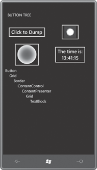
The Border element is no surprise; it’s clearly visible in the actual Button as is the TextBlock used to display the text. The first Grid hosting the Border is obviously a single-cell Grid. The purpose of the Grid hosting the TextBlock is not so obvious. If you set the Content of the Button to an explicit TextBlock, that second Grid disappears, and the tree looks more like the one for the Button with its Content property set to an Image element:
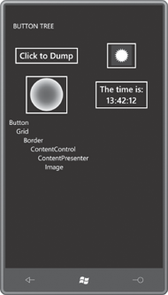
The portion of the visual tree up to an including the ContentPresenter defines the appearance of the standard Button. (Soon you’ll see how that’s the part that can be replaced by setting the control’s Template property to an object of type ControlTemplate.) Everything after the ContentPresenter is used to display the content of the Button. Here’s the tree when the Content property is set to a RadialGradientBrush but the ContentTemplate is set to an Ellipse referencing that brush:
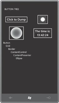
If you’re familiar with control templates from the Windows Presentation
Foundation or the web version of Silverlight, you undoubtedly expect to
see the ContentPresenter. That’s a FrameworkElement derivative used specifically for hosting content. It is the ContentPresenter that formats some objects as text in the absence of a DataTemplate, or actually applies a DataTemplate. But you may be a little puzzled about the ContentControl. I was puzzled as well for awhile. A Button derives from ContentControl, but that doesn’t necessarily mean that the visual tree of a Button should contain another ContentControl!
Finally, here’s the visual tree resulting from the more extensive DataTemplate for displaying the Clock object:
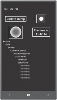
For any control that derives from ContentControl, you now know how to define the portion of the visual tree following the ContentPresenter. Now let’s see how you can redefine the top part of this visual tree.
