I demonstrated how you can assign the Content property of a ContentControl derivative (such as a Button) to almost any object. If that object derives from FrameworkElement (such as TextBlock or Image), then the element is displayed inside the ContentControl. But you can also set the Content property to an object that does not derive from FrameworkElement. Here’s the Content of a Button set to a RadialGradientBrush:
<Button HorizontalAlignment="Center"
        VerticalAlignment="Center">

    <RadialGradientBrush>
        <GradientStop Offset="0" Color="Blue" />
        <GradientStop Offset="1" Color="AliceBlue" />
    </RadialGradientBrush>

</Button>
Normally you’d set the Foreground property of a Button to a brush, or the Background property, or perhaps the BorderBrush property. But setting the Content property to a brush? What does that even mean?
If the object set to the Content property of a ControlControl does not derive from FrameworkElement, it is rendered with its ToString method, and if the class has no ToString override, the fully-qualified class name is displayed, so this particular Button looks like this:
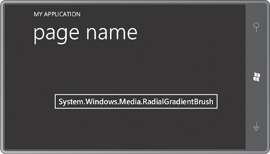
This is not exactly something you want to use to show off your programming skills to your friends.
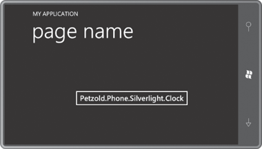
Here’s the Clock class from this article inside a Button:
<Button HorizontalAlignment="Center"
        VerticalAlignment="Center">

    <petzold:Clock />

</Button>
And this Button doesn’t display much of value either:
Yet, there is a way to display this object intelligently. The solution is an object of type DataTemplate set to the ContentTemplate property of the Button. Here’s the syntax with an empty DataTemplate:
<Button HorizontalAlignment="Center"
        VerticalAlignment="Center">

    <petzold:Clock />

    <Button.ContentTemplate>
        <DataTemplate>

        </DataTemplate>
    </Button.ContentTemplate>
</Button>
ContentTemplate is one of two properties defined by ContentControl and inherited by Button; the other property is Content itself.
And now all you need to do is supply a visual tree within the DataTemplate tags that contains bindings to properties in the Clock class:
<Button HorizontalAlignment="Center"
        VerticalAlignment="Center">

    <petzold:Clock />

    <Button.ContentTemplate>
        <DataTemplate>
            <StackPanel>
                <TextBlock Text="The time is:"
                           TextAlignment="Center" />
                <StackPanel Orientation="Horizontal"
                            HorizontalAlignment="Center">
                    <TextBlock Text="{Binding Hour}" />
                    <TextBlock Text=":" />
                    <TextBlock Text="{Binding Minute}" />
                    <TextBlock Text=":" />
                    <TextBlock Text="{Binding Second}" />
                </StackPanel>
            </StackPanel>
        </DataTemplate>
    </Button.ContentTemplate>
</Button>
The Button uses this visual tree to display the Content object. The bindings in this visual tree are often rather simple. The data bindings don’t need a Source property because the DataContext associated with this visual tree is the object set to the Content property. The bindings shown here require only Path properties, and the “Path=” part of the Binding markup extension can be omitted.
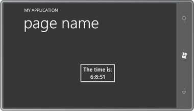
The displayed time is dynamically updated. Of course, the bindings for the Minute and Second properties should really reference a string-formatting converter to always be displayed with two digits.
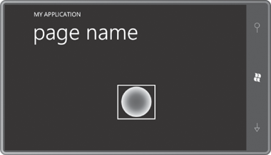
The existence of the DataTemplate means that you really can set the content of a Button to a RadialGradientBrush just as long as you define a visual tree that makes use of that brush in the DataTemplate:
<Button HorizontalAlignment="Center"
        VerticalAlignment="Center">

    <RadialGradientBrush>
        <GradientStop Offset="0" Color="Blue" />
        <GradientStop Offset="1" Color="AliceBlue" />
    </RadialGradientBrush>

    <Button.ContentTemplate>
        <DataTemplate>
            <Ellipse Width="100"
                     Height="100"
                     Fill="{Binding}" />
        </DataTemplate>
    </Button.ContentTemplate>
</Button>
Notice the Fill property setting of the Ellipse. It’s just a Binding markup extension with no Path settings set. The Fill property doesn’t want a particular property of the RadialGradientBrush. It wants the whole thing. Here’s the Button:
You can use this technique with any ContentControl derivative, or even ContentControl itself.
Let’s define that DataTemplate in the Resources collection of a MainPage.xaml files:
Example 1. Silverlight Project: ContentControlWithDataTemplates File: MainPage.xaml (excerpt)
<phone:PhoneApplicationPage.Resources>
    <DataTemplate x:Key="brushTemplate">
        <Ellipse Width="100"
                 Height="100"
                 Fill="{Binding}" />
    </DataTemplate>
</phone:PhoneApplicationPage.Resources>
|
Let’s give the content panel of this page three Button instances, each with its ContentTemplate property set to that resource, but with three different types of Brush objects set to the Content property:
Example 2. Silverlight Project: ContentControlWithDataTemplates File: MainPage.xaml (excerpt)
<Grid x:Name="ContentPanel" Grid.Row="1" Margin="12,0,12,0">
    <StackPanel>
        <Button HorizontalAlignment="Center"
                ContentTemplate="{StaticResource brushTemplate}">
            <SolidColorBrush Color="{StaticResource PhoneAccentColor}" />
        </Button>

        <Button HorizontalAlignment="Center"
                ContentTemplate="{StaticResource brushTemplate}">
            <RadialGradientBrush>
                <GradientStop Offset="0" Color="Blue" />
                <GradientStop Offset="1" Color="AliceBlue" />
            </RadialGradientBrush>
       </Button>

       <Button HorizontalAlignment="Center"
                ContentTemplate="{StaticResource brushTemplate}">
            <LinearGradientBrush>
                <GradientStop Offset="0" Color="Pink" />
                <GradientStop Offset="1" Color="Red" />
            </LinearGradientBrush>
        </Button>
    </StackPanel>
</Grid>
|
Here’s the result:
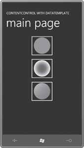
The DataTemplate is defined as a resource so it is shared among all Button controls. However, a separate visual tree based on that template is built for each Button. Somewhere within the visual tree for each Button is an Ellipse with a binding to the SolidColorBrush set to the Content property.
Sharing the DataTemplate among a few Button controls is convenient, but it doesn’t really show off the sheer power of this technique. Imagine that you can define a DataTemplate for displaying the items in a ListBox or ComboBox.
