Generally when you create a custom control, you define some new properties for the control as well as a default Style and ControlTemplate, and you put that new control in a DLL for sharing among multiple applications. You can couple the code and Style as shown in the FlipToggleButton example, but a more standard approach for Silverlight libraries involves defining the Style in a special file named generic.xaml located in a directory named Themes. This generic.xaml file has a root element of ResourceDictionary.
Let’s look at an example.
Suppose you conceive of a ToggleButton
template something like the one in the CustomButtonTemplate project but
much more generalized. Rather than just switch between two hard-coded
text strings, you want to switch between two objects of any type. And
not just switch—you want an object associated with the Checked state and
an object associated with the Unchecked state to fade from one to the
other. Your name for this new button is called FadableToggleButton.
As you think about it, you realize that the control needs to define a new property named CheckedContent, similar to the normal Content property. The Content property is the object displayed for the button’s Unchecked state, and CheckedContent is displayed for the Checked state.
I defined this class in the Petzold.Phone.Silverlight library. The complete code for FadableToggleButton is here:
Example 1. Silverlight Project: Petzold.Phone.Silverlight File: FadableToggleButton.cs
using System.Windows;
using System.Windows.Controls.Primitives;

namespace Petzold.Phone.Silverlight
{
    public class FadableToggleButton : ToggleButton
    {
        public static readonly DependencyProperty CheckedContentProperty =
            DependencyProperty.Register("CheckedContent",
            typeof(object),
            typeof(FadableToggleButton),
            new PropertyMetadata(null));

        public FadableToggleButton()
        {
            this.DefaultStyleKey = typeof(FadableToggleButton);
        }

        public object CheckedContent
        {
            set { SetValue(CheckedContentProperty, value); }
            get { return (object)GetValue(CheckedContentProperty); }
        }
    }
}
|
This is the only C# code required to implement this control! There’s not even a property-changed handler for this new CheckedContent property. It’s just a DependencyProperty definition and a CLR property definition. Everything else is XAML.
But notice the constructor. If this code file were a partial class definition partnered with a XAML file, you’d see a call to InitializeComponent in the constructor. Instead, there’s the following:
this.DefaultStyleKey = typeof(FadableToggleButton);
This statement indicates that this class has a default Style definition, and the TargetType of this Style definition is FadableToggleButton. To apply a default Style to instances of this class, Silverlight needs to find that Style definition. Where does it search?
Silverlight looks in a very
special XAML file in the library. This XAML file is always named
generic.xaml and it is always located in a directory named Themes of the
DLL project. This is how a control gets a default theme style and
template.
This generic.xaml file has a root element of ResourceDictionary. However the file is special in another way: The contents are regarded as resources but the Style elements don’t require x:Key or x:Name attributes because they are referenced via the TargetType.
Here’s the portion of the generic.xaml file in the Themes directory of Petzold.Phone.Silverlight that contains the default Style definition of the FadableToggleButton class:
Example 2. Silverlight Project: Petzold.Phone.Silverlight File: Themes/generic.xaml (excerpt)
<ResourceDictionary
        xmlns="http://schemas.microsoft.com/winfx/2006/xaml/presentation"
        xmlns:x="http://schemas.microsoft.com/winfx/2006/xaml"
        xmlns:local="clr-namespace:Petzold.Phone.Silverlight">

  <Style TargetType="local:FadableToggleButton">
    <Setter Property="Template">
      <Setter.Value>
        <ControlTemplate TargetType="local:FadableToggleButton">
          <Grid>
            <VisualStateManager.VisualStateGroups>
              <VisualStateGroup x:Name="CommonStates">
                <VisualState x:Name="Normal" />
                <VisualState x:Name="MouseOver" />
                <VisualState x:Name="Pressed" />

                <VisualState x:Name="Disabled">
                  <Storyboard>
                    <DoubleAnimation Storyboard.TargetName="disableRect"
                                     Storyboard.TargetProperty="Opacity"
                                     To="0.6" Duration="0:0:0" />
                  </Storyboard>
                </VisualState>
              </VisualStateGroup>

              <VisualStateGroup x:Name="CheckStates">
                <VisualState x:Name="Checked">
                  <Storyboard>
                    <DoubleAnimation Storyboard.TargetName="uncheckedContent"
                                     Storyboard.TargetProperty="Opacity"
                                     To="0" Duration="0:0:0.5" />
                    <DoubleAnimation Storyboard.TargetName="checkedContent"
                                     Storyboard.TargetProperty="Opacity"
                                     To="1" Duration="0:0:0.5" />
                  </Storyboard>
                </VisualState>

                <VisualState x:Name="Unchecked">
                  <Storyboard>
                    <DoubleAnimation Storyboard.TargetName="uncheckedContent"
                                     Storyboard.TargetProperty="Opacity"
                                     Duration="0:0:0.5" />
                    <DoubleAnimation Storyboard.TargetName="checkedContent"
                                     Storyboard.TargetProperty="Opacity"
                                     Duration="0:0:0.5" />
                  </Storyboard>
                </VisualState>
              </VisualStateGroup>
            </VisualStateManager.VisualStateGroups>

            <Border BorderBrush="{StaticResource PhoneForegroundBrush}"
                    BorderThickness="{StaticResource PhoneBorderThickness}"
                    Background="{TemplateBinding Background}">

              <Grid Margin="{TemplateBinding Padding}">
                <ContentPresenter
                        Name="uncheckedContent"
                        Content="{TemplateBinding Content}"
                        ContentTemplate="{TemplateBinding ContentTemplate}"
                        HorizontalAlignment="{TemplateBinding
                                                    HorizontalContentAlignment}"
                        VerticalAlignment="{TemplateBinding
                                                    VerticalContentAlignment}" />

                <ContentPresenter
                        Name="checkedContent"
                        Opacity="0"
                        Content="{TemplateBinding CheckedContent}"
                        ContentTemplate="{TemplateBinding ContentTemplate}"
                        HorizontalAlignment="{TemplateBinding
                                                    HorizontalContentAlignment}"
                        VerticalAlignment="{TemplateBinding
                                                    VerticalContentAlignment}" />
              </Grid>
            </Border>

            <Rectangle Name="disableRect"
                       Fill="{StaticResource PhoneBackgroundBrush}"
                       Opacity="0" />
          </Grid>
        </ControlTemplate>
      </Setter.Value>
    </Setter>
  </Style>

  . . .

</ResourceDictionary>
|
The TargetType for the Style is FadableToggleButton, and that’s enough to allow Silverlight to find this Style definition that becomes the default theme for the FadableToggleButton. Within the Border is a single-cell Grid with two ContentPresenter elements, one with a TemplateBinding referencing the normal Content property, the other referencing the CheckedContent property. The ContentPresenter referencing the CheckedContent property has an initial Opacity of zero. The animations for the Checked and Unchecked states target the Opacity property of the ContentPresenter so that one fades out as the other fades in.
Although the Content properties of the two ContentPresenter elements are bound to two different properties of the FadableToggleButton, the ContentTemplate properties of both are bound to the same ContentTemplate property originally defined by ContentControl. If you set a DataTemplate to the ContentTemplate property of FadableToggleButton, then that same DataTemplate must apply to both the Content property and the CheckedContent property. In other words, this template implicitly assumes that the Content property and CheckedContent property are of the same types.
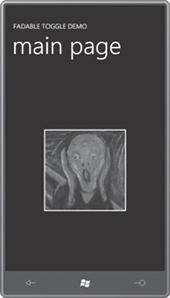
To test out this new control, I created a FadableToggleDemo
program. The project contains a reference to the
Petzold.Phone.Silverlight library and an XML namespace declaration for
the library in MainPage.xaml. I added two bitmaps of the same size to an
Images directory in the project. These bitmaps are referenced by Image elements set to the Content and CheckedContent properties of the button:
Example 3. Silverlight Project: FadableToggleDemo File: MainPage.xaml (excerpt)
<Grid x:Name="ContentPanel" Grid.Row="1" Margin="12,0,12,0">

     <petzold:FadableToggleButton HorizontalAlignment="Center"
                                  VerticalAlignment="Center">

         <petzold:FadableToggleButton.Content>
             <Image Source="Images/MunchScream.jpg"
                    Stretch="None" />
         </petzold:FadableToggleButton.Content>

         <petzold:FadableToggleButton.CheckedContent>
             <Image Source="Images/BotticelliVenus.jpg"
                    Stretch="None" />
        </petzold:FadableToggleButton.CheckedContent>

    </petzold:FadableToggleButton>

</Grid>
|
The Content property is set to an image from Edvard Munch’s painting The Scream:
The CheckedContent property uses Botticelli’s Birth of Venus:

