All this time that the Button has been redesigned with a template, it has otherwise remained a fully-functional button and it’s been generating Click events every time it’s been tapped. The big problem is that the Button does not deliver visual feedback to the user. It has a customized visual appearance, but that appearance does not change.
There are really just two features that need to be added to this template to make it functionally and visually complete:
These two features are
related because they both involve changing the visuals of the control
under certain circumstances. And the two features are also related
because the solution involves a Silverlight feature called the Visual
State Manager.
The Visual State Manager helps the developer deal with visual states, which are changes in control visuals that result from changes in properties (or other states) of the control. For the Button on Windows Phone 7, the relevant visual states correspond to the properties IsPressed and IsEnabled.
You can determine the
visual states supported by a particular control by looking at the
documentation for that control. In the first page of the Button documentation, you’ll see the class defined with six attributes of type TemplateVisualStateAttribute:
[TemplateVisualStateAttribute(Name = "Disabled", GroupName = "CommonStates")]
[TemplateVisualStateAttribute(Name = "Normal", GroupName = "CommonStates")]
[TemplateVisualStateAttribute(Name = "MouseOver", GroupName = "CommonStates")]
[TemplateVisualStateAttribute(Name = "Pressed", GroupName = "CommonStates")]
[TemplateVisualStateAttribute(Name = "Unfocused", GroupName = "FocusStates")]
[TemplateVisualStateAttribute(Name = "Focused", GroupName = "FocusStates")]
public class Button : ButtonBase
These are the six visual states of the Button. Each of these states has a name, but notice also that each of them has a group name, either CommonStates or FocusStates.
Within any group,
the visual states are mutually exclusive. One and only one visual state
in each group currently applies to the Button. In the CommonStates
group, either a button is Normal, or Disabled, or the mouse is
hovering, or the button is pressed. You don’t need to worry about
combinations of these states. You don’t have to come up with a special
state for mouse hovering on a disabled button because those two states
will never occur at the same time.
The code in the Button class is responsible for the button going into a particular state. It does this through calls to the static VisualStateManager.GoToState method. The template is responsible for responding to visual changes based on these states.
As Windows Phone 7
programmers, we have a somewhat easier job than template authors
targeting Silverlight on the web. We don’t have to worry about the two
states in the FocusStates group, or the MouseOver state. That leaves
Normal, Disabled, and Pressed.
Very often, additional elements are inserted into the template specifically for these visual
states. When a control is disabled, the contents usually get grayer in
some way regardless of the nature of the content—be it text, a bitmap,
or something else. This suggests that a disabled state can be handled by putting a semi-opaque Rectangle on top of the entire control.
So let’s put the entire visual tree of the template inside a single-cell Grid and add a Rectangle on top:
<ControlTemplate TargetType="Button">
    <Grid>
        <Border BorderBrush="{TemplateBinding BorderBrush}"
                BorderThickness="{TemplateBinding BorderThickness}"
                Background="{TemplateBinding Background}"
                CornerRadius="24">
            <ContentPresenter
                    Content="{TemplateBinding Content}"
                    ContentTemplate="{TemplateBinding ContentTemplate}"
                    Margin="{TemplateBinding Padding}"
                    HorizontalAlignment="{TemplateBinding HorizontalContentAlignment}"
                    VerticalAlignment="{TemplateBinding VerticalContentAlignment}" />
        </Border>

        <Rectangle Name="disableRect"
                   Fill="{StaticResource PhoneBackgroundBrush}"
                   Opacity="0" />
    </Grid>
</ControlTemplate>
Fortunately the new Rectangle has its Opacity set to 0 or it would block out the entire control! But if you set the Opacity to 0.6 (for example) it provides a proper dimming effect, regardless of control content.
Notice the color of the Rectangle is set as the PhoneBackgroundBrush resource. The Button has rounded corners so you don’t want the Rectangle changing the color of whatever’s behind the Button and visible through those corners. It’s also possible to give the Rectangle the same corner rounding as the Border and you’ll have a little more flexibility with the color.
Now that we have the Rectangle in there, all we need to do is find some way to change the Opacity from 0 to 0.6 when the visual state becomes Disabled.
The markup for the Visual State Manager always appears after the start tag of the top level element of the template, in this case the Grid. It begins with a VisualStateManager.VisualStateGroups tag within which can be multiple VisualStateGroups sections. I’ll be ignoring the FocusStates group:
<ControlTemplate TargetType="Button">
    <Grid>
        <VisualStateManager.VisualStateGroups>
            <VisualStateGroup x:Name="CommonStates">

            </VisualStateGroup>
        </VisualStateManager.VisualStateGroups>
        . . .
    </Grid>
</ControlTemplate>
The VisualStateGroup tags enclose a series of VisualState tags for each of the visual states in that group:
<ControlTemplate TargetType="Button">
    <Grid>
        <VisualStateManager.VisualStateGroups>
            <VisualStateGroup x:Name="CommonStates">
                <VisualState x:Name="Normal" />
                <VisualState x:Name="MouseOver" />

                <VisualState x:Name="Pressed">

                </VisualState>

                <VisualState x:Name="Disabled">

                </VisualState>
            </VisualStateGroup>
        </VisualStateManager.VisualStateGroups>
        . . .
    </Grid>
</ControlTemplate>
The VisualState tag for the Normal
state is empty because the template that’s already been designed is for
the normal button. But don’t leave out the tag; otherwise the control
won’t return to its Normal state after being in another state. The
MouseOver state won’t be used; it too will remain empty.
Within the VisualState tags you indicate what you want to happen for that state. How do you do that? You might imagine doing it with a Setting tag as in a Style,
and that would work well. But to allow you to be very much more
flexible, the Visual State Manager lets you use animations instead, and
because the animation syntax isn’t very much more complex than the Setting syntax, the Visual State Manager actually requires you to use animations. Within the VisualState tags you’ll put a Storyboard
containing one or more animations targeting properties of named
elements within the template. In many cases, these animations will have a
Duration setting of 0 so that the visual state changes immediately. But you can have smoother state animations if you want. Here’s an animation for the Opacity property of the Rectangle named disableRect:
<ControlTemplate TargetType="Button">
    <Grid>
        <VisualStateManager.VisualStateGroups>
            <VisualStateGroup x:Name="CommonStates">
                <VisualState x:Name="Normal" />
                <VisualState x:Name="MouseOver" />

                <VisualState x:Name="Pressed">

                </VisualState>

                <VisualState x:Name="Disabled">
                    <Storyboard>
                        <DoubleAnimation Storyboard.TargetName="disableRect"
                                         Storyboard.TargetProperty="Opacity"
                                         To="0.6" Duration="0:0:0" />
                    </Storyboard>
                </VisualState>
            </VisualStateGroup>
        </VisualStateManager.VisualStateGroups>
        . . .

    </Grid>
</ControlTemplate>
The animations in the Visual State Manager don’t usually have From values so they just take off from the existing value. The empty VisualState tag for the Normal state effectively restores the Opacity value back to its pre-animation value when the state goes back to Normal.
The Pressed
state presents some challenges. Usually a Pressed state is often
rendered as a form of reverse video. In the web version of Silverlight,
the Button template hard-codes a LinearGradientBrush
for the background and changes properties of that brush for the Pressed
state. Because the template is controlling the brush for the Normal
state, it can easily change that brush for the Pressed state.
In the Button template being created here, the default Foreground color is set in the theme style for the Button, and a default Background color is set in the Style
that the template is part of. If these properties aren’t changed, the
colors will be either white on black (with the “dark” theme) or black on
white. But the properties can be changed with local property settings
on the Button.
It would be great to have some
kind of graphic effect to reverse the colors, but that’s not available.
We need to define animations to set new foreground and background colors
for the Pressed state that will seem to reverse colors in the normal
case, that is, when the foreground is set to the PhoneForegroundBrush resource and the background is PhoneBackgroundBrush, which means that the Pressed state can set Foreground to PhoneBackgroundBrush and Background to PhoneForegroundBrush.
Can we use a ColorAnimation for this job? We could if we knew that the Foreground and Background brushes were actually SolidColorBrush objects. But we don’t know that. That means we need to use ObjectAnimationUsingKeyFrames objects to target the Foreground and Background properties themselves. The ObjectAnimationUsingKeyFrames can have children of only one type: DiscreteObjectKeyFrame.
Let’s do the Background property first by giving the Border a name:
<Border Name="border"
        BorderBrush="{TemplateBinding BorderBrush}"
        BorderThickness="{TemplateBinding BorderThickness}"
        Background="{TemplateBinding Background}"
        CornerRadius="12">
That name allows the animation to target the Background property of Border:
<VisualState x:Name="Pressed">
    <Storyboard>
        <ObjectAnimationUsingKeyFrames Storyboard.TargetName="border"
                                       Storyboard.TargetProperty="Background">
            <DiscreteObjectKeyFrame KeyTime="0:0:0"
                                    Value="{StaticResource PhoneForegroundBrush}" />
        </ObjectAnimationUsingKeyFrames>
    </Storyboard>
</VisualState>
For the Pressed state, the animation changes the Background property of the Border element to the brush referenced as the PhoneForegroundBrush resource. Excellent!
Now let’s add a similar animation to target the Foreground property of … of what? There is no element in this template visual tree that has a Foreground property!
It would be ideal if ContentPresenter had a Foreground property but it does not.
But wait a minute. What about ContentControl? ContentControl is basically just a ContentPresenter but ContentControl has a Foreground property. So let’s replace ContentPresenter with a ControlControl and give it a name:
<ContentControl Name="contentControl"
                Content="{TemplateBinding Content}"
                ContentTemplate="{TemplateBinding ContentTemplate}"
                Margin="{TemplateBinding Padding}"
                HorizontalAlignment="{TemplateBinding HorizontalContentAlignment}"
                VerticalAlignment="{TemplateBinding VerticalContentAlignment}" />
Now it’s possible to define the second animation for the Pressed state:
<VisualState x:Name="Pressed">
    <Storyboard>
        . . .
        <ObjectAnimationUsingKeyFrames Storyboard.TargetName="contentControl"
                                       Storyboard.TargetProperty="Foreground">
            <DiscreteObjectKeyFrame KeyTime="0:0:0"
                                    Value="{StaticResource PhoneBackgroundBrush}" />
        </ObjectAnimationUsingKeyFrames>
    </Storyboard>
</VisualState>
And here’s the pressed Button:
I will now declare this template to be completed! (And now you’ll understand why the default template for the Button contains a ContentControl.)
Let’s look at this entire Style and ControlTemplate in the context of a page. In the CustomButtonTemplate program, the Style is defined in the page’s Resources collection. Mostly to reduce keep the lines lengths shorter than the width of the page, the ControlTemplate is defined as a separate resource and then referenced by the Style. Here’s the ControlTemplate first followed by the Style referencing that template:
Example 1. Silverlight Project: CustomButtonTemplate File: MainPage.xaml (excerpt)
<phone:PhoneApplicationPage.Resources>
    <ControlTemplate x:Key="buttonTemplate" TargetType="Button">
        <Grid>
            <VisualStateManager.VisualStateGroups>
                <VisualStateGroup x:Name="CommonStates">
                    <VisualState x:Name="Normal" />
                    <VisualState x:Name="MouseOver" />

                    <VisualState x:Name="Pressed">
                        <Storyboard>
                            <ObjectAnimationUsingKeyFrames
                                        Storyboard.TargetName="border"
                                        Storyboard.TargetProperty="Background">
                                <DiscreteObjectKeyFrame KeyTime="0:0:0"
                                    Value="{StaticResource PhoneForegroundBrush}" />
                            </ObjectAnimationUsingKeyFrames>

                            <ObjectAnimationUsingKeyFrames
                                        Storyboard.TargetName="contentControl"
                                        Storyboard.TargetProperty="Foreground">
                                <DiscreteObjectKeyFrame KeyTime="0:0:0"
                                    Value="{StaticResource PhoneBackgroundBrush}" />
                            </ObjectAnimationUsingKeyFrames>
                        </Storyboard>
                    </VisualState>

                    <VisualState x:Name="Disabled">
                        <Storyboard>
                            <DoubleAnimation Storyboard.TargetName="disableRect"
                                             Storyboard.TargetProperty="Opacity"
                                             To="0.6" Duration="0:0:0" />
                        </Storyboard>
                    </VisualState>
                </VisualStateGroup>
            </VisualStateManager.VisualStateGroups>

            <Border Name="border"
                    BorderBrush="{TemplateBinding BorderBrush}"
                    BorderThickness="{TemplateBinding BorderThickness}"
                    Background="{TemplateBinding Background}"
                    CornerRadius="12">

                <ContentControl Name="contentControl"
                                Content="{TemplateBinding Content}"
                                ContentTemplate="{TemplateBinding ContentTemplate}"
                                Margin="{TemplateBinding Padding}"
                                HorizontalAlignment="{TemplateBinding
                                                       HorizontalContentAlignment}"
                                VerticalAlignment="{TemplateBinding
                                                     VerticalContentAlignment}" />
            </Border>

            <Rectangle Name="disableRect"
                       Fill="{StaticResource PhoneBackgroundBrush}"
                       Opacity="0" />
        </Grid>
    </ControlTemplate>

    <Style x:Key="buttonStyle" TargetType="Button">
        <Setter Property="BorderBrush" Value="{StaticResource PhoneAccentBrush}" />
        <Setter Property="BorderThickness" Value="6" />
        <Setter Property="Background" Value="{StaticResource PhoneChromeBrush}" />
        <Setter Property="Template" Value="{StaticResource buttonTemplate}" />
    </Style>
</phone:PhoneApplicationPage.Resources>
|
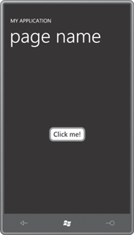
The content area contains a Button that references this Style, of course, but I wanted to test the enabling and disabling of the Button in a very interactive manner, so I added a ToggleButton to the page and set a binding targeting the IsEnabled property on the styled and templated Button from the IsChecked property of the ToggleButton.
But it didn’t look quite right for the ToggleButton to be toggled on (that is, highlighted) when the regular Button was in its normal (that is, enabled) state. It occurred to me that what I really wanted was for the ToggleButton to actually say “Button Enabled” when the ToggleButton was toggled on and the Button was enabled, and for it to say “Button Disabled” when the ToggleButton was toggled off and the Button was disabled.
This is the beauty of templates.
You can do something like this right in XAML without a whole lot of
fuss and without any extra tools like Expression Blend.
Example 2. Silverlight Project: CustomButtonTemplate File: MainPage.xaml (excerpt)
<Grid x:Name="ContentPanel" Grid.Row="1" Margin="12,0,12,0">
    <Grid.RowDefinitions>
        <RowDefinition Height="*" />
        <RowDefinition Height="*" />
    </Grid.RowDefinitions>

    <Button Grid.Row="0"
            Content="Click me!"
            Style="{StaticResource buttonStyle}"
            IsEnabled="{Binding ElementName=toggleButton, Path=IsChecked}"
            HorizontalAlignment="Center"
            VerticalAlignment="Center" />

    <ToggleButton Name="toggleButton"
                  Grid.Row="1"
                  IsChecked="true"
                  HorizontalAlignment="Center"
                  VerticalAlignment="Center">
        <ToggleButton.Template>
            <ControlTemplate TargetType="ToggleButton">
                <Border BorderBrush="{StaticResource PhoneForegroundBrush}"
                        BorderThickness="{StaticResource PhoneBorderThickness}">

                    <VisualStateManager.VisualStateGroups>
                        <VisualStateGroup x:Name="CheckStates">
                            <VisualState x:Name="Checked">
                                <Storyboard>
                                    <ObjectAnimationUsingKeyFrames
                                            Storyboard.TargetName="txtblk"
                                            Storyboard.TargetProperty="Text">
                                        <DiscreteObjectKeyFrame KeyTime="0:0:0"
                                                        Value="Button Enabled" />
                                    </ObjectAnimationUsingKeyFrames>
                                </Storyboard>
                            </VisualState>

                            <VisualState x:Name="Unchecked" />

                        </VisualStateGroup>
                    </VisualStateManager.VisualStateGroups>

                    <TextBlock Name="txtblk"
                               Text="Button Disabled"/>
                </Border>
            </ControlTemplate>
       </ToggleButton.Template>
    </ToggleButton>
</Grid>
|
This ToggleButton here has what I think of as a single-purpose special-use ad hoc ControlTemplate, so it doesn’t have a lot of extra frills. The visual tree consists entirely of a Border and a TextBlock. It ignores the Content property, and the Text property of the TextBlock is initialized with “Button Disabled”. Everything else is done with visual states. In addition to the regular Button visual states, the ToggleButton
also defines a CheckStates group with states Checked and Unchecked.
These are the only states this template handles, and the animation for
the Checked state sets the Text property of the TextBlock to “Button Enabled.” Here it is in action with the Button disabled:
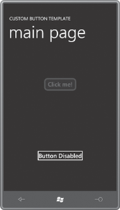
I didn’t define a Disabled state for the ToggleButton because this is a template I intend to use only for this program, and I know that this ToggleButton will never be disabled.
