As you might expect, the Slider
has one of the more complex templates in all of standard Silverlight,
and for that reason, it’s important to get familiar with it—particularly
if you’re not a big fan of the default Slider template implemented in Windows Phone 7.
At first, a Slider does not seem to fit into the scheme of templates, primarily because it contains moving parts. How does this work exactly?
If you look at the documentation of Slider, you’ll see the customary TemplateVisualStateAttribute tags, but also a collection of TemplatePartAttribute tags (rearranged somewhat here form their order in the documentation):
[TemplateVisualStateAttribute(Name = "Normal", GroupName = "CommonStates")]
[TemplateVisualStateAttribute(Name = "MouseOver", GroupName = "CommonStates")]
[TemplateVisualStateAttribute(Name = "Disabled", GroupName = "CommonStates")]
[TemplateVisualStateAttribute(Name = "Focused", GroupName = "FocusStates")]
[TemplateVisualStateAttribute(Name = "Unfocused", GroupName = "FocusStates")]
[TemplatePartAttribute(Name = "HorizontalTemplate", Type = typeof(FrameworkElement))]
[TemplatePartAttribute(Name = "HorizontalTrackLargeChangeDecreaseRepeatButton",
                       Type = typeof(RepeatButton))]
[TemplatePartAttribute(Name = "HorizontalTrackLargeChangeIncreaseRepeatButton",
                       Type = typeof(RepeatButton))]
[TemplatePartAttribute(Name = "HorizontalThumb", Type = typeof(Thumb))]
[TemplatePartAttribute(Name = "VerticalTemplate", Type = typeof(FrameworkElement))]
[TemplatePartAttribute(Name = "VerticalTrackLargeChangeDecreaseRepeatButton",
                       Type = typeof(RepeatButton))]
[TemplatePartAttribute(Name = "VerticalTrackLargeChangeIncreaseRepeatButton",
                       Type = typeof(RepeatButton))]
[TemplatePartAttribute(Name = "VerticalThumb", Type = typeof(Thumb))]
public class Slider : RangeBase
What this means is that the Slider
expects its template to contain eight elements with the names of
“HorizontalTemplate” and so forth. These are referred to as “parts” of the template. The “HorizontalTemplate” and “VerticalTemplate” parts need only be of type FrameworkElement (or derived from FrameworkElement) but other parts are required to be of type RepeatButton or Thumb.
The RepeatButton and Thumb are a couple of controls that I haven’t yet had much occasion to use in this book. (They are both found in the System.Windows.Controls.Primitives namespace, a subtle suggestion that the controls are intended to be used in building other controls.) The RepeatButton is similar to a regular Button except that when you hold your finger on it, it fires repeated Click events. It’s perfect for a ScrollBar or Slider and was probably invented specifically for that purpose.
The Thumb is a rather special control that reports how the user is trying to drag it. But if you can’t quite figure out where the Thumb is located in the standard Slider on Windows Phone 7, that’s because it’s been pretty well hidden in the theme template. One of my goals here is to restore the Thumb to the Slider.
A control with parts (such as the Slider) overrides the ApplyTemplate method to be notified when a template has been set to its Template property. It then uses GetTemplateChild
to find the elements with these particular names. It can attach event
handlers to these elements, and otherwise manipulate these elements when
the control is in use.
The standard Slider
supports horizontal and vertical orientations, and the template
actually contains two separate (and fairly independent) templates for
these orientations. These two separate templates are enclosed in
elements with the “HorizontalTemplate” and “VerticalTemplate” names. If the Orientation property of Slider is Horizontal, then the Slider sets the Visibility property of the “HorizontalTemplate” element to Visible and the Visibility property of “VerticalTemplate” element to Collapsed, and oppositely for the Vertical orientation.
When designing a new template for the Slider, the most straightfoward approach is to use a single-cell Grid to enclose the two templates. A nested Grid named “HorizontalTemplate” contains three columns with the two RepeatButton controls and a Thumb. Another nested Grid named “VerticalTemplate” has three rows.
Here’s is what I think of as a “bare bones” template for Slider defined as a resource:
Example 1. Silverlight Project: BareBonesSlider File: MainPage.xaml (excerpt)
<phone:PhoneApplicationPage.Resources>
    <ControlTemplate x:Key="bareBonesSliderTemplate"
                     TargetType="Slider">
        <Grid>
            <Grid Name="HorizontalTemplate">
                <Grid.ColumnDefinitions>
                    <ColumnDefinition Width="Auto" />
                    <ColumnDefinition Width="Auto" />
                    <ColumnDefinition Width="*" />
                </Grid.ColumnDefinitions>

                <RepeatButton Name="HorizontalTrackLargeChangeDecreaseRepeatButton"
                              Grid.Column="0"
                              Content="-" />

                <Thumb Name="HorizontalThumb"
                       Grid.Column="1" />

                <RepeatButton Name="HorizontalTrackLargeChangeIncreaseRepeatButton"
                              Grid.Column="2"
                              Content="+" />
            </Grid>

            <Grid Name="VerticalTemplate">
                <Grid.RowDefinitions>
                    <RowDefinition Height="*" />
                    <RowDefinition Height="Auto" />
                    <RowDefinition Height="Auto" />
                </Grid.RowDefinitions>

                <RepeatButton Name="VerticalTrackLargeChangeDecreaseRepeatButton"
                              Grid.Row="0"
                              Content="-" />

                <Thumb Name="VerticalThumb"
                       Grid.Row="1" />

                <RepeatButton Name="VerticalTrackLargeChangeIncreaseRepeatButton"
                              Grid.Row="2"
                              Content="+" />
            </Grid>
        </Grid>
    </ControlTemplate>
</phone:PhoneApplicationPage.Resources>
|
The Slider template does not exactly require the two RepeatButton controls and the Thumb to be in a three-row or three-column Grid, but it’s certainly the easiest solution. Notice that I rather whimsically assigned the Content properties of the RepeatButton controls to minus signs and plus signs depending on their role.
Let’s focus on the Horizontal orientation: The RepeatButton to decrease values is in the first Grid cell with a width of Auto, and the Thumb is in the second Grid cell, also with a Width of Auto. The Thumb itself has a fixed width, but the Slider logic directly changes the width of the decreasing RepeatButton to reflect the Value property of the Slider. When Value is set to Minimum, this RepeatButton gets a width of zero. When Value is set to Maximum, the RepeatButton gets a width based on the entire control width minus the Thumb width.
The Slider changes the Value property (and consequently the relative size of the two RepeatButton controls) when the user presses a RepeatButton or physically moves the Thumb.
The BareBonesSlider project continues by instantiating two Slider controls in its content area and applying the template:
Example 2. Silverlight Project: BareBonesSlider File: MainPage.xaml (excerpt)
<Grid x:Name="ContentPanel" Grid.Row="1" Margin="12,0,12,0">
    <Grid.RowDefinitions>
        <RowDefinition Height="Auto"/>
        <RowDefinition Height="*" />
    </Grid.RowDefinitions>

    <Slider Grid.Row="0"
            Orientation="Horizontal"
            Template="{StaticResource bareBonesSliderTemplate}" />

    <Slider Grid.Row="1"
            Orientation="Vertical"
            Template="{StaticResource bareBonesSliderTemplate}"
            HorizontalAlignment="Center" />
</Grid>
|
Here’s what they look like after they’ve been moved a bit from their initial positions:
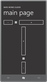
The RepeatButton looks just like Button and Thumb is a square surrounded by a transparent area.
Now that we know how to create a custom template for Slider, can we pretty this up a bit? Yes, and the key involves realizing that RepeatButton and Thumb derive from Control, which means they both have Template properties, and within the Slider template you can define new templates for RepeatButton and Thumb specifically for use in the Slider template.
Here’s a fancier Slider that also incorporates template bindings for the Background and Foreground properties. Those properties are given default values in a Style that also incorporates the ControlTemplate. Shown here is only the outer Grid of the ControlTemplate object, which has its own Resources section for defining a very simple ControlTemplate for the RepeatButton and rather extensive templates for the horizontal and vertical Thumb:
Example 3. Silverlight Project: AlternativeSlider File: MainPage.xaml (excerpt)
<phone:PhoneApplicationPage.Resources>
    <Style x:Key="alternativeSliderStyle" TargetType="Slider">
        <Setter Property="Background"
                Value="{StaticResource PhoneBackgroundBrush}" />
        <Setter Property="Foreground"
                Value="{StaticResource PhoneForegroundBrush}" />
        <Setter Property="Template">
            <Setter.Value>
                <ControlTemplate TargetType="Slider">
                    <Grid Background="{TemplateBinding Background}">

                        <Grid.Resources>
                            <ControlTemplate x:Key="repeatButtonTemplate"
                                             TargetType="RepeatButton">
                                <Rectangle Fill="Transparent" />
                            </ControlTemplate>

                            <Style x:Key="horizontalThumbStyle"
                                   TargetType="Thumb">
                                <Setter Property="Width" Value="72" />
                                <Setter Property="Height" Value="72" />
                                <Setter Property="Template">
                                    <Setter.Value>
                                        <ControlTemplate TargetType="Thumb">
                                            <Border Background="Transparent">
                                                <Rectangle Margin="18 0"
                                                           RadiusX="6"
                                                           RadiusY="6"
                                                           Stroke="{StaticResource
                                                                PhoneAccentBrush}"
                                                           Fill="{TemplateBinding
                                                              Foreground}" />
                                            </Border>
                                        </ControlTemplate>
                                    </Setter.Value>
                                </Setter>
                            </Style>

                            <Style x:Key="verticalThumbStyle"
                                   TargetType="Thumb">
                                <Setter Property="Width" Value="72" />
                                <Setter Property="Height" Value="72" />
                                <Setter Property="Template">
                                    <Setter.Value>
                                        <ControlTemplate TargetType="Thumb">
                                            <Border Background="Transparent">
                                                <Rectangle Margin="0 18"
                                                           RadiusX="6"
                                                           RadiusY="6"
                                                           Stroke="{StaticResource
                                                                PhoneAccentBrush}"
                                                           Fill="{TemplateBinding
                                                                  Foreground}" />
                                            </Border>
                                        </ControlTemplate>
                                    </Setter.Value>
                                </Setter>
                            </Style>
                        </Grid.Resources>

                        . . .

                    </Grid>
                </ControlTemplate>
            </Setter.Value>
        </Setter>
    </Style>
</phone:PhoneApplicationPage.Resources>
|
The RepeatButton template is just a transparent Rectangle. (You want the Rectangle to have a transparent Fill rather than a null Fill so it can receive touch input.) For the Thumb styles, however, I needed to redefine Width and Height properties. In the theme style, they’re set at 48, which seemed a little low to me. I provided a Border with a transparent background for a touch target of the larger size, but the visual part is a little smaller to look more like a traditional Slider thumb.
The two Grid elements for the horizontal and vertical orientations each begins with a Rectangle that provides a kind of visual track. Each RepeatButton and Thumb references the Style for that control defined earlier:
Example 4. Silverlight Project: AlternativeSlider File: MainPage.xaml (excerpt)
<Grid Name="HorizontalTemplate">
    <Grid.ColumnDefinitions>
        <ColumnDefinition Width="Auto" />
        <ColumnDefinition Width="Auto" />
        <ColumnDefinition Width="*" />
    </Grid.ColumnDefinitions>

    <Rectangle Grid.Column="0" Grid.ColumnSpan="3"
               Height="8"
               Margin="12 0"
               Stroke="{TemplateBinding Foreground}"
               Fill="{StaticResource PhoneAccentBrush}" />

    <RepeatButton Name="HorizontalTrackLargeChangeDecreaseRepeatButton"
                  Grid.Column="0"
                  Template="{StaticResource repeatButtonTemplate}" />

    <Thumb Name="HorizontalThumb"
           Grid.Column="1"
           Style="{StaticResource horizontalThumbStyle}" />

    <RepeatButton Name="HorizontalTrackLargeChangeIncreaseRepeatButton"
                  Grid.Column="2"
                  Template="{StaticResource repeatButtonTemplate}" />
</Grid>

<Grid Name="VerticalTemplate">
    <Grid.RowDefinitions>
        <RowDefinition Height="*" />
        <RowDefinition Height="Auto" />
        <RowDefinition Height="Auto" />
    </Grid.RowDefinitions>

    <Rectangle Grid.Row="0" Grid.RowSpan="3"
               Width="8"
               Margin="0 12"
               Stroke="{TemplateBinding Foreground}"
               Fill="{StaticResource PhoneAccentBrush}" />

    <RepeatButton Name="VerticalTrackLargeChangeDecreaseRepeatButton"
                  Grid.Row="0"
                  Template="{StaticResource repeatButtonTemplate}" />

    <Thumb Name="VerticalThumb"
           Grid.Row="1"
           Style="{StaticResource verticalThumbStyle}" />

    <RepeatButton Name="VerticalTrackLargeChangeIncreaseRepeatButton"
                  Grid.Row="2"
                  Template="{StaticResource repeatButtonTemplate}" />
</Grid>
|
The content area of the program looks pretty much like the previous program except that the Slider controls reference this new style:
Example 5. Silverlight Project: AlternativeSlider File: MainPage.xaml (excerpt)
<Grid x:Name="ContentPanel" Grid.Row="1" Margin="12,0,12,0">
    <Grid.RowDefinitions>
        <RowDefinition Height="Auto"/>
        <RowDefinition Height="*" />
    </Grid.RowDefinitions>

    <Slider Grid.Row="0"
            Orientation="Horizontal"
            Style="{StaticResource alternativeSliderStyle}" />

    <Slider Grid.Row="1"
            Orientation="Vertical"
            Style="{StaticResource alternativeSliderStyle}"
            HorizontalAlignment="Center" />
</Grid>
|
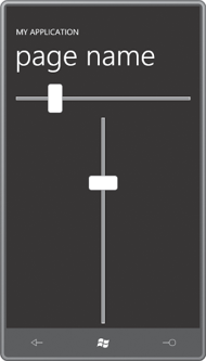
And here they are:
I decided to move this Style and ControlTemplate to Petzold.Phone.Silverlight as the default Style for a class named AltSlider. The class has no additional properties so the code file needs only identify the class that AltSlider derives from and what class should be used for locating the default Style:
Example 6. Silverlight Project: Petzold.Phone.Silverlight File: AltSlider.cs
using System.Windows.Controls;

namespace Petzold.Phone.Silverlight
{
    public class AltSlider : Slider
    {
        public AltSlider()
        {
            this.DefaultStyleKey = typeof(AltSlider);
        }
    }
}
|
This default Style (including the ControlTemplate) is in generic.xaml. I won’t show the whole thing here because it mostly repeats the Style definition from the AlternativeSlider project:
Example 7. Silverlight Project: Petzold.Phone.Silverlight File: Themes/generic.xaml (excerpt)
<ResourceDictionary
        xmlns="http://schemas.microsoft.com/winfx/2006/xaml/presentation"
        xmlns:x="http://schemas.microsoft.com/winfx/2006/xaml"
        xmlns:local="clr-namespace:Petzold.Phone.Silverlight">

    . . .

    <Style TargetType="local:AltSlider">
        <Setter Property="Background"
                Value="{StaticResource PhoneBackgroundBrush}" />
        <Setter Property="Foreground"
                Value="{StaticResource PhoneForegroundBrush}" />
        <Setter Property="Template">
            <Setter.Value>
                <ControlTemplate TargetType="local:AltSlider">
                    . . .
                </ControlTemplate>
            </Setter.Value>
        </Setter>
    </Style>

    . . .

</ResourceDictionary>
|
Of course, it’s now necessary to test it. The AltSliderDemo
project has a reference to the Petzold.Phone.Silverlight project, and
an XML namespace declaration for it. The content area is similar to the
past two programs:
Example 8. Silverlight Project: AltSliderDemo File: MainPage.xaml (excerpt)
<Grid x:Name="ContentPanel" Grid.Row="1" Margin="12,0,12,0">
    <Grid.RowDefinitions>
        <RowDefinition Height="Auto"/>
        <RowDefinition Height="*" />
    </Grid.RowDefinitions>

    <petzold:AltSlider Grid.Row="0"
                       Orientation="Horizontal"
                       Style="{StaticResource altSliderStyle}"/>

    <petzold:AltSlider Grid.Row="1"
                       Orientation="Vertical"
                       HorizontalAlignment="Center"
                       Style="{StaticResource altSliderStyle}" />
</Grid>
|
You’ll notice these AltSlider controls have their Style properties set. What is that? That is a reference to a Style defined in the Resources collection of the page:
Example 9. Silverlight Project: AltSliderDemo File: MainPage.xaml (excerpt)
<phone:PhoneApplicationPage.Resources>
    <Style x:Key="altSliderStyle"
           TargetType="petzold:AltSlider">
        <Setter Property="Margin" Value="12" />
        <Setter Property="Background" Value="{StaticResource PhoneChromeBrush}" />
    </Style>
</phone:PhoneApplicationPage.Resources>
|
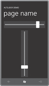
The only purpose of this Style is to demonstrate that defining a default Style for the AltSlider class does not negate the ability to set another Style later on, even one that overrides one of the properties in the original Style. Here’s the program running:
