As you know, if you’re creating controls that need only be used for special purposes in your own applications, the easiest approach is UserControl. Simply define a visual tree for the control in the XAML file.
You can also take a similar approach with ContentControl, except that the XAML file would contain a Style and ControlTemplate definition. The advantage of this approach is that you retain use of the Content property for the control’s own purposes.
You can also derive from Control.
This approach makes sense if the derived class is in a library, and you
want the control to have a replaceable template. The default theme Style and ControlTemplate are in the library’s generic.xaml file.
The Petzold.Phone.Silverlight library has an example of such a control named XYSlider. This control is intended to let the user move a Thumb around a two-dimensional surface; the control reports a location in a property name Value of type Point,
but the two coordinates are normalized between 0 and 1 relative to the
upper-left corner. This normalization relieves the control of defining Minimum and Maximum values like a regular Slider.
Besides a Value property, the XYSlider class also defines a PlaneBackground property of type Brush. This is the surface on which the Thumb moves, and you’ll see shortly why it must be distinguished from the regular Background property of Control.
As the class attributes indicate, the class expects the template to have two elements: a Canvas named “PlanePart” and a Thumb named “ThumbPart”:
Example 1. Silverlight Project: Petzold.Phone.Silverlight File: XYSlider.cs (excerpt)
[TemplatePartAttribute(Name = "PlanePart", Type = typeof(Canvas))]
[TemplatePartAttribute(Name = "ThumbPart", Type = typeof(Thumb))]
public class XYSlider : Control
{
    Canvas planePart;
    Thumb thumbPart;
    Point absoluteThumbPoint;

    public event RoutedPropertyChangedEventHandler<Point> ValueChanged;

    public static readonly DependencyProperty PlaneBackgroundProperty =
        DependencyProperty.Register("PlaneBackground",
            typeof(Brush),
            typeof(XYSlider),
            new PropertyMetadata(new SolidColorBrush(Colors.Gray)));

    public static readonly DependencyProperty ValueProperty =
        DependencyProperty.Register("Value",
            typeof(Point),
            typeof(XYSlider),
            new PropertyMetadata(new Point(0.5, 0.5), OnValueChanged));

    public XYSlider()
    {
        this.DefaultStyleKey = typeof(XYSlider);
    }

    public Brush PlaneBackground
    {
        set { SetValue(PlaneBackgroundProperty, value); }
        get { return (Brush)GetValue(PlaneBackgroundProperty); }
    }

    public Point Value
    {
        set { SetValue(ValueProperty, value); }
        get { return (Point)GetValue(ValueProperty); }
    }

    . . .
}
|
A Control derivative is informed that its template has been built by a call to OnApplyTemplate. This is an appropriate time for the class to call GetTemplateChild
with the names indicated in the attributes. It is considered proper
behavior for the class to quietly accept the possibility that some parts
might be missing, even if those parts are essential for the proper
functioning of the control:
Example 2. Silverlight Project: Petzold.Phone.Silverlight File: XYSlider.cs (excerpt)
public override void OnApplyTemplate()
{
    if (planePart != null)
    {
        planePart.SizeChanged -= OnPlaneSizeChanged;
    }

    if (thumbPart != null)
    {
        thumbPart.DragDelta -= OnThumbDragDelta;
    }

    planePart = GetTemplateChild("PlanePart") as Canvas;
    thumbPart = GetTemplateChild("ThumbPart") as Thumb;

    if (planePart != null && thumbPart != null)
    {
        planePart.SizeChanged += OnPlaneSizeChanged;
        thumbPart.DragStarted += OnThumbDragStarted;
        thumbPart.DragDelta += OnThumbDragDelta;
        ScaleValueToPlane(this.Value);
    }

    base.OnApplyTemplate();
}
|
If the Canvas and Thumb are present, a handler is installed for the SizeChanged event of the Canvas and the DragStarted and DragDelta events of the Thumb.
The SizeChanged handler updates the location of the Thumb relative to the Canvas; the DragDelta handler updates the Value property of XYSlider:
Example 3. Silverlight Project: Petzold.Phone.Silverlight File: XYSlider.cs (excerpt)
void OnPlaneSizeChanged(object sender, SizeChangedEventArgs args)
{
    ScaleValueToPlane(this.Value);
}

void OnThumbDragStarted(object sender, DragStartedEventArgs args)
{
    absoluteThumbPoint = new Point(Canvas.GetLeft(thumbPart),
                                   Canvas.GetTop(thumbPart));
}

void OnThumbDragDelta(object sender, DragDeltaEventArgs args)
{
    absoluteThumbPoint.X += args.HorizontalChange;
    absoluteThumbPoint.Y += args.VerticalChange;

    Value = new Point(Math.Max(0,
                      Math.Min(1, absoluteThumbPoint.X / planePart.ActualWidth)),
                      Math.Max(0,
                      Math.Min(1, absoluteThumbPoint.Y / planePart.ActualHeight)));
}

void ScaleValueToPlane(Point point)
{
    if (planePart != null && thumbPart != null)
    {
        Canvas.SetLeft(thumbPart, planePart.ActualWidth * point.X);
        Canvas.SetTop(thumbPart, planePart.ActualHeight * point.Y);
    }
}
|
The property-changed handler for Value also updates the location of the Thumb and fires the ValueChanged event:
Example 4. Silverlight Project: Petzold.Phone.Silverlight File: XYSlider.cs (excerpt)
static void OnValueChanged(DependencyObject obj,
                           DependencyPropertyChangedEventArgs args)
{
    (obj as XYSlider).OnValueChanged((Point)args.OldValue, (Point)args.NewValue);
}

protected virtual void OnValueChanged(Point oldValue, Point newValue)
{
    if (newValue.X < 0 || newValue.X > 1 || newValue.Y < 0 || newValue.Y > 1)
        throw new ArgumentOutOfRangeException("Value",
            "Value property must be Point with coordinates between 0 and 1");

    ScaleValueToPlane(newValue);

    if (ValueChanged != null)
        ValueChanged(this,
            new RoutedPropertyChangedEventArgs<Point>(oldValue, newValue));
}
|
The default Style and ControlTemplate are in the generic.xaml file:
Example 5. Silverlight Project: Petzold.Phone.Sivlerlight File: Themes/generic.xaml (excerpt)
<Style TargetType="local:XYSlider">
  <Setter Property="Template">
    <Setter.Value>
      <ControlTemplate TargetType="local:XYSlider">
        <Border Background="{TemplateBinding Background}"
                BorderBrush="{TemplateBinding BorderBrush}"
                BorderThickness="{TemplateBinding BorderThickness}">

          <Canvas Name="PlanePart"
                  Background="{TemplateBinding PlaneBackground}"
                  Margin="48">
            <Thumb Name="ThumbPart">
              <Thumb.Style>
                <Style TargetType="Thumb">
                  <Setter Property="Width" Value="96" />
                  <Setter Property="Height" Value="96" />
                  <Setter Property="Template">
                    <Setter.Value>
                      <ControlTemplate TargetType="Thumb">
                        <Path Name="path"
                              Stroke="{StaticResource PhoneForegroundBrush}"
                              StrokeThickness="{StaticResource
                                                       PhoneStrokeThickness}"
                              Fill="Transparent">
                          <Path.Data>
                            <GeometryGroup FillRule="Nonzero">
                              <EllipseGeometry RadiusX="48" RadiusY="48" />
                              <EllipseGeometry RadiusX="6" RadiusY="6" />
                              <LineGeometry StartPoint="-48 0" EndPoint="-6 0" />
                              <LineGeometry StartPoint="48 0" EndPoint="6 0" />
                              <LineGeometry StartPoint="0 -48" EndPoint="0 -6" />
                              <LineGeometry StartPoint="0 48" EndPoint="0 6" />
                            </GeometryGroup>
                          </Path.Data>
                        </Path>
                      </ControlTemplate>
                    </Setter.Value>
                  </Setter>
                </Style>
              </Thumb.Style>
            </Thumb>
          </Canvas>
        </Border>
      </ControlTemplate>
    </Setter.Value>
  </Setter>
</Style>
|
A Border surrounds the whole control, and the Canvas named “PlanePart” is given a Margin that just so happens to be half the size of the Thumb. This allows the center of the Thumb to indicate a point on the plane while still remaining entirely within the control. Within the ControlTemplate for the Control is another ControlTemplate for the Thumb that forms a kind of bull’s eye pattern.
The program is tested in a project named WorldMap. The content area contains an XYSlider with the PlaneBackground property set to an ImageBrush based on a map of the world:
Example 6. Silverlight Project: WorldMap File: MainPage.xaml (excerpt)
<Grid x:Name="ContentPanel" Grid.Row="1" Margin="12,0,12,0">
    <Grid.RowDefinitions>
        <RowDefinition Height="*" />
        <RowDefinition Height="Auto" />
    </Grid.RowDefinitions>

    <petzold:XYSlider Name="xySlider"
                      Grid.Row="0"
                      ValueChanged="OnXYSliderValueChanged">
        <petzold:XYSlider.PlaneBackground>
            <!-- Image courtesy of NASA/JPL-Caltech (http://maps.jpl.nasa.gov). -->
            <ImageBrush ImageSource="Images/ear0xuu2.jpg" />
        </petzold:XYSlider.PlaneBackground>
    </petzold:XYSlider>

    <TextBlock Name="txtblk"
               Grid.Row="1"
               HorizontalAlignment="Center" />
</Grid>
|
The code-behind file is devoted to handling the ValueChanged event from the XYSlider and converting the normalized Point to longitude and latitude:
Example 7. Silverlight Project: WorldMap File: MainPage.xaml.cs (excerpt)
public partial class MainPage : PhoneApplicationPage
{
    public MainPage()
    {
        InitializeComponent();
        DisplayCoordinates(xySlider.Value);
    }

    void OnXYSliderValueChanged(object sender,
                                RoutedPropertyChangedEventArgs<Point> args)
    {
        DisplayCoordinates(args.NewValue);
    }

    void DisplayCoordinates(Point point)
    {
        double longitude = 360 * point.X - 180;
        double latitude = 90 - 180 * point.Y;
        txtblk.Text = String.Format("Longitude: {0:F0} Latitude: {1:F0}",
                                    longitude, latitude);
    }
}
|
And here it is:
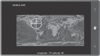
As you move the Thumb
with your finger, the longitude and latitude values displayed at the
bottom are updated. It’s easy to imagine the WorldMap program being
enhanced to obtain the phone’s location and using that to initialize the
position of the Thumb.
