The second of the three approacesh to filling an items control requires explicitly defining the contents in XAML. The ItemsControlsFromXaml project uses this approach to fill an ItemsControl and two ListBox controls. The Items property defined by ItemsControl
is the content property of the control, so in XAML all you need to do
is put a bunch of objects between the begin and end tags of the
particular items control.
In anticipation of formatting some strings in data bindings, a StringFormatConverter is included in the Resources collection of the program’s MainPage.xaml file:
Example 1. Silverlight Project: ItemsControlsFromXaml File: MainPage.xaml (excerpt)
<phone:PhoneApplicationPage.Resources>
    <petzold:StringFormatConverter x:Name="stringFormat" />
</phone:PhoneApplicationPage.Resources>
|
The content area contains a three-column Grid:
Example 2. Silverlight Project: ItemsControlsFromXaml File: MainPage.xaml (excerpt)
<Grid x:Name="ContentPanel" Grid.Row="1" Margin="12,0,12,0">
    <Grid.ColumnDefinitions>
        <ColumnDefinition Width="*" />
        <ColumnDefinition Width="*" />
        <ColumnDefinition Width="*" />
    </Grid.ColumnDefinitions>

    . . .

</Grid>
|
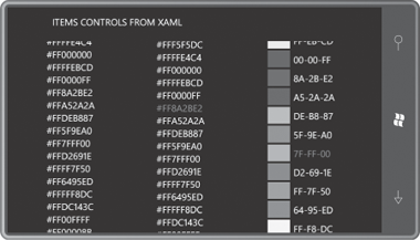
The first Grid cell contains a ScrollViewer hosting an ItemsControl which contains Color objects for all the colors defined in Silverlight:
Example 3. Silverlight Project: ItemsControlsFromXaml File: MainPage.xaml (excerpt)
<ScrollViewer Grid.Column="0">
    <ItemsControl>
        <Color>AliceBlue</Color>
        <Color>AntiqueWhite</Color>
        <Color>Aqua</Color>
        <Color>Aquamarine</Color>
        <Color>Azure</Color>
        . . .
        <Color>Wheat</Color>
        <Color>White</Color>
        <Color>WhiteSmoke</Color>
        <Color>Yellow</Color>
        <Color>YellowGreen</Color>
    </ItemsControl>
</ScrollViewer>
|
Based on your experience of seeing what happens when you put a Color object in a Button, you can probably guess the result: a list of 141 hexadecimal color values. But at least it will be scrollable.
For a little variety, the second column of the Grid contains a ListBox with 141 SolidColorBrush objects:
Example 4. Silverlight Project: ItemsControlsFromXaml File: MainPage.xaml (excerpt)
<ListBox Grid.Column="1"
         DisplayMemberPath="Color">
    <SolidColorBrush Color="AliceBlue" />
    <SolidColorBrush Color="AntiqueWhite" />
    <SolidColorBrush Color="Aqua" />
    <SolidColorBrush Color="Aquamarine" />
    <SolidColorBrush Color="Azure" />
    . . .
    <SolidColorBrush Color="Wheat" />
    <SolidColorBrush Color="White" />
    <SolidColorBrush Color="WhiteSmoke" />
    <SolidColorBrush Color="Yellow" />
    <SolidColorBrush Color="YellowGreen" />
</ListBox>
|
Again, from your experience with putting a SolidColorBrush object in a Button,
you know that this will be even worse: All you’ll get will be 141
instances of a text string with the fully-qualified class name
“System.Windows.Media.SolidColorBrush”.
But wait: Look at that property setting on the ListBox:
DisplayMemberPath="Color"
This property is defined by ItemsControl, and it allows you to specify one property of the items in the items control that you want used for display
purposes. (Of course, it helps if all the items are of the same type,
which is not otherwise a requirement.) With this property setting, ListBox will not display the SolidColorBrush object but will instead display the Color property of each SolidColorBrush, and the same hexadecimal values as the ItemsControl.
The third column is a ListBox done right. It has the same 141 SolidColorBrush items as the first ListBox but it also has a DataTemplate set to its ItemTemplate property that allows it to format the display of the items:
Example 5. Silverlight Project: ItemsControlsFromXaml File: MainPage.xaml (excerpt)
<ListBox Grid.Column="2">
    <ListBox.ItemTemplate>
        <DataTemplate>
            <StackPanel Orientation="Horizontal">
                <Rectangle Width="48" Height="36"
                           Margin="2"
                           Fill="{Binding}" />

                <StackPanel Orientation="Horizontal"
                            VerticalAlignment="Center">
                    <TextBlock Text="{Binding Color.R,
                                        Converter={StaticResource stringFormat},
                                        ConverterParameter=' {0:X2}'}" />
                    <TextBlock Text="{Binding Color.G,
                                        Converter={StaticResource stringFormat},
                                        ConverterParameter='-{0:X2}'}" />
                    <TextBlock Text="{Binding Color.B,
                                        Converter={StaticResource stringFormat},
                                        ConverterParameter='-{0:X2}'}" />
                </StackPanel>
            </StackPanel>
        </DataTemplate>
    </ListBox.ItemTemplate>

    <SolidColorBrush Color="AliceBlue" />
    <SolidColorBrush Color="AntiqueWhite" />
    <SolidColorBrush Color="Aqua" />
    <SolidColorBrush Color="Aquamarine" />
    <SolidColorBrush Color="Azure" />
    . . .
    <SolidColorBrush Color="Wheat" />
    <SolidColorBrush Color="White" />
    <SolidColorBrush Color="WhiteSmoke" />
    <SolidColorBrush Color="Yellow" />
    <SolidColorBrush Color="YellowGreen" />
</ListBox>
|
In this DataTemplate, a Rectangle has its Fill property set to an empty Binding:
Fill="{Binding}"
This means that Fill is set to the particular item in the ListBox, which is of type SolidColorBrush. The three TextBlock elements have bindings that reference the R, G, and B properties of the Color property of the brush. Although this ListBox still displays hexadecimal numbers, it at least displays them with a modicum of class:
Defining a list of items for an items control entirely in XAML is fine for a small number of fixed items; the only reason I used this technique with the 141 Color values is because you can’t generate them in Silverlight code by performing reflection on the Colors class. (The Colors
class in Silverlight only defines 15 of these colors, so I wrote a WPF
program instead that generated the markup that I then pasted into the
Silverlight XAML file.)
If the items you want to put into an ItemsControl or ListBox in XAML are just text
strings, you need to force the XAML parser to differentiate them.
Perhaps the easiest solution is to define an XML namespace declaration
for the System namespace:
xmlns:system="clr-namespace:System;assembly=mscorlib"
You can then explicitly delimit the items with String tags:
<ItemsControl>
    <system:String>Item Number 1</system:String>
    <system:String>Item Number 2</system:String>
    <system:String>Item Number 3</system:String>
    <system:String>Item Number 4</system:String>
    . . .
</ItemsControl>
In a similar way, you can explicitly fill an ItemsControl with numbers using system:Double tags. If you’re using a ListBox rather than ItemsControl, you can separate string items with ListBoxItem tags:
<ListBox>
    <ListBoxItem>Item Number 1</ListBoxItem>
    <ListBoxItem>Item Number 1</ListBoxItem>
    <ListBoxItem>Item Number 1</ListBoxItem>
</ListBox>
Earlier I said that ListBox automatically generates ListBoxItem objects as containers. Won’t this markup cause ListBox to wrap these ListBoxItem objects in additional ListBoxItem objects? Actually, no. Specifically to prevent this problem, ItemsControl defines a virtual method named IsItemItsOwnContainerOverride.
| Property | Property Type | Purpose |
|---|
| Template | ControlTemplate | customizes display of control “chrome” |
| ContentTemplate | DataTemplate | customizes display of content |
For an items control, there are three types of templates you can use, and another is indirectly available for ListBox and ComboBox. These are listed as you might encounter them from the top of the visual tree to the bottom
| Property | Property Type | Purpose |
|---|
| Template | ControlTemplate | customizes display of control “chrome” |
|---|
| ItemsPanel | ItemsPanelTemplate | specifies Panel used to list items |
| ItemContainerStyle | Style | style of ListBoxItem or ComboBoxItem |
| ItemTemplate | DataTemplate | customizes display of item itself |
