With a combination of a DataTemplate and an ItemsPanelTemplate, you can make a ListBox or ItemsControl look like no other ListBox or ItemsControl you’ve ever seen.
Let’s create a new project,
and include references and XML namespace declarations for both the
Petzold.Phone.Silverlight and ElPasoHighSchool libraries. Set properties
in the root tag of MainPage.xaml for landscape. Put the StudentBodyPresenter in the Resources collection.
Here’s an ItemsControl with no ScrollViewer. The ItemsSource is the Students property of the StudentBodyPresenter instance. The ItemsPanelTemplate is set to a UniformStack with a Horizontal orientation:
<Grid x:Name="ContentPanel" Grid.Row="1" Margin="12,0,12,0"
      DataContext="{Binding Source={StaticResource studentBodyPresenter},
                            Path=StudentBody}">

    <ItemsControl ItemsSource="{Binding Students}"
                  VerticalAlignment="Bottom">

        <ItemsControl.ItemsPanel>
            <ItemsPanelTemplate>
                <petzold:UniformStack Orientation="Horizontal" />
            </ItemsPanelTemplate>
        </ItemsControl.ItemsPanel>
    </ItemsControl>
</Grid>
With no DataTemplate the ItemsControl displays the fully-qualified class name as a string: “ElPasoHighSchool.Student.” But with a UniformStack panel, every item gets the same amount of space so only the first “E” is visible:

This doesn’t seem very promising, but let’s set the DataTemplate to a Rectangle whose Height property is bound to the GradePointAverage property:
<ItemsControl ItemsSource="{Binding Students}"
              VerticalAlignment="Bottom">
    <ItemsControl.ItemTemplate>
        <DataTemplate>
            <Rectangle Fill="{StaticResource PhoneAccentBrush}"
                       Height="{Binding GradePointAverage}"
                       VerticalAlignment="Bottom"
                       Margin="1 0" />
        </DataTemplate>
    </ItemsControl.ItemTemplate>

    <ItemsControl.ItemsPanel>
        <ItemsPanelTemplate>
            <petzold:UniformStack Orientation="Horizontal" />
        </ItemsPanelTemplate>
    </ItemsControl.ItemsPanel>
</ItemsControl>
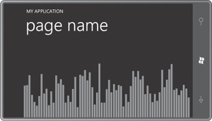
Notice how the ItemsControl itself is aligned at the bottom of the display, and each Rectangle is aligned at the bottom of the ItemsControl. The result is a bar chart:
Of course, the values of the GradePointAverage property only range between 0 and 5, so the bars are rather tiny. How can that problem be solved?
You might think about applying a ScaleTransform to the Rectangle
with a constant vertical scaling factor of, say, 50. That was my first
choice as well, but the results were unsatisfactory. It seemed as if the
heights of the rectangles were being rounded to the nearest pixel
before being scaled. So I abandoned that approach and wrote a new data
converter:
Example 1. Silverlight Project: Petzold.Phone.Silverlight File: MultiplyConverter.cs
using System;
using System.Globalization;
using System.Windows.Data;

namespace Petzold.Phone.Silverlight
{
    public class MultiplyConverter : IValueConverter
    {
        public object Convert(object value, Type targetType,
                              object parameter, CultureInfo culture)
        {
            double multiplier;

            if (value is IConvertible &&
                    parameter is string &&
                        Double.TryParse(parameter as string, out multiplier))
            {
                return (value as IConvertible).ToDouble(culture) * multiplier;
            }
            return value;
        }

        public object ConvertBack(object value, Type targetType,
                                  object parameter, CultureInfo culture)
        {
            double divider;

            if (value is IConvertible &&
                    parameter is string &&
                        Double.TryParse(parameter as string, out divider))
            {
                return (value as IConvertible).ToDouble(culture) / divider;
            }
            return value;
        }
    }
}
|
This converter multiplies the binding source by a factor provided as the converter parameter. Define one of these in the Resources collection:
<phone:PhoneApplicationPage.Resources>
    <elpaso:StudentBodyPresenter x:Key="studentBodyPresenter" />
    <petzold:MultiplyConverter x:Key="multiply" />
</phone:PhoneApplicationPage.Resources>
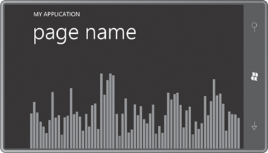
Now reference the converter in the binding to multiply each value by 50:
<DataTemplate>
    <Rectangle Fill="{StaticResource PhoneAccentBrush}"
               Height="{Binding GradePointAverage,
                                Converter={StaticResource multiply},
                                ConverterParameter=50}"
               VerticalAlignment="Bottom"
               Margin="1 0" />
</DataTemplate>
And now it looks like a real bar chart:
What’s more, as the GradePointAverage values dynamically change, the bars on the bar chart bounce up and down.
Do you remember the ValueToBrushConverter
in the Petzold.Phone.Silverlight library? That converter allows us to
color-code the bars so we’re alerted to any student whose grade point
average dips below 1 (for example). Here’s the converter as it would
appear in the Resources collection:
<petzold:ValueToBrushConverter x:Key="valueToBrush"
                               Criterion="1"
                               GreaterThanBrush="{StaticResource PhoneAccentBrush}"
                               EqualToBrush="{StaticResource PhoneAccentBrush}"
                               LessThanBrush="Red" />
Here’s the new DataTemplate:
<DataTemplate>
    <Rectangle Fill="{Binding GradePointAverage,
                              Converter={StaticResource valueToBrush}}"

               Height="{Binding GradePointAverage,
                                Converter={StaticResource multiply},
                                ConverterParameter=50}"
               VerticalAlignment="Bottom"
               Margin="1 0" />
</DataTemplate>
As the teacher of these
students, you’ll be glad you implemented this feature because very soon
you’ll see that a few students are in danger of failing:
Is there a way to determine which students these are?
The GpaBarChart project shows one approach. It has the StudentBodyPresenter and two converters I mentioned defined as resources:
Example 2. Silverlight Project: GpiBarChart File: MainPage.xaml (excerpt)
<phone:PhoneApplicationPage.Resources>
    <elpaso:StudentBodyPresenter x:Key="studentBodyPresenter" />
    <petzold:MultiplyConverter x:Key="multiply" />
    <petzold:ValueToBrushConverter x:Key="valueToBrush"
                               Criterion="1"
                               GreaterThanBrush="{StaticResource PhoneAccentBrush}"
                               EqualToBrush="{StaticResource PhoneAccentBrush}"
                               LessThanBrush="Red" />
</phone:PhoneApplicationPage.Resources>
|
Most of the content area you’ve already seen but I also added a Border with the name “studentDisplay” floating near the top. This Border includes a couple TextBlock elements with their Text properties bound to the properties FullName and GradePointAverage under the assumption that the DataContext of this Border is an object of type Student. That’s not normally the case, so the Border has its Visibility property initialized to Collapsed:
Example 3. Silverlight Project: GpiBarChart File: MainPage.xaml (excerpt)
<Grid x:Name="ContentPanel" Grid.Row="1" Margin="12,0,12,0"
      DataContext="{Binding Source={StaticResource studentBodyPresenter},
                            Path=StudentBody}">

    <Border x:Name="studentDisplay"
            BorderBrush="{StaticResource PhoneForegroundBrush}"
            BorderThickness="{StaticResource PhoneBorderThickness}"
            HorizontalAlignment="Center"
            VerticalAlignment="Top"
            Margin="24"
            Padding="12"
            CornerRadius="24"
            Visibility="Collapsed">
        <StackPanel>
            <TextBlock Text="{Binding FullName}"
                       HorizontalAlignment="Center" />
            <StackPanel Orientation="Horizontal">
                <TextBlock Text="GPA = " />
                <TextBlock Text="{Binding GradePointAverage}" />
            </StackPanel>
        </StackPanel>
    </Border>

    <ItemsControl ItemsSource="{Binding Students}"
                  VerticalAlignment="Bottom">
        <ItemsControl.ItemTemplate>
            <DataTemplate>
                <Rectangle Fill="{Binding GradePointAverage,
                                          Converter={StaticResource valueToBrush}}"

                           Height="{Binding GradePointAverage,
                                            Converter={StaticResource multiply},
                                            ConverterParameter=50}"
                           VerticalAlignment="Bottom"
                           Margin="1 0" />
            </DataTemplate>
        </ItemsControl.ItemTemplate>

        <ItemsControl.ItemsPanel>
            <ItemsPanelTemplate>
                <petzold:UniformStack Orientation="Horizontal" />
            </ItemsPanelTemplate>
        </ItemsControl.ItemsPanel>
    </ItemsControl>
</Grid>
|
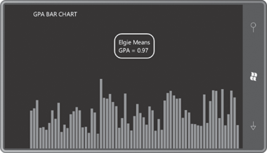
The code-behind file fills in the missing logic. The page processes the Touch.FrameReported event. When the element directly behind the primary touch point is a Rectangle, the event handler obtains the DataContext of that Rectangle. That is an object of type Student. That object is then set to the DataContext of the Border. The TouchAction property is used to turn the Visibility on and off:
Example 4. Silverlight Project: GpiBarChart File: MainPage.xaml.cs (excerpt)
public partial class MainPage : PhoneApplicationPage
{
    public MainPage()
    {
        InitializeComponent();
        Touch.FrameReported += OnTouchFrameReported;
    }

    void OnTouchFrameReported(object sender, TouchFrameEventArgs args)
    {
        TouchPoint touchPoint = args.GetPrimaryTouchPoint(this);

        if (touchPoint != null && touchPoint.Action == TouchAction.Down)
            args.SuspendMousePromotionUntilTouchUp();

        if (touchPoint != null && touchPoint.TouchDevice.DirectlyOver is Rectangle)
        {
            Rectangle rectangle =
                    (touchPoint.TouchDevice.DirectlyOver as Rectangle);

            // This DataContext is an object of type Student
            object dataContext = rectangle.DataContext;
            studentDisplay.DataContext = dataContext;

            if (touchPoint.Action == TouchAction.Down)
                studentDisplay.Visibility = Visibility.Visible;

            else if (touchPoint.Action == TouchAction.Up)
                studentDisplay.Visibility = Visibility.Collapsed;
        }
    }
}
|
As you run your fingers across the bars, you can see the student that each bar represents:
