Both Pivot and Panorama derive from ItemsControl by way of a class with a generic parameter:
public class TemplatedItemsControl<T> : ItemsControl where T : new(), FrameworkElement
This indicates an ItemsControl that is intended to be filled with objects of type T. Both Pivot and Panorama derive from TemplatedItemsControl with a type parameter set to PivotItem or PanoramaItem, respectively:
public class Pivot : TemplatedItemsControl<PivotItem>
public class Panorama : TemplatedItemsControl<PanoramaItem>
The Pivot control expects to contain items of type PivotItem while the Panorama control expects to contain items of type PanoramaItem. Both PivotItem and PanoramaItem derive from ContentControl. If you’re filling the Items collection of a Pivot or Panorama object explicitly in XAML and code, you’ll want to fill it with PivotItem or PanoramaItem items, because there’s a crucial Header property you need to set on these controls. If you instead use a binding on the ItemsSourceItemsControl, these PivotItem and PanoramaItem objects are created for you behind the scenes, and you set the Header property through a template. (Don’t worry: I’ll have examples.) property defined by
To instantiate these controls in a
XAML file you’ll need an XML namespace declaration for the
Microsoft.Phone.Controls library and namespace:
xmlns:controls="clr-namespace:Microsoft.Phone.Controls;assembly=Microsoft.Phone.Controls"
Perhaps the best way to
explore these classes is to experiment with an actual example. The New
Project dialog in Visual Studio allows you to create an project of type Windows Phone Pivot Application or Windows
Phone Panorama Application, and you can surely experiment with those.
Here’s a MainPage.xaml file from a project named PivotDemonstration.
I created this project normally, that is, by selecting Windows Phone
Application from the New Project dialog box. But then I deleted most of
the contents of MainPage.xaml except the PhoneApplicationPage
tags. I added the XML namespace declaration for “controls” (it’s the
widest one) and I replaced the contents of the page with a Pivot and four nested PivotItem children:
Example 1. Silverlight Project: PivotDemonstration File: MainPage.xaml (excerpt)
<phone:PhoneApplicationPage
    x:Class="PivotDemonstration.MainPage"
    xmlns="http://schemas.microsoft.com/winfx/2006/xaml/presentation"
    xmlns:x="http://schemas.microsoft.com/winfx/2006/xaml"
    xmlns:phone="clr-namespace:Microsoft.Phone.Controls;assembly=Microsoft.Phone"
    xmlns:shell="clr-namespace:Microsoft.Phone.Shell;assembly=Microsoft.Phone"
  xmlns:controls="clr-namespace:Microsoft.Phone.Controls;assembly=Microsoft.Phone.
Controls"
    xmlns:system="clr-namespace:System;assembly=mscorlib"
    xmlns:d="http://schemas.microsoft.com/expression/blend/2008"
    xmlns:mc="http://schemas.openxmlformats.org/markup-compatibility/2006"
    mc:Ignorable="d" d:DesignWidth="480" d:DesignHeight="768"
    FontFamily="{StaticResource PhoneFontFamilyNormal}"
    FontSize="{StaticResource PhoneFontSizeNormal}"
    Foreground="{StaticResource PhoneForegroundBrush}"
    SupportedOrientations="PortraitOrLandscape" Orientation="Portrait"
    shell:SystemTray.IsVisible="True">

    <controls:Pivot Title="PIVOT DEMONSTRATION">
        <controls:PivotItem Header="ListBox">
            . . .
        </controls:PivotItem>

        <controls:PivotItem Header="Ellipse">
            . . .
        </controls:PivotItem>

        <controls:PivotItem Header="TextBlock">
            . . .
        </controls:PivotItem>

        <controls:PivotItem Header="Animation">
            . . .
        </controls:PivotItem>
    </controls:Pivot>
</phone:PhoneApplicationPage>
|
The Pivot control’s Title
property is set to “PIVOT DEMONSTRATION.” By default, this title will
appear in the same location and be the same size as the text displayed
at the top of the normal Windows Phone page. (That’s the text normally
displayed by the TextBlock with the name ApplicationTitle.) Each of the four PivotItem controls has a Header property set; this text appears in the same location and is the same size as the customary TextBlock named PageTitle.
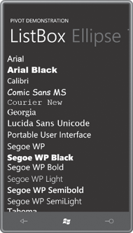
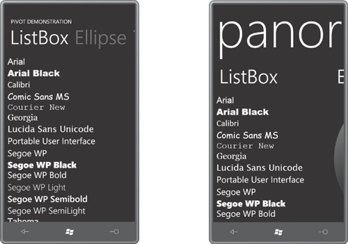
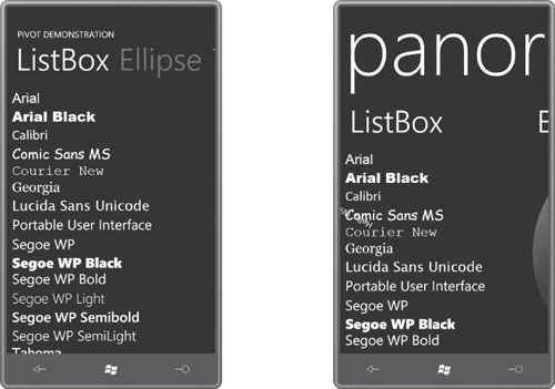
The PivotItem control derives from ContentControl, so you can put pretty much anything in those controls. I gave the first PivotItem a ListBox containing all the fonts available to Windows Phone 7 programs, including a simple DataTemplate:
Example 2. Silverlight Project: PivotDemonstration File: MainPage.xaml (excerpt)
<controls:PivotItem Header="ListBox">
    <ListBox FontSize="{StaticResource PhoneFontSizeLarge}">
        <ListBox.ItemTemplate>
            <DataTemplate>
                <TextBlock Text="{Binding}"
                           FontFamily="{Binding}" />
            </DataTemplate>
        </ListBox.ItemTemplate>

        <system:String>Arial</system:String>
        <system:String>Arial Black</system:String>
        <system:String>Calibri</system:String>
        <system:String>Comic Sans MS</system:String>
        <system:String>Courier New</system:String>
        <system:String>Georgia</system:String>
        <system:String>Lucida Sans Unicode</system:String>
        <system:String>Portable User Interface</system:String>
        <system:String>Segoe WP</system:String>
        <system:String>Segoe WP Black</system:String>
        <system:String>Segoe WP Bold</system:String>
        <system:String>Segoe WP Light</system:String>
        <system:String>Segoe WP Semibold</system:String>
        <system:String>Segoe WP SemiLight</system:String>
        <system:String>Tahoma</system:String>
        <system:String>Times New Roman</system:String>
        <system:String>Trebuchet MS</system:String>
        <system:String>Verdana</system:String>
        <system:String>Webdings</system:String>
    </ListBox>
</controls:PivotItem>
|
The PivotItem gives the ListBox an amount of space equal to the size of the page less the Title text and the Header text:
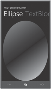
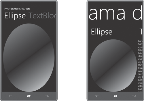
The ListBox is vertically scrollable, of course. Notice the Header text of the second PivotItem in a dimmed state next to the first one. That second PivotItem just displays an Ellipse:
Example 3. Silverlight Project: PivotDemonstration File: MainPage.xaml (excerpt)
<controls:PivotItem Header="Ellipse">
    <Ellipse>
        <Ellipse.Fill>
            <LinearGradientBrush>
                <GradientStop Offset="0" Color="{StaticResource PhoneAccentColor}" />
                <GradientStop Offset="0.5" Color="{StaticResource
PhoneBackgroundColor}" />
                <GradientStop Offset="1" Color="{StaticResource PhoneForegroundColor}"
/>
            </LinearGradientBrush>
        </Ellipse.Fill>
    </Ellipse>
</controls:PivotItem>
|
This clearly shows exactly how large an area the PivotItem is offering to its content:
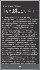
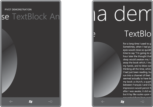
The third PivotItem contains a ScrollViewer with a large TextBlock containing the opening paragraph from a well-known novel:
Example 4. Silverlight Project: PivotDemonstration File: MainPage.xaml (excerpt)
<controls:PivotItem Header="TextBlock">
    <ScrollViewer>
        <!-- from http://www.gutenberg.org/files/7178/7178-8.txt -->
        <TextBlock TextWrapping="Wrap">
            For a long time I used to go to bed early. Sometimes, when I had put out
            my candle, my eyes would close so quickly that I had not even time to
            say "I'm going to sleep." And half an hour later the thought that it was
            time to go to sleep would awaken me; I would try to put away the book
            which, I imagined, was still in my hands, and to blow out the light; I
            had been thinking all the time, while I was asleep, of what I had just
            been reading, but my thoughts had run into a channel of their own,
            until I myself seemed actually to have become the subject of my book:
            a church, a quartet, the rivalry between François I and Charles V. This
            impression would persist for some moments after I was awake; it did not
            disturb my mind, but it lay like scales upon my eyes and prevented them
            from registering the fact that the candle was no longer burning. Then
            it would begin to seem unintelligible, as the thoughts of a former
            existence must be to a reincarnate spirit; the subject of my book would
            separate itself from me, leaving me free to choose whether I would form
            part of it or no; and at the same time my sight would return and I
            would be astonished to find myself in a state of darkness, pleasant and
            restful enough for the eyes, and even more, perhaps, for my mind, to
            which it appeared incomprehensible, without a cause, a matter dark
            indeed.
        </TextBlock>
    </ScrollViewer>
</controls:PivotItem>
|
Once again, there’s no issue with scrolling:
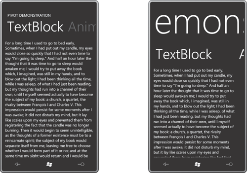
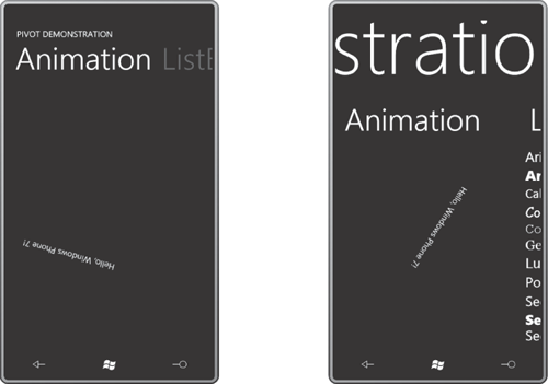
The final PivotItem contains a TextBlock with several animations applied:
Example 5. Silverlight Project: PivotDemonstration File: MainPage.xaml (excerpt)
<controls:PivotItem Header="Animation">
    <TextBlock Text="Hello, Windows Phone 7!"
               HorizontalAlignment="Left"
               VerticalAlignment="Top"
               RenderTransformOrigin="0.5 0.5">
        <TextBlock.RenderTransform>
            <CompositeTransform x:Name="xform" />
        </TextBlock.RenderTransform>
    </TextBlock>

    <controls:PivotItem.Triggers>
        <EventTrigger>
            <BeginStoryboard>
                <Storyboard>
                    <DoubleAnimation Storyboard.TargetName="xform"
                                     Storyboard.TargetProperty="Rotation"
                                     From="0" To="360" Duration="0:0:3"
                                     RepeatBehavior="Forever" />

                    <DoubleAnimation Storyboard.TargetName="xform"
                                     Storyboard.TargetProperty="TranslateX"
                                     From="0" To="300" Duration="0:0:5"
                                     AutoReverse="True"
                                     RepeatBehavior="Forever" />

                    <DoubleAnimation Storyboard.TargetName="xform"
                                     Storyboard.TargetProperty="TranslateY"
                                     From="0" To="600" Duration="0:0:7"
                                     AutoReverse="True"
                                     RepeatBehavior="Forever" />
                </Storyboard>
            </BeginStoryboard>
        </EventTrigger>
    </controls:PivotItem.Triggers>
</controls:PivotItem>
|
The animations make the TextBlock move and spin around:
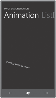
Notice the header of the first PivotItem to the right of the active one. The animations are tailored for the approximate size of the content area of the PivotItem for the large screen in portrait mode. If you turn the phone or emulator sideways, the TextBlock will drift off the screen temporarily.
The PanoramaDemonstration program is extremely similar to PivotDemonstration.
For the most part, every place in the MainPage.xaml file of
PivotDemonstration where the word “Pivot” occurs is replaced with the
word “Panorama.” Beyond that, the only other difference was the change
in the Title property to lowercase:
Example 6. Silverlight Project: PanoramaDemostration File: MainPage.xaml (excerpt)
<controls:Panorama Title="panorama demonstration">
    <controls:PanoramaItem Header="ListBox">
        . . .
    </controls:PanoramaItem>

    <controls:PanoramaItem Header="Ellipse">
        . . .
    </controls:PanoramaItem>

    <controls:PanoramaItem Header="TextBlock">
        . . .
    </controls:PanoramaItem>

    <controls:PanoramaItem Header="Animation">
        . . .
    </controls:PanoramaItem>
</controls:Panorama>
|
Although Pivot and Panorama
are conceptually very similar, they have rather different aesthetics.
The next several screen shots show the two controls side-by-side with Pivot on the left and Panorama on the right. Notice how the Title is handled in the Panorama: It’s much larger and suggests that it stretches to encompass all the other items:
Although I haven’t done so here, generally you’ll set the Background property of the Panorama control to an ImageBrush
with a wide bitmap that spreads out behind the back. (On the phone,
look at the Games, Marketplace, and Pictures applications to get some
ideas.)
As a result of the large Title, the Panorama offers less vertical space for the content of each PanoramaItem. Slightly less horizontal space is available as well because the next item to the right is peaking through at the right edge.
You can navigate forwards or backwards through the Pivot and Panorama just by sweeping your finger to the right or left. With Panorama, sweeping your finger along the Title text feels very natural. With the Pivot (but not the Panorama) you can navigate to one of the other items by tapping its Header text:
Notice how the Title of the Panorama has also shifted to visually indicate where you are in terms of the virtual width of all the content.
As you experiment with sweeping your finger across the screen, you’ll discover that the Pivot and Panorama actually behave in very different ways: In both cases the Header texts are somewhat visually uncoupled from the actual items. With the Pivot, one item moves completely off the screen before the next item slides in; with the Panorama, you can see two items simultaneously. Here’s a view in progress between two items:
The Panorama gives a much better sense of a wide virtual screen through which a viewport is visible, particularly when used with a wide background bitmap. The Pivot seems more like it’s occupying just the screen area and works by sliding individual items in and out of view.
The Pivot control defines several events that the Panorama control does not: LoadingPivotItem, LoadedPivotItem, UnloadingPivotItem, UnloadedPivotItem. These events
signal when one item slips out of view and another item slips in. These
events don’t quite apply to the more fluid nature of the Panorama.
Both Pivot and Panorama define SelectionChanged events, as well as SelectedIndex and SelectedItem. The selection is considered to be the PivotItem or PanoramaItem in full view, and the event isn’t fired until the item finishes sliding fully into place.
Both Pivot and Panorama define TitleTemplate and HeaderTemplate properties of type DataTemplate so if you use bindings to set the content of the control you can define a visual tree to indicate how the Title property and Header properties use the data.
The HeaderTemplate property is particularly important if you bind the ItemsSource property of Pivot or Panorama to a collection, in which case you aren’t creating the PivotItem or PanoramaItem objects explicitly. You’ll need this HeaderTemplate for a binding to set the Header text, but the template can consist solely of a TextBlock.
If you’re feeling particularly adventurous, you can also define a whole new ControlTemplate for Pivot or Panorama. The Pivot template requires a PivotHeadersControl (which is a TemplateItemsControl of type PivotHeaderItem) and the Panorama template requires three PanningLayer objects. PanningLayer derives from ContentControl, and the Microsoft.Phone.Controls.Primitives namespace includes PanningBackgroundLayer and PanningTitleLayer classes that derive from PanningLayer.
In the final view, we’ve circle back to the beginning. But in the Panorama control you can simultaneously see three PanoramaItem children: The ListBox is in full view, there’s a little sliver of the Ellipse at the right, but look at that snippet of rotated text intersecting the “Comic Sans MS” item: That’s the animation to the left.
