OverlapPanel defines an Orientation property and arranges its children either horizontally or vertically. If OverlapPanel is arranging its children horizontally, each child is positioned slightly to the right of the child
before it, leaving the left-most sliver of the previous child visible.
For a vertical orientation, the top of each child is visible.
If there are very many children, then that visible sliver will become very small. To make OverlapPanel
more useful, it should be possible to specify that the sliver be at
least a minimum height or width, even if that causes the contents of the
panel to overrun the available space. In possibly going beyond the
space available for it, the OverlapPanel behaves much like a regular StackPanel. A ScrollViewer will be necessary to view all the items.
OverlapPanel defines two properties, Orientation and MinimumOverlap:
Example 1. Silverlight Project: Petzold.Phone.Silverlight File: OverlapPanel.cs (excerpt)
public class OverlapPanel : Panel
{
    Size maxChildSize = new Size();

    public static readonly DependencyProperty OrientationProperty =
        DependencyProperty.Register("Orientation",
            typeof(Orientation),
            typeof(OverlapPanel),
            new PropertyMetadata(Orientation.Horizontal, OnAffectsMeasure));

    public static readonly DependencyProperty MinimumOverlapProperty =
        DependencyProperty.Register("MinimumOverlap",
            typeof(double),
            typeof(OverlapPanel),
            new PropertyMetadata(0.0, OnAffectsMeasure));

    public Orientation Orientation
    {
        set { SetValue(OrientationProperty, value); }
        get { return (Orientation)GetValue(OrientationProperty); }
    }

    public double MinimumOverlap
    {
        set { SetValue(MinimumOverlapProperty, value); }
        get { return (double)GetValue(MinimumOverlapProperty); }
    }

    static void OnAffectsMeasure(DependencyObject obj,
                                 DependencyPropertyChangedEventArgs args)
    {
        (obj as OverlapPanel).InvalidateMeasure();
    }
    . . .
}
|
Changes to either of these two properties causes a call to InvalidateMeasure, which initiates a new layout pass.
The MeasureOverride method first enumerates through all its children to obtain the maximum child size. Of course, when you use OverlapPanel with an ItemsControlListBox, all the children will probably have the same size. or
Example 2. Silverlight Project: Petzold.Phone.Silverlight File: OverlapPanel.cs (excerpt)
protected override Size MeasureOverride(Size availableSize)
{
    if (Children.Count == 0)
        return new Size(0, 0);

    maxChildSize = new Size();

    foreach (UIElement child in Children)
    {
        if (Orientation == Orientation.Horizontal)
            child.Measure(new Size(Double.PositiveInfinity, availableSize.Height));

        else
            child.Measure(new Size(availableSize.Width, Double.PositiveInfinity));

        maxChildSize.Width = Math.Max(maxChildSize.Width,
                                      child.DesiredSize.Width);

        maxChildSize.Height = Math.Max(maxChildSize.Height,
                                       child.DesiredSize.Height);
    }

    if (Orientation == Orientation.Horizontal)
    {
        double maxTotalWidth = maxChildSize.Width * Children.Count;
        double minTotalWidth = maxChildSize.Width +
                                   MinimumOverlap * (Children.Count - 1);

        if (Double.IsPositiveInfinity(availableSize.Width))
            return new Size(minTotalWidth, maxChildSize.Height);

        if (maxTotalWidth < availableSize.Width)
            return new Size(maxTotalWidth, maxChildSize.Height);

        else if (minTotalWidth < availableSize.Width)
            return new Size(availableSize.Width, maxChildSize.Height);

        return new Size(minTotalWidth, maxChildSize.Height);
    }
    // Orientation = Vertical
    double maxTotalHeight = maxChildSize.Height * Children.Count;
    double minTotalHeight = maxChildSize.Height +
                                MinimumOverlap * (Children.Count - 1);

    if (Double.IsPositiveInfinity(availableSize.Height))
        return new Size(maxChildSize.Width, minTotalHeight);

    if (maxTotalHeight < availableSize.Height)
        return new Size(maxChildSize.Width, maxTotalHeight);

    else if (minTotalHeight < availableSize.Height)
        return new Size(maxChildSize.Width, availableSize.Height);

    return new Size(maxChildSize.Width, minTotalHeight);
}
|
The method then splits into two different sections depending on the Orientation property. For example, for the vertical orientation (which I’ll be using in the example below), the method calculates a maxTotalHeight, when all the children are side-by-side without overlap, and a minTotalHeight,
when the children are overlapped to the maximum extent. If the
available height is not infinite (a possibility handled separately),
then the available height is either greater than maxTotalHeight or between minTotalHeight and maxTotalHeight, or less than minTotalHeight.
If all the children can fit side-by-side in the available space, then
that’s the space requested. But the method never requests less height
than it needs to display all the children.
The ArrangeOverride method is somewhat simpler. The increment value is the width or height of the sliver of each child that will always be visible:
Example 3. Silverlight Project: Petzold.Phone.Silverlight File: OverlapPanel.cs (excerpt)
protected override Size ArrangeOverride(Size finalSize)
{
    if (Children.Count == 0)
        return finalSize;

    double increment = 0;

    if (Orientation == Orientation.Horizontal)
        increment = Math.Max(MinimumOverlap,
             (finalSize.Width - maxChildSize.Width) / (Children.Count - 1));
    else
        increment = Math.Max(MinimumOverlap,
            (finalSize.Height - maxChildSize.Height) / (Children.Count - 1));

    Point ptChild = new Point();

    foreach (UIElement child in Children)
    {
        child.Arrange(new Rect(ptChild, maxChildSize));

        if (Orientation == Orientation.Horizontal)
            ptChild.X += increment;
        else
            ptChild.Y += increment;
    }

    return finalSize;
}
|
The StudentCardFile project has references to the Petzold.Phone.Silverlight and ElPasoHighSchool libraries. The MainPage.xaml file includes the StudentBodyPresenter in the Resources collection:
Example 4. Silverlight Project: StudentCardFile File: MainPage.xaml (excerpt)
<phone:PhoneApplicationPage.Resources>
    <elpaso:StudentBodyPresenter x:Key="studentBodyPresenter" />
</phone:PhoneApplicationPage.Resources>
|
The content area is rather simple, containing only a ScrollViewer and an ItemsControl. The ItemsPanel property of the ItemsControl references the OverlapPanel with two properties set:
Example 5. Silverlight Project: StudentCardFile File: MainPage.xaml (excerpt)
<Grid x:Name="ContentPanel" Grid.Row="1" Margin="12,0,12,0"
      DataContext="{Binding Source={StaticResource studentBodyPresenter},
                            Path=StudentBody}">
    <ScrollViewer>
        <ItemsControl ItemsSource="{Binding Students}">
            <ItemsControl.ItemTemplate>
                <DataTemplate>
                    <local:StudentCard />
                </DataTemplate>
            </ItemsControl.ItemTemplate>

            <ItemsControl.ItemsPanel>
                <ItemsPanelTemplate>
                    <petzold:OverlapPanel Orientation="Vertical"
                                          MinimumOverlap="24" />
                </ItemsPanelTemplate>
            </ItemsControl.ItemsPanel>
        </ItemsControl>
    </ScrollViewer>
</Grid>
|
The simplicity of the markup here is mostly a result of the DataTemplate property of the ItemsControl being set to another control named StudentCard.
StudentCard derives from UserControl. Deriving from UserControl is a common technique for creating a control to serve as a DataTemplate. If you ignore the ellipses (…) below, this is a very straightforward assemblage of a TextBlock and Image elements, with a collapsed Rectangle used as a dividing line:
Example 6. Silverlight Project: StudentCardFile File: StudentCard.xaml (excerpt)
<UserControl x:Class="StudentCardFile.StudentCard"
             xmlns="http://schemas.microsoft.com/winfx/2006/xaml/presentation"
             xmlns:x="http://schemas.microsoft.com/winfx/2006/xaml"
             FontFamily="{StaticResource PhoneFontFamilyNormal}"
             FontSize="{StaticResource PhoneFontSizeNormal}"
             Foreground="{StaticResource PhoneForegroundBrush}"
             Width="240" Height="240">

    . . .

    <Border BorderBrush="{StaticResource PhoneAccentBrush}"
            BorderThickness="1"
            Background="{StaticResource PhoneChromeBrush}"
            CornerRadius="12"
            Padding="6 0">

        . . .

        <Grid>
            <Grid.RowDefinitions>
                <RowDefinition Height="Auto" />
                <RowDefinition Height="Auto" />
                <RowDefinition Height="*" />
                <RowDefinition Height="Auto" />
            </Grid.RowDefinitions>

            <TextBlock Grid.Row="0"
                        Text="{Binding FullName}" />

            <Rectangle Grid.Row="1"
                       Fill="{StaticResource PhoneAccentBrush}"
                       Height="1"
                       Margin="0 0 0 4" />

            <Image Grid.Row="2"
                   Source="{Binding PhotoFilename}" />

            <StackPanel Grid.Row="3"
                        Orientation="Horizontal"
                        HorizontalAlignment="Center">
                <TextBlock Text="GPA = " />
                <TextBlock Text="{Binding GradePointAverage}" />
            </StackPanel>
        </Grid>
    </Border>
</UserControl>
|
The cards are listed down the left side of the display but only the top of each card is visible. Conveniently, the top of each card is a TextBlock displaying the student’s name:
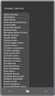
I set MinimumOverlap to a value sufficient to display this TextBlock. As you scroll down to the bottom, you’ll see that the bottom card is entirely visible:
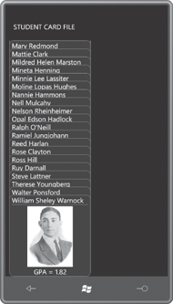
That’s great if you want to look at the very last card,
but rather deficient otherwise. What we need is a way to selectively
bring a particular card into view. One approach might be to change the Canvas.ZIndex
attached property of a particular card. Or, the whole deck of cards
might be re-ordered to move a particular card to the topmost position.
I decided I wanted a selected
card to slide out of the deck when it’s touched, and then slide back
when the card is touched again, or when another card is touched.
As you start integrating other code with ScrollViewer, you’ll discover that ScrollViewer tends to hog the Manipulation events. Obviously ScrollViewer needs these Manipulation events for its own scrolling logic. But that makes it difficult for visual descendents of the ScrollViewer (such as these StudentCard elements) to process Manipulation events of their own for sliding in and out of the deck
For that reason, I decided that StudentCard would install a handler for the low-level Touch.FrameReported event, and to use that to toggle a dependency property named IsOpen. Here’s that property in the StudentCard code-behind file:
Example 7. Silverlight Project: StudentCardFile File: StudentCard.xaml.cs (excerpt)
public partial class StudentCard : UserControl
{
    . . .
    public static readonly DependencyProperty IsOpenProperty =
        DependencyProperty.Register("IsOpen",
            typeof(bool),
            typeof(StudentCard),
            new PropertyMetadata(false, OnIsOpenChanged));
    . . .
    bool IsOpen
    {
        set { SetValue(IsOpenProperty, value); }
        get { return (bool)GetValue(IsOpenProperty); }
    }
    . . .
}
|
I’ll show you the property-changed handler for IsOpen shortly.
When you touch one instance of StudentCard,
it is supposed to slide out of the deck, but if another card is
currently exposed, that card should slide back into the deck. If the CardFile class is to handle this logic on its own, each instance of CardFile needs access to all the other instances. For that reason, I defined a static field of type List to maintain these instances:
Example 8. Silverlight Project: StudentCardFile File: StudentCard.xaml.cs (excerpt)
public partial class StudentCard : UserControl
{
    static List<StudentCard> studentCards = new List<StudentCard>();
    . . .
    public StudentCard()
    {
        InitializeComponent();
        studentCards.Add(this);
    }
    . . .
}
|
Each new instance simply adds itself to the collection.
It also became apparent to me that each individual StudentCard instance does not need its own handler for the Touch.FrameReported event. All instances could share the same static handler installed in the static constructor and referencing static fields:
Example 9. Silverlight Project: StudentCardFile File: StudentCard.xaml.cs (excerpt)
public partial class StudentCard : UserControl
{
    . . .
    static int contactTime;
    static Point contactPoint;
    . . .
    static StudentCard()
    {
        Touch.FrameReported += OnTouchFrameReported;
    }
    . . .
    static void OnTouchFrameReported(object sender, TouchFrameEventArgs args)
    {
        TouchPoint touchPoint = args.GetPrimaryTouchPoint(null);

        if (touchPoint != null && touchPoint.Action == TouchAction.Down)
        {
            contactPoint = touchPoint.Position;
            contactTime = args.Timestamp;
        }
        else if (touchPoint != null && touchPoint.Action == TouchAction.Up)
        {
            // Check if finger is directly over StudentCard or child
            DependencyObject element = touchPoint.TouchDevice.DirectlyOver;

            while (element != null && !(element is StudentCard))
                element = VisualTreeHelper.GetParent(element);
            if (element == null)
                return;

            // Get lift point and calculate difference
            Point liftPoint = touchPoint.Position;
            double distance = Math.Sqrt(Math.Pow(contactPoint.X - liftPoint.X, 2) +
                                        Math.Pow(contactPoint.Y - liftPoint.Y, 2));

            // Qualify as a Tap if distance < 12 pixels within 1/4th second
            if (distance < 12 && args.Timestamp - contactTime < 250)
            {
                // Enumerate StudentCard objects and set IsOpen property
                foreach (StudentCard studentCard in studentCards)
                    studentCard.IsOpen =
                             (element == studentCard && !studentCard.IsOpen);
            }
        }
    }
    . . .
}
|
With a little
experimentation, I determined that I wanted a tap to qualify as a touch
and release with ¼ second where the touch point moves less than 12
pixels. That seemed to be about right and still allow flicks to be
recognized by the ScrollViewer.
At the bottom of this method a foreach loop enumerates through all the StudentCard objects and sets the IsOpen property on each one. IsOpen is always set to falseStudentCard is not the touched element, and IsOpen is also set to false if IsOpen is currently true. Otherwise, if the StudentCard object is the touched element, and IsOpen is currently false, then it’s set to true. Of course, as a dependency property, IsOpen property-changed handlers will only be called if the property is truly changing. if the
I have not yet shown you the property-changed handler for the IsOpen property. As usual, the static version calls the instance version:
Example 10. Silverlight Project: StudentCardFile File: StudentCard.xaml.cs (excerpt)
public partial class StudentCard : UserControl
{
    . . .
    static void OnIsOpenChanged(DependencyObject obj,
                                DependencyPropertyChangedEventArgs args)
    {
        (obj as StudentCard).OnIsOpenChanged(args);
    }
    . . .

    void OnIsOpenChanged(DependencyPropertyChangedEventArgs args)
    {
        VisualStateManager.GoToState(this, IsOpen ? "Open" : "Normal", false);
    }
}
|
The instance version calls VisualStateManager.GoToState.
Although the Visual State Manger is most frequently used in connection
with controls and controls template, you can also use it with UserControl derivatives such as StudentCard. Calling GoToState is how you trigger a state change from code.
In the XAML file, the Visual State Manager markup must appear right after the topmost element in the visual tree. In the case of StudentCard.xaml, that’s the Border
element. Here’s the rest of StudentCard.xaml (with some repetition from
the previous excerpt) showing the Visual State Manager markup targeting
a TranslateTransform set on the control itself:
Example 11. Silverlight Project: StudentCardFile File: StudentCard.xaml (excerpt)
<UserControl x:Class="StudentCardFile.StudentCard"
             xmlns="http://schemas.microsoft.com/winfx/2006/xaml/presentation"
             xmlns:x="http://schemas.microsoft.com/winfx/2006/xaml"
             FontFamily="{StaticResource PhoneFontFamilyNormal}"
             FontSize="{StaticResource PhoneFontSizeNormal}"
             Foreground="{StaticResource PhoneForegroundBrush}"
             Width="240" Height="240">

    <UserControl.RenderTransform>
        <TranslateTransform x:Name="translate" />
    </UserControl.RenderTransform>

    <Border BorderBrush="{StaticResource PhoneAccentBrush}"
            BorderThickness="1"
            Background="{StaticResource PhoneChromeBrush}"
            CornerRadius="12"
            Padding="6 0">

        <VisualStateManager.VisualStateGroups>
            <VisualStateGroup x:Name="CommonStates">
                <VisualState x:Name="Open">
                    <Storyboard>
                        <DoubleAnimation Storyboard.TargetName="translate"
                             Storyboard.TargetProperty="X"
                             To="220" Duration="0:0:1" />
                    </Storyboard>
                </VisualState>

                <VisualState x:Name="Normal">
                <Storyboard>
                    <DoubleAnimation Storyboard.TargetName="translate"
                             Storyboard.TargetProperty="X"
                             Duration="0:0:1" />
                </Storyboard>
            </VisualState>
            </VisualStateGroup>
        </VisualStateManager.VisualStateGroups>

        . . .

    </Border>
</UserControl>
|
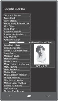
When you tap one of the items, it slides out to reveal the full card:
But much of the required code doesn’t replace the XAML: the code helps support
the markup. These classes take the form of binding converters and
custom panels that are referenced within the XAML file. In general, you
should try to code for XAML and not instead of XAML, and you’ll be a happier and better Silverlight and Windows Phone 7 programmer.
