An analytic chart is a highly interactive
visualization that can be placed on a web page. The analytic chart
enables deep analytics to be performed without the user installing any
sort of client on their machine. The interactivity of the analytic chart
enables the data to be displayed in many different ways and at
different levels of detail so that users can view and look for trends in
the data.
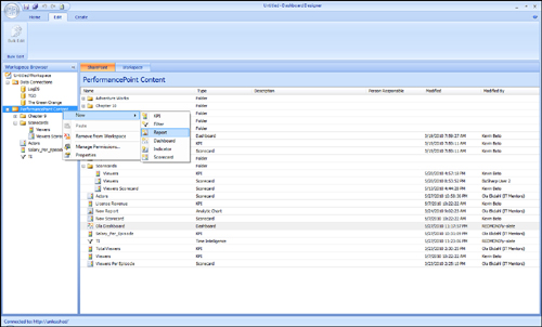
There are two ways to create an
analytic chart. You can either select Analytic Chart from the Create
tab in Dashboard Designer or you can right-click a PerformancePoint list
in the Workspace Browser and then select Report from the pop-up menu
and Analytic Chart from the dialog box (see Figure 1).
The next step is to select a
data source. To do this, you can either select a data source that exists
in your workspace or select a data source that has been deployed to
SharePoint.
Caution
It is important to note that
you can only use Analysis Services or PowerPivot data sources for these
types of reports. You cannot select a tabular data source for these
types of reports.
When you click Finish, the new
report is added to your workspace. In this example, name the report
Viewers per Season, as shown in Figure 2. Notice that the report appears in the Workspace Browser list under PerformancePoint Content.
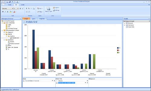
You
now have the ability to drag and drop measures, dimensions, and named
sets and add these to the series (x-axis), bottom axis (y-axis), or
background. The exact effect varies on the type of report, but in
general, it is similar to the way Excel renders effects when data is
added.
The
analytic chart automatically appears as a bar chart. Even though this
is the default setting, you can change the default analytic chart to any
of the following chart types:
Grid
Stacked bar chart
100% stacked bar chart
Line chart
Line chart with markers
Pie chart
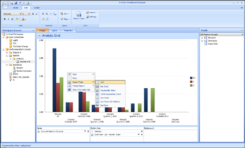
Right-click anywhere on the
report to change the report type. From the context menu that appears,
select Report Type, and then select the type of report you want (see Figure 3).
Adding Data Elements
In this example, you modify a
default report by adding data elements to break down viewers by season
to illustrate how the interactivity of the analytic chart enables data
to be displayed in many different ways and at different levels of
detail.
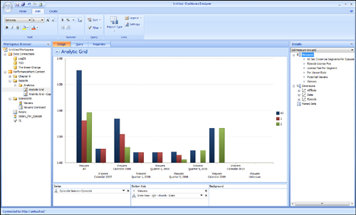
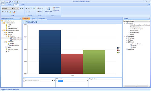
Figure 4 shows you what the Design workspace looks like before any elements have been added.
The first step in this process is
to add the Viewers measure to the Bottom Axis and the Season-Episode
hierarchy from the Episode dimension to the Series axis. Add the measure
and hierarchy by dragging the items from the Details pane on the right
to the appropriate area in the Design workspace, as shown in Figure 5.
Adding Additional Measures and Dimensions
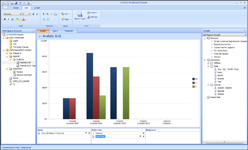
Now
you can continue to add additional measures, hierarchies, and
attributes as necessary. One more attribute, Year, has been added to the
report shown in Figure 6.
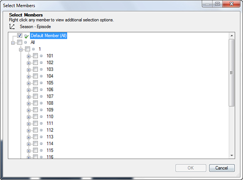
You can select the members you
want to use in your chart. In this example, you added the Season-Episode
hierarchy and all members of that hierarchy to the chart. You can also
select individual members. Click the arrow next to the hierarchy name
(Episode Season-Episode) to see the dialog box through which you can
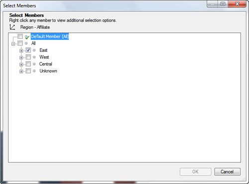
filter members. Figure 7 shows the dialog window that enables you to pick members.
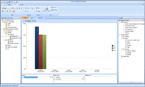
In this example, you selected episode 101, 102, and 103. Information for these episodes is now featured in the chart (see Figure 8).
Using Measures and Dimensions as Filters
The
background series enables you to add measures and dimensions that act
as a filter. Continuing with this example, you add the Region-Affiliate
hierarchy from the Affiliate dimension to the background series, and
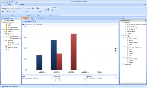
then you select the East region (see Figure 9).
Notice that chart in Figure 10
has changed and now displays data for the East region only. By enabling
the information bar, you can select to display the region in the
upper-left corner of the report, underneath the report title.
Dimensions added to
the background series are available when you add filters to your
dashboard, too. For example, you can add a time hierarchy to the
background series, configure it to use the All member, and then filter
data based on year after the dashboard has been deployed.
Using Interactivity Features and Context Menus
When you right-click an
analytic chart, you expose interactive options that enable you to modify
and refine the view on your data. Two context menus are available. One
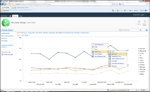
context menu is available by clicking a bar or line on the chart (see Figure 11) The second context menu is available by clicking outside of a bar or line in a chart (see Figure 12).
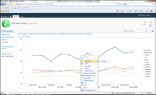
With the context menu shown in Figure 11, you can do the following:
- Drill down to another dimension.
- Show only selected member.
- Show details (drill through).
- Remove the selected member.
- Remove all members but the selected one.
- See additional actions. These are actions defined in the cube such as drill through.
- Sort and filter data member such as Top 10, Largest to Smallest, Filter Empty series.
- Show or hide the information bar. This bar is displayed at the top of the chart.
- Pivot.
- Show
a decomposition tree report.
With the context menu shown in Figure 12, you can do the following:
- Add or remove measures.
- Filter.
- Pivot.
- Change
report type. For example, this context menu enables you to change from a
bar chart to a grid, to a stacked bar chart, or to a pie chart.