The
steps for creating an analytic grid chart are the same as for the
analytic chart. You can create an analytic grid chart two ways. One
method is to select Analytic Grid from the Create tab in Dashboard
Designer. The second method is to right-click a PerformancePoint list in
the Workspace Browser, select Report, and then select Analytic Grid
from the dialog box.
Just as with the analytic chart, the analytic grid works only with Analysis Services cube and PowerPivot data sources.
Note
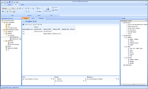
Notice that the design area for the analytic grid looks similar to the chart design area (see Figure 1).

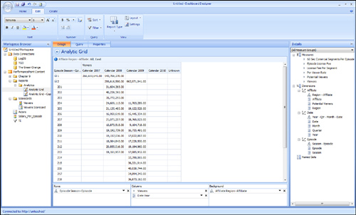
With analytic grids, you can add measures and dimensions to rows, columns, and background. As shown in Figure 2, the measure Viewers and the attribute Year from the Date dimension were added to columns. Next, you can add the Episode dimension to Rows to produce the report shown in Figure 2. The dimension members are expandable so that you can expand a parent to view its children.

Using Interactivity Features and Context Menus
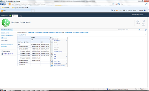
Like the analytic chart,
the analytical grid provides two context menus with the same options
discussed in the previous section. One context menu is available by
clicking the data on the chart, and the second context menu is available
by clicking outside of the data in the chart (see Figure 3).
