Examining How a Score Is Calculated
This section discusses the steps involved in calculating the score that is ultimately used in the final scorecard.
Step 1: Calculate the Band by Value
The Band by Value number is
calculated through the scoring mechanism called out in the scoring
pattern selection screen. The available options are described next.
Band by Normalized Value
This option “normalizes” the
score so that the thresholds can be dynamically compared. This is
especially useful if both the target and actual values vary based on
values coming from the data source. The formula varies depending on how
the target value is to be used.
Increasing Is Better:
This scoring pattern is used when there is no upper bound on what is
good, and when larger numbers are generally considered better than
smaller numbers. One example of this is profits, where there is no such
thing as having too much money.

Decreasing Is Better:
This scoring pattern is used when there is no lower bound on what is
considered good, and when smaller numbers are generally considered
better than larger ones. One example of this is expenses where saving
more money is usually better.

Closer to Target Is Better:
Headcount is an example where you might use this scoring pattern. When
tracking headcount for a department or a project, it is possible to have
too many or too few people. This means it is preferable to keep the
actual count as close as possible to the target value.

Band by Numeric Value of Actual
This option enables you to
enter exact values for thresholds. This is the intended scoring pattern
to use if there are static and absolute values that divide the indicator
levels.
In The Green Orange
business scenario, having a target number of commercials per episode is
an example when this option might apply. It is not difficult to come up
with worst and target values for number of commercials per episode.
These values do not change across episodes, which means you can set the
values once in Dashboard Designer and keep the values constant for
future episodes.
This is also the easiest
scoring pattern to understand since there is less math and calculations
involved. Its simplicity makes it a good scoring pattern with which to
begin.
Band by Stated Score
The Banding by Stated
Score method enables you to bypass the calculation part of the score and
directly select a Band by Value. It is possible to select a filtered
data value directly from the data source or to author a custom MDX tuple
expression.
This feature is tricky to use
and is most applicable when dealing with Excel data sources where it is
possible to do calculations in a data column and manually generate the
Band by Value if you want more control over how the score is set.
The selection of the stated score query is only accessible through the Set Scoring Pattern and Indicator Wizard.
Step 2: Identify the In Band Value
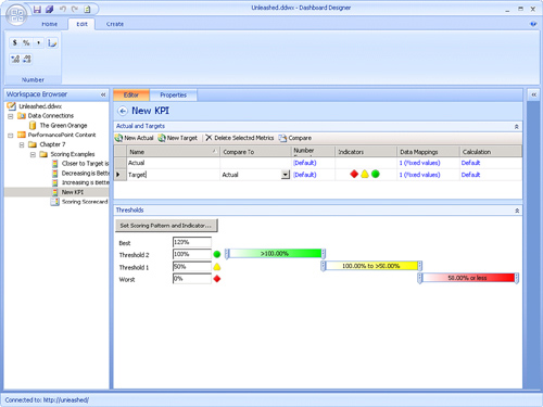
When the Band by Value is
calculated, the PPS scoring engine maps the Band by Value to a range
defined by the Threshold settings, as shown in Figure 6.
Step 3: Normalize the Score
When the appropriate
threshold is identified, the true normalized score is calculated. This
calculation varies based on the band in which the score was placed. The
following points provide a high-level overview of this process:
The bands are
distributed evenly between zero, which is the worst score and one, which
is the best score. All bands are given equal weight. This means that if
there is a band that has a smaller percentage range, it is equivalent
to a band that has a larger range.
The relative range of the band that the Band by Value score falls in is determined.
Final score is determined based on where that score falls within that range.
The technique used to
accomplish this feat varies based on the scoring pattern and the banding
method chosen. After the normalization takes place, this value can be
compared side by side with other values.
Mathematically, the
formula is a base adjustment for the band the value falls into, combined
with the In Band Value, which is the relative position of that value
within the specified thresholds. For example, if the value falls into
the top band of a two-level indicator, the position will always be
relative between the 50 percent and 100 percent marks, no matter how
wide the range is for those values.
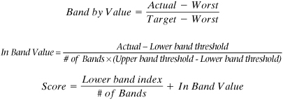
The formula to calculate the In Band Value is as follows:

The formula to calculate
the offset for the Increasing Is Better scoring pattern is shown here.
This result is added to the In Band Value to get the final score:

The formula to calculate the
offset is similar for the Decreasing Is Better scoring pattern. It is
flipped and when the calculation is done for the final score the In Band
Value is subtracted from this:

For the Closer to Target
scoring pattern only, if the score is below the target value, it is
subtracted from 1. If it is above the target, it is left alone. The
value is then multiplied by 2. This is done to compensate as the range
of possible values is doubled because conceptually this pattern is
treated as two independent patterns, one above and one below the target.
Tip
If you want to
understand more about how the score is calculated in PPS, it is helpful
to experiment with fixed value KPIs while using an Excel spreadsheet
with the calculations included that verify the outcome.
It is also helpful to show the
score on a scorecard. To do this, right-click the target metric on the
scorecard, select Metric Settings, and then set either the primary or
the secondary value displayed to the score.
Examining a Scoring Walkthrough
The following example
demonstrates Increasing Is Better scoring with normalized banding. This
example walks you step by step through the scores that are applicable to
the Increasing Is Better scoring type. You can use the same formulas
and procedure with your own numbers to understand why PPS is giving you
whatever scores it does.
The calculations relevant for this scoring pattern are the following:

Consider the following thresholds as defined in Figure 7.
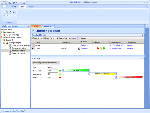
In this example, the worst value is 0, the actual value is .8, and the target value is 1.
The Band by Value would be
(0.8 − 0) / (1 − 0), which is .8. This falls between Threshold 1 and
Threshold 2. This means the indicator is yellow, which puts this score
in the second band.
The In Band Value is calculated at (0.8 − 0.2) / (3*(0.9 − 0.2)), which gives a value of 0.285.
Adding in the band offset adds 1/3 to this value, which results in a normalized score of 0.619.
Decreasing Is Better Scoring with Numeric Value Banding Example
Because the Band by Value when using Numeric Values for banding is the actual, the calculation is only one step less:

Consider the following thresholds on a 10-level indicator as defined in Figure 8.
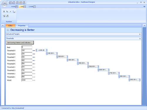
In this example, the worst value is 1,000, the actual value is 170, and the target value is 0.
The Band by Value is the
Actual (170), which is .8. This falls between Threshold 1 and Threshold
2, which means the indicator is yellow putting this score in the second
band.
Normalizing the score with the previous formula gives you the following:

This results in a normalized score of 0.83.
Closer to Target Is Better Scoring with Normalized Banding Example
Listed here are the two calculations relevant for this scoring pattern:
Consider the thresholds shown in Figure 9.
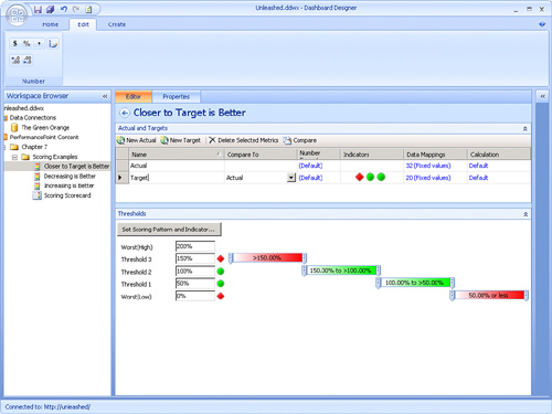
In this example, the worst value is 5, the actual value is 7, and the target value is 10.
The Band by Value would be (7 −
5) / (10 − 5), which is 0.133. This falls between the Worst value and
Threshold 1, which means the indicator is red putting this score in the
bottom band.
As previously specified,
because you are doing a Closer to Target Is Better scoring pattern, you
need to multiply the In Band Value by 2 to compensate for the two halves
to the scoring pattern. The In Band Value will be 2*(0.1333 − .0) /
(4*(.5 − 0)), which is 0.133.
Because it is in the bottom band, the band offset will be 0 / 2, resulting in a normalized score of 0.133, or 13.3%.
Examining Rollup Scoring
After the final scores have
been calculated at a particular tree level in a scorecard, if there is
an objective KPI above these scores, the score is “rolled up” to produce
the value for the parent KPI.
Some scores can be weighted
more than others, which means they have larger influence over the
rolled-up value. Weighting is a scorecard-level setting that can be done
through the KPI settings dialog box. Note that weighting is used only
if the default calculation is used on the parent KPI.