Scoring is a complex concept that has been included
in the PPS feature set. At a conceptual level, the score of a KPI is
what is used to enable it to be compared to other KPIs that specifically
have different metrics or thresholds.
Table 1
summarizes the terms unique to scoring that are used when discussing
scoring concepts within PPS. These terms are all unique to PPS, but some
of them do not apply to all types of scoring patterns.
Table 1. Scoring Definitions
| Term | Definition |
|---|
| Score | A calculated value between 0 and 1 indicating the relative position, with 0 being worst and 1 being the best. |
| Scoring pattern | The
definition of what is considered good or bad for the score. For
example, Increasing Is Better means that a higher value is better,
whereas Decreasing Is Better means that a lower value is better. |
| Threshold | A
boundary where the indicator changes levels such as from yellow to
green. There is one threshold per level available in the indicator being
used. |
| Banding | The
input type for the threshold boundaries. Normalized values are entered
as percentages from the target, whereas numeric values are absolute
values. |
| Normalize | In
the case of parent/child KPI hierarchies, normalization is how the
individual scores are combined to represent the parent or rollup score. |
| Best/worst value | Absolute
values that represent the boundaries of possible values for the score.
Any scores outside of this boundary are pegged at either 0 or 1. |
Changing a Scoring Pattern
Scoring patterns for a KPI are
stored within each target metric in the KPI. Scoring patterns can only
be edited through the Edit Banding Settings Wizard. The user interface
varies based on which scoring pattern is used. This example uses the
default Increasing Is Better/Band by Normalized Value Pattern.
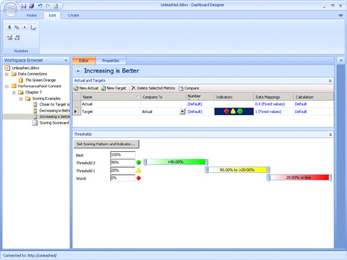
1. | Click the Indicators column in the Target row, as shown in Figure 1.
|
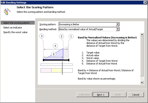
2. | Click the Set Scoring Pattern and Indicator button to display the Edit Banding Settings Wizard, as shown in Figure 2.
|
3. | Choose
the desired scoring pattern and banding method; then click Next. A
brief explanation of the selected scoring pattern and banding method
appears.
Note
This description shown in the
Edit Banding Settings dialog is used to calculate the band by value, not
the final score.
|
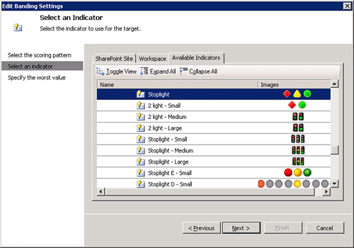
4. | After
choosing the scoring pattern and banding method, you need to select an
indicator. User created indicators appear in the SharePoint Site or
Workspace tabs, whereas default built-in indicators appear in the
Available Indicators tab. Find the indicator that you want to use,
select it, and then click Next.
Note
The indicators shown in Figure 3
match the scoring pattern. If Closer to Target Is Better is selected,
only centered indicators will be shown. If the Increasing Is Better or
the Decreasing Is Better scoring patterns are selected, standard
indicators will be available for selection here.
|
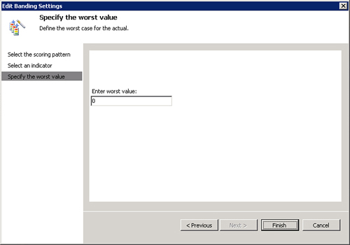
5. | The final screen of the wizard, shown in Figure 4,
asks for the worst value that will be used in the calculation to
determine the worst case for the actual value. If the score is below
this threshold, the score will be pegged at zero.
|
Caution
You
may be tempted to put in an excessively large or small value for the
worst value, especially in the Decreasing Is Better scenario. This value
will directly affect the score generated, so setting an extreme worst
value requires the creation of very tight and unnatural thresholds to
ensure logical scoring behavior.
The score is capped at the
worst value, so there is no benefit to setting an unrealistic worst
value. Instead, make this the “best possible” worst value to make it
easier to work with the threshold calculation.
Editing Thresholds
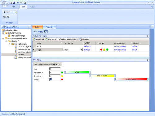
It is also possible to edit
thresholds in the KPI editing user interface. You can access the
Thresholds dialog box by clicking anywhere on the target metric row you
want to edit. The threshold editing UI appears below the metrics for the
KPI, as shown in Figure 5.
Tip
If you do not see the
Thresholds user interface after selecting a target metric, it is
probably collapsed. In this case, you can re-expand the view by clicking
the expansion chevron on the Thresholds section at the bottom of
Dashboard Designer.
The thresholds set in
this example are dependent on the scoring pattern selected. The
thresholds give a general impression of what color the indicators will
be for various values.
Caution
Do not confuse this with the
KPI score that can be displayed on the scorecard. This is actually the
Band by Value number that the threshold editor is using. There is
another step in the scoring process that normalizes the score based on
the band. For more information, see the following section, “Examining How a Score Is Calculated.”