As you’ve seen, it’s possible to derive from a class that derives from Control to add some additional properties. It’s also possible to derive directly from Control to create entirely new controls (or to derive from ContentControl if the control needs to have a Content property). However, deriving from Control or ContentControl
in a proper and cordial manner involves creating a default template in
XAML that describes the control’s visual appearance, and allowing that
template to be replaced to redefine the visuals of the control.
This is not inherently
difficult, but often requires giving deep thought to how the control
will be customized.
If you’re in the control-writing business, the custom controls that you develop and market should derive from Control or ContentControl or ItemsControl . A replaceable template is an essential feature for commercial-grade controls.
But some custom controls
don’t require additional visual customization: For controls specific to a
particular project, or used only by one programmer or a programming
team within a company, or controls that have an inherent visual
appearance, it’s usually not necessary to allow the control’s template
to be replaced.
For such controls, deriving from UserControl is often an ideal solution. (The User in UserControl is you—the programmer.) Moreover, you already have experience deriving from UserControl! The PhoneApplicationPage class derives from Page, which derives from UserControl.
UserControl has a property named Content of type UIElement. When deriving from UserControl you generally define new properties in code (and often methods and events as well), but you define your visuals in XAML by assigning a visual tree to that Content property. This makes the Content property unusable for other purposes. If your UserControl derivative requires a Content property, you should define a new property named Child or something similar to serve the same purpose.
Making liberal use of UserControl is an ideal way to modularize the visuals of your program.
If you wanted to adapt the concept of ColorScroll to a reusable control, you might begin by deriving a class named ColorColumn from UserControl, and then putting three ColorColumn controls together in a UserControl derivative named RgbColorScroller.
ColorColumn and RgbColorScroller can both be found in a dynamic link library (DLL) project called Petzold.Phone.Silverlight. Creating
a DLL in Visual Studio for your Windows Phone programs is easy: In the
New Project dialog, select Silverlight for Windows Phone at the left and
Windows Phone Class Library in the middle area. (To facilitate testing, you’ll probably want a second application
project in the same solution as the library; or you might want to
develop custom classes in an application project and then move them to
the library when you know they’re working right.)
Within the Petzold.Phone.Silverlight
project (or any other library project), you can add a new item by
right-clicking the project name in the Solution Explorer and selecting
Add and New Item.
To make a new UserControl in either an application project or a library project. From the Add New Item dialog box, select Windows Phone User Control and give it a name.You’ll get two files: a XAML file and a code-behind file.
The XAML file is rather simpler than the one created for a PhoneApplicationPage class. The root element is UserControl. It contains an x:Class attribute indicating the derived class, and the only nested element is a Grid named LayoutRoot. You don’t need to retain that Grid but it’s usually convenient.
The root element contains attributes to set these properties:
FontFamily="{StaticResource PhoneFontFamilyNormal}"
FontSize="{StaticResource PhoneFontSizeNormal}"
Foreground="{StaticResource PhoneForegroundBrush}"
You’ll almost certainly want to delete those attributes. These three properties are inherited through the visual tree, so the UserControl will normally get the settings of these properties from MainPage.
By setting these properties here, you’re disabling any markup (or code)
that sets these properties on the control that you’re creating. Keep
these properties in the UserControl only if your control relies on them.
I also deleted the designer-related attributes, so here’s the complete ColorColumn.xaml file. Notice I’ve also changed the Background property on the Grid from a StaticResource referencing PhoneChromeBrush to Transparent:
Example 1. Silverlight Project: Petzold.Phone.Silverlight File: ColorColumn.xaml
<UserControl
    x:Class="Petzold.Phone.Silverlight.ColorColumn"
    xmlns="http://schemas.microsoft.com/winfx/2006/xaml/presentation"
    xmlns:x="http://schemas.microsoft.com/winfx/2006/xaml">

    <Grid x:Name="LayoutRoot" Background="Transparent">
        <Grid.RowDefinitions>
            <RowDefinition Height="Auto" />
            <RowDefinition Height="*" />
            <RowDefinition Height="Auto" />
        </Grid.RowDefinitions>

        <TextBlock Name="colorLabel"
                   Grid.Row="0"
                   TextAlignment="Center" />

        <Slider Name="slider"
                Grid.Row="1"
                Orientation="Vertical"
                Minimum="0"
                Maximum="255"
                ValueChanged="OnSliderValueChanged" />

        <TextBlock Name="colorValue"
                   Grid.Row="2"
                   Text="00"
                   TextAlignment="Center" />
    </Grid>
</UserControl>
|
The Grid has three rows with a TextBlock at the top with a name of colorLabel, a Slider with a range of 0 to 255, and another TextBlock with a name of colorValue. The Slider has an event handler set on its OnSliderValueChanged event.
The text displayed by the TextBlock named colorLabel
will indicate that color, but I decided I wanted to handle that text a
little differently, with a property specifically for that purpose.
This means the ColorColumn class defines two properties—a Label property for the text above the Slider as well as the more expected Value property corresponding to the Slider position. Like the Slider itself, the ColorColumn class also defines an event named ValueChanged to indicate when the Slider value has changed.
Generally a UserControl derivative will define its own properties
and events, and very often these properties and events will parallel
properties and events of elements in its visual tree. It’s typical for a
class like ColorColumn to have a Label property corresponding to the Text property of a TextBlock, and a Value property corresponding to the Value property of the Slider, and a ValueChanged event corresponding to the ValueChanged event of the Slider.
Here’s the portion of the ColorColumn code-behind file devoted to the Label property for the text above the Slider:
Example 2. Silverlight Project: Petzold.Phone.Silverlight File: ColorColumn.xaml.cs (excerpt)
public partial class ColorColumn : UserControl
{
    . . .
    public static readonly DependencyProperty LabelProperty =
        DependencyProperty.Register("Label",
            typeof(string),
            typeof(ColorColumn),
            new PropertyMetadata(OnLabelChanged));
    . . .
    public string Label
    {
        set { SetValue(LabelProperty, value); }
        get { return (string)GetValue(LabelProperty); }
    }
    . . .
    static void OnLabelChanged(DependencyObject obj,
                               DependencyPropertyChangedEventArgs args)
    {
        (obj as ColorColumn).colorLabel.Text = args.NewValue as string;
    }
}
|
The property-changed handler for Label simply sets the value to the Text property of the TextBlock in the visual tree named colorLabel. This is one way that a property defined on the custom
control is transferred to a property on an element in the visual tree.
The Value property in ColorColumn is a little more complex because it needs to fire a ValueChanged event. This Value property is eventually used in the calculation of a Color, so I thought it should be of type byte rather than double. Here’s the code in the class pertaining to the Value property and ValueChanged event:
Example 3. Silverlight Project: Petzold.Phone.Silverlight File: ColorColumn.xaml.cs (excerpt)
public partial class ColorColumn : UserControl
{
    public static readonly DependencyProperty ValueProperty =
        DependencyProperty.Register("Value",
            typeof(byte),
            typeof(ColorColumn),
            new PropertyMetadata((byte)0, OnValueChanged));
    . . .
    public event RoutedPropertyChangedEventHandler<byte> ValueChanged;
    . . .
    public byte Value
    {
        set { SetValue(ValueProperty, value); }
        get { return (byte)GetValue(ValueProperty); }
    }
    . . .
    static void OnValueChanged(DependencyObject obj,
                               DependencyPropertyChangedEventArgs args)
    {
        (obj as ColorColumn).OnValueChanged((byte)args.OldValue, (byte)args.NewValue);
    }

    protected virtual void OnValueChanged(byte oldValue, byte newValue)
    {
        slider.Value = newValue;
        colorValue.Text = newValue.ToString("X2");

        if (ValueChanged != null)
            ValueChanged(this,
                new RoutedPropertyChangedEventArgs<byte>(oldValue, newValue));
    }
    . . .
}
|
To define the ValueChanged event I chose to use the generic RoutedPropertyChangedEventHandler and the corresponding RoutedPropertyChangedEventArgs.) This is a good choice for signaling when dependency properties change because it accommodates old and new values.
The static OnValueChanged method calls a protected virtual instance method also named OnValueChanged but with arguments indicating the old and new property values. (My design was inspired by the OnValueChanged method in RangeBase.) This instance method sets the Slider and the TextBlock indicating the current value and fires the ValueChanged event.
The only code of ColorColumn not yet discussed encompass the constructor and the handler for the ValueChanged event of the Slider. This event handler simply casts the Value property of the Slider to a byte and sets it to the Value property of the ColorColumn class.
Example 4. Silverlight Project: Petzold.Phone.Silverlight File: ColorColumn.xaml.cs (excerpt)
public partial class ColorColumn : UserControl
{
    . . .
    public ColorColumn()
    {
        InitializeComponent();
    }
    . . .
    void OnSliderValueChanged(object sender,
                              RoutedPropertyChangedEventArgs<double> args)
    {
        Value = (byte)args.NewValue;
    }
}
|
And now you may detect an infinite loop: The user manipulates the Slider. The Slider fires a ValueChanged event. The OnSliderValueChanged method sets the Value property of ColorColumn. The static property-changed handler OnValueChanged is called. The static method calls the instance OnValueChanged method, which sets the Value property of the Slider, which fires another ValueChanged event, and so forth.
In reality, this doesn’t happen because at some point one of these Value properties—either the Value property of the Slider or the Value property of ColorColumn—will be set to its existing value, and no property-changed event will be fired. The infinite loop grinds to a halt.
The RgbColorScoller class also derives from UserControl and consists of three ColorColumn controls. Here’s the complete XAML file:
Example 5. Silverlight Project: Petzold.Phone.Silverlight File: RgbColorScroller.xaml
<UserControl
    x:Class="Petzold.Phone.Silverlight.RgbColorScroller"
    xmlns="http://schemas.microsoft.com/winfx/2006/xaml/presentation"
    xmlns:x="http://schemas.microsoft.com/winfx/2006/xaml"
    xmlns:petzold="clr-namespace:Petzold.Phone.Silverlight">

    <Grid x:Name="LayoutRoot" Background="Transparent">
        <Grid.ColumnDefinitions>
            <ColumnDefinition Width="*" />
            <ColumnDefinition Width="*" />
            <ColumnDefinition Width="*" />
        </Grid.ColumnDefinitions>

        <petzold:ColorColumn x:Name="redColumn"
                             Grid.Column="0"
                             Foreground="Red"
                             Label="Red"
                             ValueChanged="OnColorColumnValueChanged" />

        <petzold:ColorColumn x:Name="greenColumn"
                             Grid.Column="1"
                             Foreground="Green"
                             Label="Green"
                             ValueChanged="OnColorColumnValueChanged" />

        <petzold:ColorColumn x:Name="blueColumn"
                             Grid.Column="2"
                             Foreground="Blue"
                             Label="Blue"
                             ValueChanged="OnColorColumnValueChanged" />
    </Grid>
</UserControl>
|
Each of the three ColorColumn controls has its Foreground property set to one of the three colors, and its Label property to the same value but a string rather than a Color.
Notice each ColorColumn is identified with x:Name rather than Name. I normally use Name but Name is not allowed for referencing a class from the same assembly, and both ColorColumn and RgbColorScroller are in the Petzold.Phone.Silverlight assembly.
The RgbColorScroller class defines one property named Color (of type Color, of course) and an event named ColorChanged. Here’s the whole class in one shot:
Example 6. Silverlight Project: Petzold.Phone.Silverlight File: RgbColorScroller.xaml.cs (excerpt)
public partial class RgbColorScroller : UserControl
{
    public static readonly DependencyProperty ColorProperty =
        DependencyProperty.Register("Color",
            typeof(Color),
            typeof(RgbColorScroller),
            new PropertyMetadata(Colors.Gray, OnColorChanged));

    public event RoutedPropertyChangedEventHandler<Color> ColorChanged;

    public RgbColorScroller()
    {
        InitializeComponent();
    }

    public Color Color
    {
        set { SetValue(ColorProperty, value); }
        get { return (Color)GetValue(ColorProperty); }
    }

    void OnColorColumnValueChanged(object sender,
                    RoutedPropertyChangedEventArgs<byte> args)
    {
        Color = Color.FromArgb(255, redColumn.Value,
                                    greenColumn.Value,
                                    blueColumn.Value);
    }

    static void OnColorChanged(DependencyObject obj,
                               DependencyPropertyChangedEventArgs args)
    {
        (obj as RgbColorScroller).OnColorChanged((Color)args.OldValue,
                                                 (Color)args.NewValue);
    }

    protected virtual void OnColorChanged(Color oldValue, Color newValue)
    {
        redColumn.Value = newValue.R;
        greenColumn.Value = newValue.G;
        blueColumn.Value = newValue.B;

        if (ColorChanged != null)
            ColorChanged(this,
                new RoutedPropertyChangedEventArgs<Color>(oldValue, newValue));
    }
}
|
The two OnColorChanged methods are called when the Color property changes. These are responsible for breaking down the Color property into bytes, setting the Value properties of the individual ColorColumn objects, and firing the ColorChanged event.
The OnColorColumnValueChanged handler is called when any of the three ColorColumn controls fires a ValueChanged event. This handler is responsible for assembling the individual bytes from the three ColorColumn controls into a single Color.
Again, it looks like an infinite loop might result but in reality it doesn’t happen.
To use this RgbColorScroller class from the Petzold.Phone.Silverlight
library, create a new application project. Let’s call it
SelectTwoColors. Right-click the References header under the project
name in the Solution Explorer, and select Add Reference. In the Add
Reference dialog box, select the Browse tag. Navigate to the DLL file
(in this case Petzold.Phone.Silverlight.dll) and select it.
In the MainPage.xaml file you’ll need a XML namespace declaration for the library. Because the library is a separate assembly, this namespace declaration requires an assembly section to refer to the DLL file:
xmlns:petzold="clr-namespace:Petzold.Phone.Silverlight;assembly=Petzold.Phone.Silverlight"
The SelectTwoColors XAML file has two RgbColorScroller controls, each inside a Border with a Rectangle element between them. Each RgbColorScroll has its ColorChanged event attached to the same handler:
Example 7. Silverlight Project: SelectTwoColors File: MainPage.xaml (excerpt)
<Grid x:Name="ContentPanel" Grid.Row="1" Margin="12,0,12,0">
    <Grid.ColumnDefinitions>
        <ColumnDefinition Width="*" />
        <ColumnDefinition Width="*" />
        <ColumnDefinition Width="*" />
    </Grid.ColumnDefinitions>

    <Border Grid.Column="0"
            BorderBrush="{StaticResource PhoneForegroundBrush}"
            BorderThickness="2"
            Margin="12"
            Padding="12">

        <petzold:RgbColorScroller
                    Name="colorScroller1"
                    ColorChanged="OnColorScrollerColorChanged" />
    </Border>

    <Rectangle Name="rectangle"
               Grid.Column="1"
               StrokeThickness="24"
               Margin="12" />

    <Border Grid.Column="2"
            BorderBrush="{StaticResource PhoneForegroundBrush}"
            BorderThickness="2"
            Margin="12"
            Padding="12">

        <petzold:RgbColorScroller
                    Name="colorScroller2"
                    ColorChanged="OnColorScrollerColorChanged" />
    </Border>
</Grid>
|
The constructor of the code-behind file initializes the two RgbColorScroller controls with two colors, which causes the first ColorChanged events to fire, which are then processed by the event handler to set colors on the Rectangle:
Example 8. Silverlight Project: SelectTwoColors File: MainPage.xaml.cs (excerpt)
public partial class MainPage : PhoneApplicationPage
{
    public MainPage()
    {
        InitializeComponent();

        colorScroller1.Color = Color.FromArgb(0xFF, 0xC0, 0x80, 0x40);
        colorScroller2.Color = Color.FromArgb(0xFF, 0x40, 0x80, 0xC0);
    }

    void OnColorScrollerColorChanged(object sender,
                                     RoutedPropertyChangedEventArgs<Color> args)
        {
        Brush brush = new SolidColorBrush(args.NewValue);

        if (sender == colorScroller1)
            rectangle.Stroke = brush;

        else if (sender == colorScroller2)
            rectangle.Fill = brush;
    }
}
|
And here it is in landscape mode:
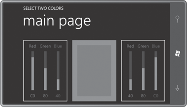
Notice that the labels have picked up the Foreground property set to each ColorColumn control through property inheritance, but not the Slider. I suspect the Foreground property is set in the theme style for the Slider and that’s blocking property inheritance. If getting that color was really important, I’d probably define a new Color property on ColorColumn and use that to programmatically set the Foreground property on the Slider.
I deliberately designed the layout of SelectTwoColors so it wouldn’t work quite well in portrait mode:
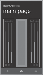
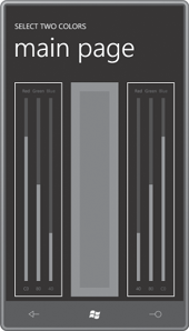
As you can see, the text runs together. But all is not lost. All that’s necessary is to set a smaller FontSize property directly on the two RgbColorScroller controls:
FontSize="12"
That one property setting affects all six TextBlock elements in each control. The text becomes very small, of course, but it’s no longer overlapping:
