Let’s dig deeper into paragraph text options and
discover new ways to embellish your printed message; create or open a
document now that contains a paragraph text frame. Because of the large
screen resolutions we enjoy today, we can view pages at almost a 1:1
resolution as they would print, but this also means we might need to
scroll and mouse around a document more than is healthy for the wrists.
The solution in CorelDRAW is a simple one: if you’re working extensively
with text, you float the Text toolbar close to the area of the document
in which you’re fine-tuning. Right-click over any area of the property
bar, and then choose Text from the pop-up menu. You can drag the Text
toolbar to hover over any area you like.
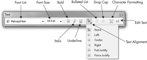
The Text toolbar can be used to
edit single characters in artistic text and paragraph text, but its real
strength is in the offering of options for making paragraph text look
polished and sophisticated. When the Pick tool or the Text tool is
active, all the features shown in Figure 1 are active and at your disposal.
Tip
The
Text toolbar and the Text options on the property bar when the Pick or
the Text tool have selected text are essentially identical. The Text
toolbar is simply a more portable device for working closely with text.
Drop Caps and Bulleted Lists Formatting
A drop cap
is a dropped capital character at the beginning of a paragraph, much
larger than the rest of the text, extending three, four, or more lines
down in the paragraph... and it adds a touch of class to a document,
particularly if you’re illustrating a fairy tale.
Bulleted lists
are a common necessity for page layouts: restaurant menus, assembly
instructions, just about anything that’s a list that doesn’t need to be a
numbered list! In the following sections, you’ll see not only how to
create a bulleted list, but also how to choose any character you like
for the bullet and even create a hanging indent for the bulleted list
for an ultra-professional presentation.
Creating a Drop Cap
You have a lot of options, hence
a lot of design opportunities, for drop caps in a CorelDRAW document:
you can decide on the drop cap’s height relative to the lines of
paragraph text of its neighbors, whether it’s nestled into the body of
the text or stands to the left (called a hanging indent), and even
choose the font used for the drop cap.
First, the Drop Cap button on
the Text toolbar and property bar is available when the Pick tool is
used to select paragraph text, and when the Text tool is used to
highlight a paragraph within a paragraph text frame. This is a show/hide
toggle button:
it turns the default attributes for a drop cap on and off within the
selected text. Therefore, you can create a drop cap for paragraph text
in one click, but if you want to add your own input, you need to
additionally work with the Drop Cap options box, as demonstrated in the
following steps.
Adding a Drop Cap to Your Paragraph Text
Create some paragraph text.
Use
the Text tool to highlight a paragraph that you want to lead off with a
drop cap. You can create drop caps by simply selecting a paragraph text
frame with the Pick tool, but doing so will put a drop cap at the
beginning of every paragraph (after every hard return), which might be
overdoing the effect.
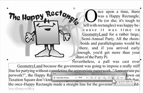
On
the Text toolbar or the property bar, click the Drop Cap button; you’ll
get the default drop cap effect, as seen in the illustration below.
The
easiest way to make the drop cap into an ornamental drop cap is to
toggle the Drop Cap on the property bar to hide it; then highlight the
first letter, and change the font for this one character. Then, with the
I-beam cursor in front of the letter, click the Drop Cap button once
more.
Choose Text | Drop Cap to display the options
for the drop cap. The most common customizing would be to change how
many lines the cap is dropped; by default, it’s three, but four or even
five can look interesting, depending on the font you use. If you feel
there isn’t enough air between the paragraph text and the drop cap, use
the Space After Drop Cap spin box to increase the space to the right of
the drop cap. You also have the option to Use Hanging Indent Style For
Drop Cap, which casts the drop cap to the left of the paragraph text
while the paragraph text then takes on a flush-left indent. The
following illustration shows the completed effect; a hanging indent was
not used because the design uses paragraph text inside a path to wrap the text around the cartoon, and an indent would spoil the overall composition.

Making Bulleted Paragraph Text
Like the toggling Drop Cap
button, the show/hide Bulleted List button can be your one-click stop
for creating bulleted lists; however, you’ll surely want a custom
bulleted list that looks as artistic as your document layout. On the
Text menu you’ll find the Bullets command; it’s straightforward and
you’ll quickly achieve great results. Find or create a list of
something, and follow along to see how to work the options for bullets.
Creating a Bullet Motif
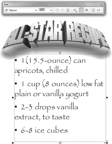
There’s
no real harm in simply using the Pick tool to select the paragraph text
you want to make a fancy bulleted list: every line break in the list
begins a new bulleted item, so select the text and then click the
show/hide Bulleted List button on the property bar or on the Text
toolbar. See the following illustration.
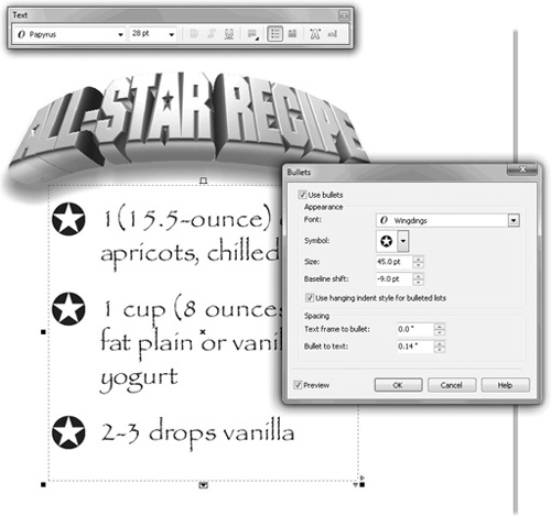
Choose
a typeface that contains a character that works well with the theme of
the bulleted list composition. The illustration is an “All-Star Recipe,”
so a bullet shaped like a star is appropriate. Microsoft’s Wingdings
font is installed with every copy of Windows, and it features some nice
symbols: choose Wingdings from the Font drop-down list in this example,
and then click the Symbol drop-down arrow, and locate a good star shape.
Click the Use Hanging Indent Style For Bulleted Lists check box to get a polished look for the list.
Increase the point size by dragging upward in the center of the spin box control for Size.
Most
likely, the baseline of the enlarged symbol won’t look right compared
with the text in the list (it’ll be too high). Drag downward on the
Baseline Shift spin box control until the bullets look aligned.
Optionally,
if your symbol is crowding into the list text, increase the Bullet To
Text spacing. Similarly, the paragraph text frame might be too tight to
the left of the bullet; in this case, you increase the Text Frame To
Bullet amount. See the following illustration for the completed design.
Working with Columns
Although you can
manually create flowing columns of paragraph text, it’s often less
time-consuming to use the automated Columns feature in CorelDRAW. Text
columns divide paragraph text frames into several vertical columns
separated by gutters
(margins). Multiple columns can be created only in the Text | Columns
dialog. This section describes how to manipulate columns with the mouse.
You must have paragraph text selected with the Text tool to work with
columns: the tabs do not show on the rulers using other tools.
Select the frame in which you
want to place columns, choose Text | Columns, and then set the Number Of
Columns on the Column Settings dialog. It is always a good idea to keep
the
number of columns balanced, so each column is neither too wide nor too
narrow. A good rule of thumb for legibility is: each line of text should
be no wider than 6 inches or 16 words, but it should be wide enough to
have at least 4 words per line.
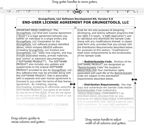
To change the width of the
columns and margins, drag the column guides, column-boundary markers,
gutter handles, and horizontal-resize handles, as shown in Figure 2.
When dragging the column guides or boundary markers, if the Equal
Column Width option is selected in the Column Settings dialog, all the
gutters will be resized together; the gutter handles are available only
when this option is not selected.
Note
Columns can be applied only to whole paragraph text frames and cannot be applied to individual paragraphs or artistic text.
Column Settings
Once you’ve created a
paragraph text object with columns, you can refine and make precise
columns and gutter widths through the Column Settings dialog (Text |
Columns), shown in Figure 3.
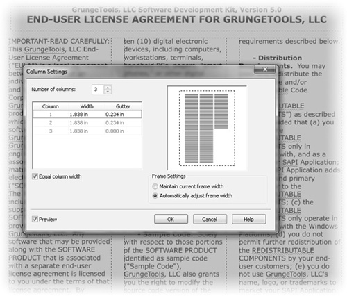
To add extra columns, first set
the Number Of Columns, and then set the Widths of the columns. The
Gutter value is the distance between the selected column and the next
one. If Equal Column Width is selected, changing the width of any column
or gutter changes the width
of all columns or gutters to the same value. If Maintain Current Frame
Width is selected, changing the width of any column or gutter will not
change the overall width of the frame, so the other columns and gutters
will be resized to accommodate the change. A preview of the column
settings is shown in the preview frame on the right side of the dialog.
Text in columns (even if only one column is used) can be justified via the Text toolbar and the Paragraph Formatting box.
Tip
You can have more control over columns by laying them out as multiple text frames, each one containing a single column.