Indicators are the images used to display the
approximate value of a KPI visually in a scorecard. Typical indicators
include the popular traffic light icons that display green (on target),
amber (needs attention), and red (off target) to indicate status.
Indicators prove useful when displaying a large amount of data on a
scorecard. For example, a scorecard might contain hundreds of different
KPI metrics. Visual indicators on a scorecard heavily populated with
KPIs can communicate a high-level status and make performance
understandable with a single glance.
Examining Indicator
Styles
In PPS there are two types of
indicators:
Standard indicators
Centered indicators
Standard indicators are
indicators that have increasingly better statuses. For example, a
metric with no upper limit to its goodness, such as profit, would be
best represented by a standard indicator. Likewise, a metric such as
spending that gets better as it decreases should also be represented by a
standard indicator. The decision to choose which end is better can be
made when creating the KPI to be associated with the indicator, not when
you are creating the indicator.
Centered indicators are used
for KPIs that aim for a specific target. For example, monitoring
headcount in a department is the type of metric that could use a
centered indicator. With headcount, a manager generally has a target
number, which means it could be bad to go too far above or too far below
the target number.
Examining Indicator
Sources
Indicators are stored as
objects within the SharePoint content database. In PPS, there are two
indicator sources:
Built-in indicators
Custom indicators
PPS comes with a variety of
free indicator images out of the box. All of these built-in indicators
can be used royalty free.
Note
There
is also a set of built-in indicators on trending. These trending
indicators can be tricky to use. They also require a form of time
intelligence to be applied to the scorecard.
It is also possible to
upload your own images and make custom indicators, either from scratch
or by modifying an existing indicator. Custom indicators are useful for
adding corporate branding or a personalized touch to scorecards.
Creating Custom
Indicators
Custom indicators are
best created through Dashboard Designer. Follow these steps to create a
custom indicator:
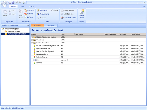
1. | Open
Dashboard Designer, shown in Figure 1, and then open the
PerformancePoint content list in which you want to create the custom
indicator.
|
2. | Select the
Create tab on the ribbon, shown in Figure2, and then click
the Indicator button to launch the Select an Indicator Template Wizard.

|
3. | From the
Select an Indicator Template Wizard, shown in Figure 3, select Blank
Indicator, and then click OK.
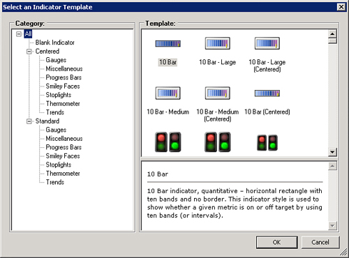
Tip
In this
example, you use the Blank Indicator template, which allows the
greatest amount of customization. However, if you just want to modify an
existing indicator, choose a built-in indicator with which to start.
For example, you can choose a built-in indicator to change the
background highlight of the indicator’s display cell.
After you have created an
indicator, it is only possible to change images and colors. You cannot
add or remove levels after an indicator has been created.
|
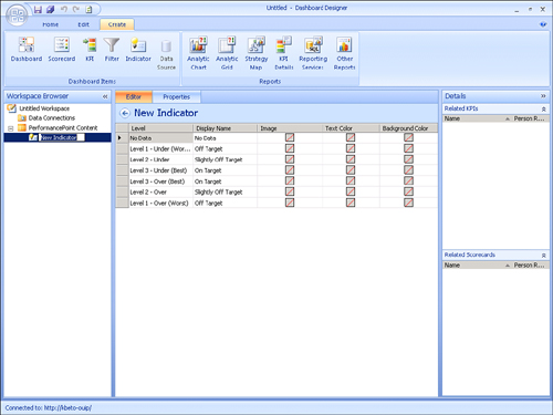
4. | When the
Create New Indicator dialog page appears, shown in Figure 4, you have the
option to choose which style of indicator you want, such as standard or
centered. You can also choose the number of levels in the indicator.
Choose suitable values for this task, and then click Finish.

|
Note
The number of levels for a
centered indicator indicates the number of levels from the center. For
example, if you create a centered indicator with three levels, you will
have three levels above center and three levels below center. The “best”
score for all centered indicators is made up of two halves, one on the
top half and one on the bottom half of true center.
In
addition, all indicators have a No Data level that is used when the
indicators do not have associated data. This may occur in cases when the
data source is not available or when there are no valid intersections
between dimensions.
At this point, Dashboard
Designer creates the indicator for you in the root of the PPS Content
List currently selected, as shown in Figure 5. In addition, the Dashboard Designer displays the
Indicator editing page.
Editing a Custom
Indicator
When your custom indicator
has been created, Dashboard Designer has functionality that enables you
to modify some of the custom indicator’s properties. Much like other
objects within the PPS world, changes you make are viewed and applied
locally in Dashboard Designer. These changes become “live” for all users
when they are saved to the server. You can make changes to the
following values on the Editor tab when viewing an indicator:
Display name
Image
Text color
Background
Edit Display Name
The display name is an edit
box field. Edit the field by selecting the cell and then changing or
entering the new text to display in the field.
Edit Image
The image used for the
indicator can be in JPG, BMP, GIF, or PNG format. Select the image by
selecting the Image cell on the level where you want to edit the
indicator. Next, you can either use the Edit—Picture from File option or
double-click the cell. Select the picture file you want to use as an
indicator.
Indicator images must be 255-by-255
pixels or smaller. When using larger images for indicators, consider
how many of those types of indicators you want to have on a scorecard.
Tip
Keep in mind that a
scorecard can become crowded and lose its effectiveness in communicating
performance.
Caution
The Reset Indicator button that
is available in the Edit tab clears the selection of the Image and Text
Color fields. However, because there is not a good reason to do this,
it is better to avoid using this button.
Edit Text Color
The Text Color field controls
the color of the text displayed in a cell on a scorecard. When a KPI on a
scorecard has a value corresponding to that level, the text color of
the target cell for that value changes to the color selected.
Edit Background Color
The Background Color field is
similar to the Text Color field. When a KPI on a scorecard has a value
corresponding to that level, the background color of the target cell for
that value changes to the color selected.
Caution
By default, target metrics are
not configured to honor text and background color changes as defined by
indicators. If you want these changes to take effect, right-click the
target metric header on the scorecard where you want the text changes.
When you want background color changes to be displayed, select the
Metric Settings from the context menu, and then select the Indicator
section of the dialog box. At this point, you can configure several
options such as text and background color that control how this metric
is displayed.
