You’ve
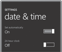
probably noticed a new style of toggle button in some Windows Phone 7
screens. Here they are on the page that lets you set date and time,
blown up to almost double size:

If you experiment with these
controls a bit, you’ll find that you can toggle the switch just by
tapping it, but you can also move the larger block back and forth with
your finger, although it will tend to snap into position either at the
left or right.
I’m not going to try to duplicate that more complex movement. My version will respond only to taps. For that reason I call it TapSlideToggle. The button is a UserControl derivative in the Petzold.Phone.Silverlight library. (I should note that something similar could be implemented entirely in a template applied to the existing ToggleButton, and the Silverlight for Windows Phone Toolkit implements this control under the name ToggleSwitchButton.) Here’s the complete XAML file of my version:
Example 1. Silverlight Project: Petzold.Phone.Silverlight File: TapSlideToggle.xaml
<UserControl x:Class="Petzold.Phone.Silverlight.TapSlideToggle"
             xmlns="http://schemas.microsoft.com/winfx/2006/xaml/presentation"
             xmlns:x="http://schemas.microsoft.com/winfx/2006/xaml"
             xmlns:d="http://schemas.microsoft.com/expression/blend/2008"
             xmlns:mc="http://schemas.openxmlformats.org/markup-compatibility/2006"
             mc:Ignorable="d"
             d:DesignHeight="36" d:DesignWidth="96">

    <Grid x:Name="LayoutRoot"
          Background="Transparent"
          Width="96" Height="36">

        <Border BorderBrush="{StaticResource PhoneForegroundBrush}"
                BorderThickness="2"
                Margin="4 2"
                Padding="4">
            <Rectangle Name="fillRectangle"
                       Fill="{StaticResource PhoneAccentBrush}"
                       Visibility="Collapsed" />
        </Border>

        <Border Name="slideBorder"
                BorderBrush="{StaticResource PhoneBackgroundBrush}"
                BorderThickness="4 0"
                HorizontalAlignment="Left">
            <Rectangle Stroke="{StaticResource PhoneForegroundBrush}"
                       Fill="White"
                       StrokeThickness="2"
                       Width="20" />
        </Border>
    </Grid>
</UserControl>
|
The button is given a specific size in the Grid. If you want a control to have a specific size, here’s the place to do it rather than with the Height and Width
properties of the control itself. I also changed the designer-related
attributes and left them in so I could get a little sense of what the controls looks like in the design view.
I must confess that I’m not entirely happy with the approach I took here: To keep it simple, I restricted myself to two Border elements each containing a Rectangle, but to mimic the gap between the larger sliding block and the wide background, I gave the second Border a BorderBrush colored with the background color. The button will not look right if it’s on a surface that is not colored with the PhoneBackgroundBrush resource.
To somewhat mimic the normal ToggleButton (but without the three-state option) the code-behind file defines an IsChecked dependency property of type bool and two events named Checked and Unchecked. One or the other of these events is fired when the IsChecked property changes value:
Example 2. Silverlight Project: Petzold.Phone.Silverlight File: TapSlideToggle.xaml.cs (excerpt)
public partial class TapSlideToggle : UserControl
{
    public static readonly DependencyProperty IsCheckedProperty =
        DependencyProperty.Register("IsChecked",
            typeof(bool),
            typeof(TapSlideToggle),
            new PropertyMetadata(false, OnIsCheckedChanged));

    public event RoutedEventHandler Checked;
    public event RoutedEventHandler Unchecked;

    public TapSlideToggle()
    {
        InitializeComponent();
    }

    public bool IsChecked
    {
        set { SetValue(IsCheckedProperty, value); }
        get { return (bool)GetValue(IsCheckedProperty); }
    }

    . . .

    static void OnIsCheckedChanged(DependencyObject obj,
                                   DependencyPropertyChangedEventArgs args)
    {
        (obj as TapSlideToggle).OnIsCheckedChanged(args);
    }

    void OnIsCheckedChanged(DependencyPropertyChangedEventArgs args)
    {
        fillRectangle.Visibility = IsChecked ? Visibility.Visible :
                                               Visibility.Collapsed;

        slideBorder.HorizontalAlignment = IsChecked ? HorizontalAlignment.Right :
                                                      HorizontalAlignment.Left;

        if (IsChecked && Checked != null)
            Checked(this, new RoutedEventArgs());

        if (!IsChecked && Unchecked != null)
            Unchecked(this, new RoutedEventArgs());
    }
}
|
The static property-changed
handler calls an instance handler of the same name, which alters the
visuals in the XAML just a little bit and then fires one of the two
events. The only methods missing from the code above are the overrides of two Manipulation events. Here they are:
Example 3. Silverlight Project: Petzold.Phone.Silverlight File: TapSlideToggle.xaml.cs (excerpt)
protected override void OnManipulationStarted(ManipulationStartedEventArgs args)
{
args.Handled = true;
base.OnManipulationStarted(args);
}
protected override void OnManipulationCompleted(ManipulationCompletedEventArgs args)
{
Point pt = args.ManipulationOrigin;
if (pt.X > 0 && pt.X < this.ActualWidth &&
pt.Y > 0 && pt.Y < this.ActualHeight)
IsChecked ^= true;
args.Handled = true;
base.OnManipulationCompleted(args);
}
|
I decided to toggle
the button only if the user presses the button and then releases the
finger while it’s still over the button, which is the common approach.
The OnManipulationStarted override sets Handled to true
to prevent the event from travelling further up the visual tree and in
effect, to signal that the button is commandeering this particular
manipulation. The OnManipulationCompleted override then checks if the ManipulationOrigin property is within the bounds of the control. If so, IsChecked is toggled:
IsChecked ^= true;
The TapSlideToggleDemo program tests it out. The content area defines two instances of TapSlideToggle and two TextBlock element to display their current state:
Example 4. Silverlight Project: TapSlideToggleDemo File: MainPage.xaml (excerpt)
<Grid x:Name="ContentPanel" Grid.Row="1" Margin="12,0,12,0">
    <Grid.RowDefinitions>
        <RowDefinition Height="Auto" />
        <RowDefinition Height="Auto" />
    </Grid.RowDefinitions>

    <Grid.ColumnDefinitions>
        <ColumnDefinition Width="*" />
        <ColumnDefinition Width="*" />
    </Grid.ColumnDefinitions>

    <TextBlock Name="option1TextBlock"
               Grid.Row="0" Grid.Column="0"
               Text="off"
               Margin="48"
               VerticalAlignment="Center" />

    <petzold:TapSlideToggle Name="slideToggle1"
                            Grid.Row="0" Grid.Column="1"
                            Margin="48"
                            HorizontalAlignment="Right"
                            Checked="OnSlideToggle1Checked"
                            Unchecked="OnSlideToggle1Checked" />

    <TextBlock Name="option2TextBlock"
               Grid.Row="1" Grid.Column="0"
               Text="off"
               Margin="48"
               VerticalAlignment="Center" />

    <petzold:TapSlideToggle Name="slideToggle2"
                            Grid.Row="1" Grid.Column="1"
                            Margin="48"
                            HorizontalAlignment="Right"
                            Checked="OnSlideToggle2Checked"
                            Unchecked="OnSlideToggle2Checked" />
</Grid>
|
Each of the two TapSlideToggle instances has both its Checked and Unchecked events set to the same handler,
but different handlers are used for the two instances. This allows each
handler to determine the state of the button by obtaining the IsChecked property and accessing the corresponding TextBlock:
Example 5. Silverlight Project: TapSlideToggleDemo File: MainPage.xaml.cs (excerpt)
public partial class MainPage : PhoneApplicationPage
{
    public MainPage()
    {
        InitializeComponent();
        slideToggle2.IsChecked = true;
    }

    void OnSlideToggle1Checked(object sender, RoutedEventArgs args)
    {
        TapSlideToggle toggle = sender as TapSlideToggle;
        option1TextBlock.Text = toggle.IsChecked ? "on" : "off";
    }

    void OnSlideToggle2Checked(object sender, RoutedEventArgs args)
    {
        TapSlideToggle toggle = sender as TapSlideToggle;
        option2TextBlock.Text = toggle.IsChecked ? "on" : "off";
    }
}
|
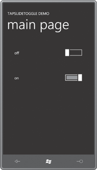
And here’s the result:

This button does not implement a unique visual appearance if the button is disabled. When IsEnabled is set to false, a control
no longer gets user input automatically, but visually conveying this
state is the responsibility of the control itself. Commonly, a
semi-transparent black Rectangle overlays the entire control with a VisibilityCollapsed. When IsEnabled is true, the Visibility property of this Rectangle is set to Visible, in effect, “graying out” the visuals of the control. property set to