2. Using Resource Monitor
Like the Performance tab in Windows
Task Manager, Resource Monitor gives you both instantaneous and
recent-history readouts of key performance metrics. Also like Windows
Task Manager, Resource Monitor can show you, in excruciating detail,
what each process is doing.The version of Resource Monitor in Windows 7
is extremely usable and packed with enough information to keep you busy
for hours or days.
To open Resource Monitor, click its shortcut on the All Programs menu (under Accessories, System Tools). Or just type resource
in the Start menu search box and click the shortcut that appears at the
top of the list. (In either case, you'll need administrative
credentials.) Or take the direct route: type perfmon /res at a command prompt.
Note:
You can open Resource
Monitor by clicking the button at the bottom of the Performance tab in
Task Manager. This is, in our opinion, the preferred way to use this
utility. Start with a quick overview from Task Manager, and if you need
more information call on Resource Monitor.
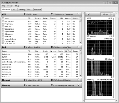
When you first open Resource Monitor, you see the Overview tab shown in Figure 2, which provides both detailed tables and charts that summarize performance in four areas.
Tabs along the top of the
Resource Monitor window allow you to switch to a different context and
focus on a specific type of resource usage. The basic layout of each tab is similar and consists of a handful of common elements.

One or more tables contain details about the resource featured on that tab. The first table on each tab is called the key table;
it contains a list of all processes currently using the selected
resource, with a check mark to the left of each process allowing you to
filter the data displayed in additional tables on the tab. The key table
at the top of the Overview tab lists all running processes, in a
display that is similar to the Processes tab of Task Manager.
Within each table, you can add or hide columns,
change the order of columns, and resize columns. To see the full list
of available columns for an individual table, right-click the column
headings for that table and choose Select Columns. On the CPU tab, for
example, you can add the following normally hidden columns to the
Processes table: User Name, to help identify the owner of a process;
Operating System Context, to identify the Windows version a program was
originally written for; Platform, to distinguish 32-bit and 64-bit
processes on a 64-bit Windows installation; and Elevated, which
identifies processes running with full administrative privileges. You
can sort any column by clicking the heading; click again to reverse the
sort order.
The heading atop each table
serves several purposes. At its most basic, it contains a label that
identifies the table's contents. You can also click the arrow at the
right side of the heading to expand or collapse its contents. To the
right of the label is one or more elements that summarize the
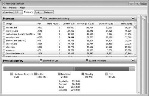
information in that table. In Figure 3, for instance, the header above the Processes table shows the percentage of physical memory in use, while the informational graphics in the Physical Memory header show the amount of RAM in use and available.

For each of four resources—CPU, disk, network, and memory—the Overview tab presents instantaneous and recent-history graphs of two metrics. The recent-history data appears in the chart pane
on the right. The instantaneous readouts are in the small squares to
the right of the label in the header above each table. Each graph uses
colors—green and blue—to distinguish its two data sets. The performance metrics are shown in Table 1.
Table 1. Performance Metrics Displayed on the Overview Tab
| Resource | Green Display | Blue Display |
|---|
| CPU | Percent of CPU capacity in use | Percent of full clock speed at which CPU is running |
| Disk | IO activity for all disks (scale changes depending on workload) | Percentage of disks' available throughput in use |
| Network | Network activity (scale changes depending on workload) | Percent of network capacity in use |
| Memory | Hard faults per second | Percent of physical RAM in use |
For most (but not all) of the graphs
in the chart pane, you'll see two lines—one blue and one green. The
color keys correspond to the information on the header for the
associated table. Thus, on the Overview tab, the green line on the CPU
graph shows total CPU usage in real time, while the blue line shows the
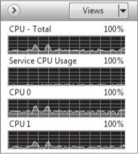
maximum frequency at which the CPU is operating. If you find the graphs
distracting, you can hide them by clicking the right-facing arrow in
the header above the graphs; you can also use the choices on the Views
menu to switch to Large, Medium, and Small displays of the real-time
data. The display shown here is the Small variant of the chart pane on
the CPU tab.

The four charts on this
tab are worth a closer look. At the top is a chart showing total CPU
usage. At the bottom are two charts, one for each of the cores in this
dual-core processor.
The second chart, Service CPU Usage, helps identify how much of the CPU
is being used by background services. If this chart shows steady,
significant activity, you should take a closer look at running processes
to see if any are using more than their fair share of the CPU.
|
One of our criticisms
of Resource Monitor's predecessor in Windows Vista was its inability to
remember layout changes you made. In Windows 7, that's fixed, and then
some. When you reopen Resource Monitor, it remember the settings you had
selected when you closed it previously and restores those settings. Not
only that, but you can save the display state—active tab, window size,
column widths and additional columns within tables, and whether tables
are expanded or collapsed. (The only setting not saved is the set of
filters you've applied to the current view.) To save your current
display settings, click Save Settings As from the File menu, enter a
descriptive name, and then click Save. To load a saved configuration,
choose Load Settings from the File menu, select your saved configuration
file, and then click Open. Alternatively, doubleclick the saved
configuration file in Windows Explorer to open Resource Monitor with
your configuration settings loaded.
|
For each graph, the line on the horizontal axis (the time scale) represents 5 seconds; with 11 lines, that means the
display encompasses 55 seconds, not 60 seconds as the legend
incorrectly notes. The vertical axis contains 10 lines and always
depicts a percentage of the current scale.
In Figure 4, we see the four graphs from the Overview tab on a desktop PC that is using the Balanced power scheme. The CPU
is currently running at 75 percent of its clock speed but has spent the
last 45 seconds or so running at 80–95% of its full rated speed. The
hard disks have seen brief spikes of activity in this time slice,
loading code as new programs launched and then quieting down. Very
little is happening on the network at the current time; about 30 seconds
earlier, there was a brief burst of activity from the network that used
only a small fraction of the gigabit speeds available. At this instant,
the system is experiencing virtually no hard
faults, at the rate of 1 per second (having peaked at roughly 100 a
short time ago), and is using 43 percent of its physical memory.

You can stop data
collection at any time and freeze the display of information completely,
a useful feature if you've just observed a spike in activity and then
watched it calm down, and now you want to examine the details. Click
Monitor, and then click Stop Monitoring to pause the display. Click
Start Monitoring on the same menu to resume the data collection and
display.
Filtering
the display of data in Resource Monitor is an especially valuable
technique when you're trying to track down the cause of a particular
burst of activity (and possibly an associated slowdown). You can also
use this technique to identify services, handles, and modules associated
with a particular process.
On the CPU tab, for instance, you might notice that an instance of
Svchost.exe is using a disproportionate amount of the CPU and doesn't
seem to be showing signs of stopping. To find out why, select the check
box to the left of its entry in the Processes
table. The entry immediately moves to the top of the list, and the
tables below pick up an orange header indicating they're filtered by the
selected item. A similar orange line appears on the graph to the right
to help you isolate resource usage for the filtered items.